Robot Food Revamps Logo and Packaging for fritz-kola
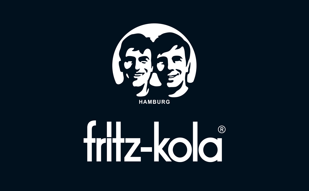
Robot Food has updated the logo and packaging design for German soft drinks brand, fritz-kola.
Founded in 2003 by two students in Hamburg who set out to take on the ‘big boys’ of cola, the soda brand is currently said to be the second biggest soft drink company in Central Europe.
The new look forms part of plans for a wider European growth effort by what is still an independently owned business.
“The new identity has been sensitively evolved to sharpen, clarify, and add depth to the brand, without losing the strong connection their consumer base has with the current design and its story,” says the team at Robot Food.
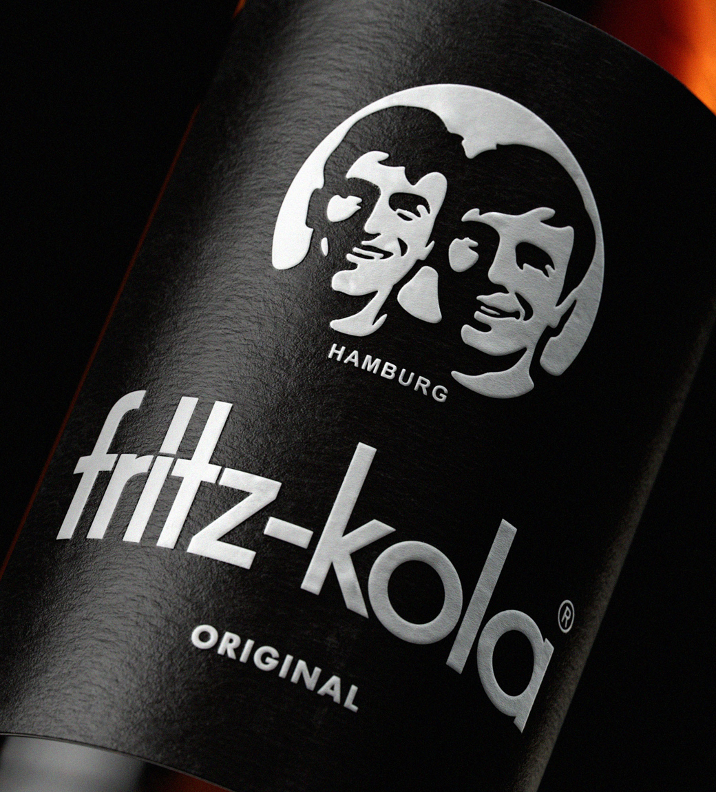
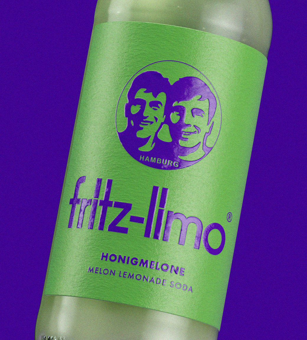
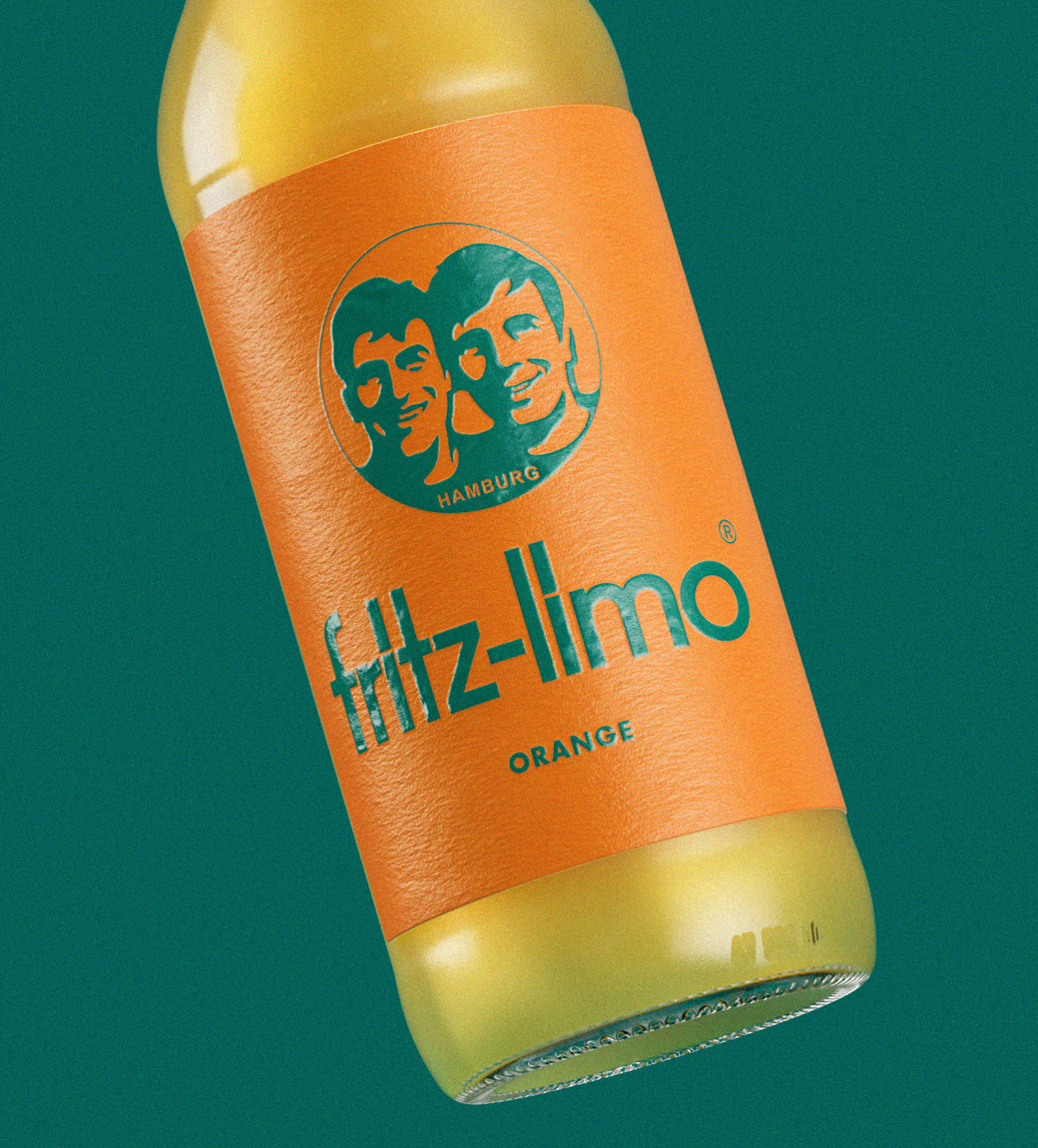
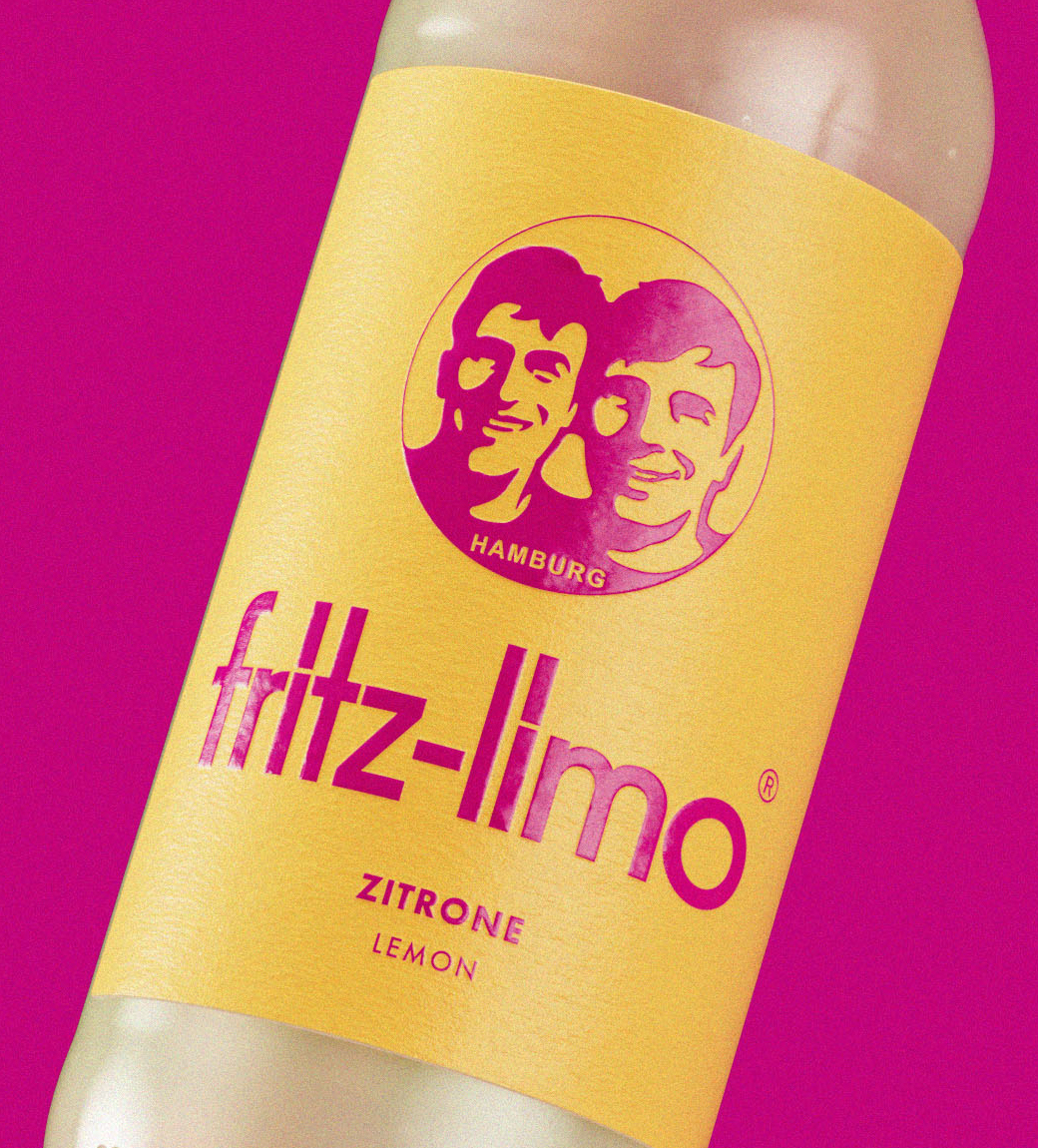
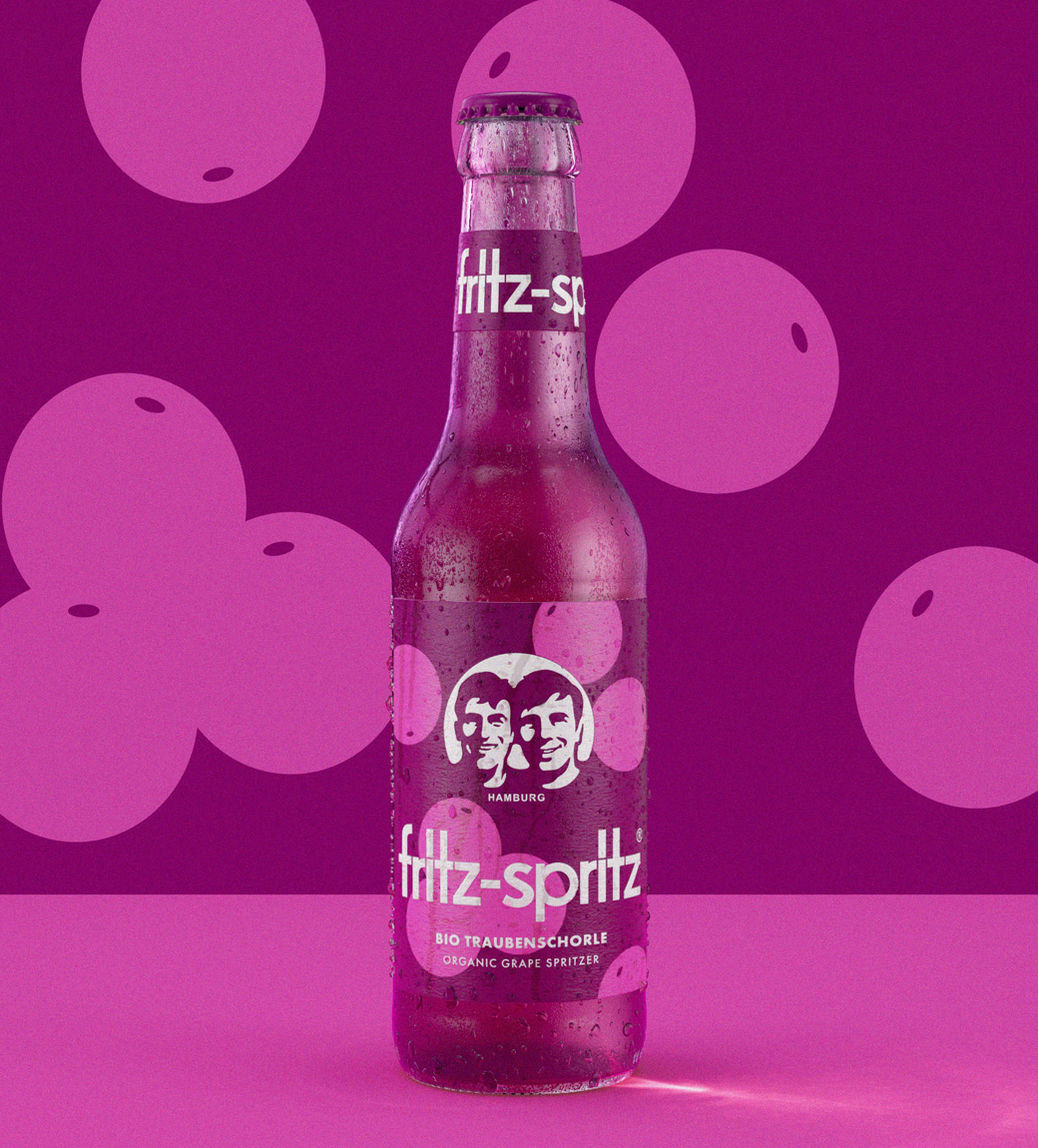
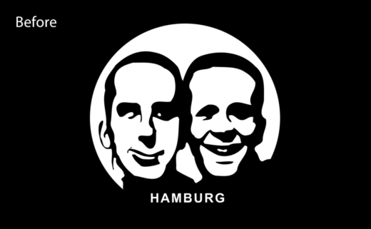
While the original wordmark therefore remains unchanged, the agency has reworked the accompanying brand icon in collaboration with illustrator Chris Mitchell.
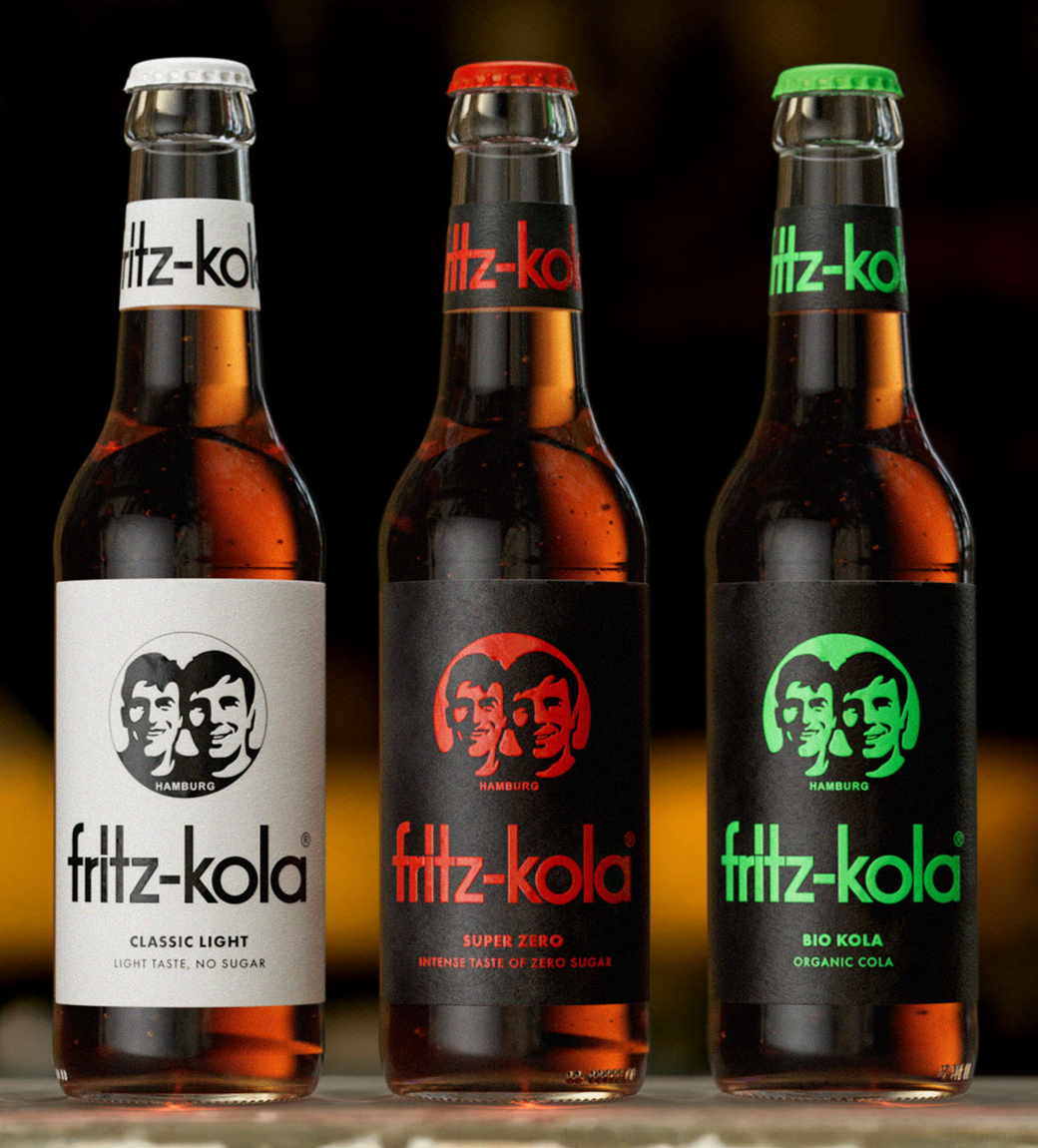
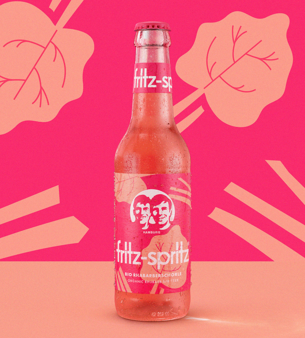
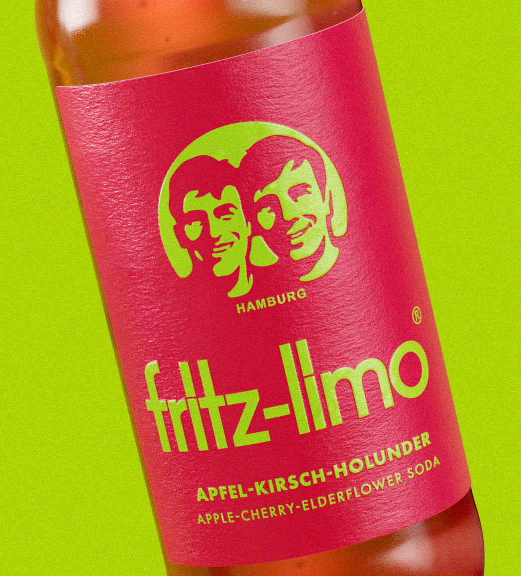
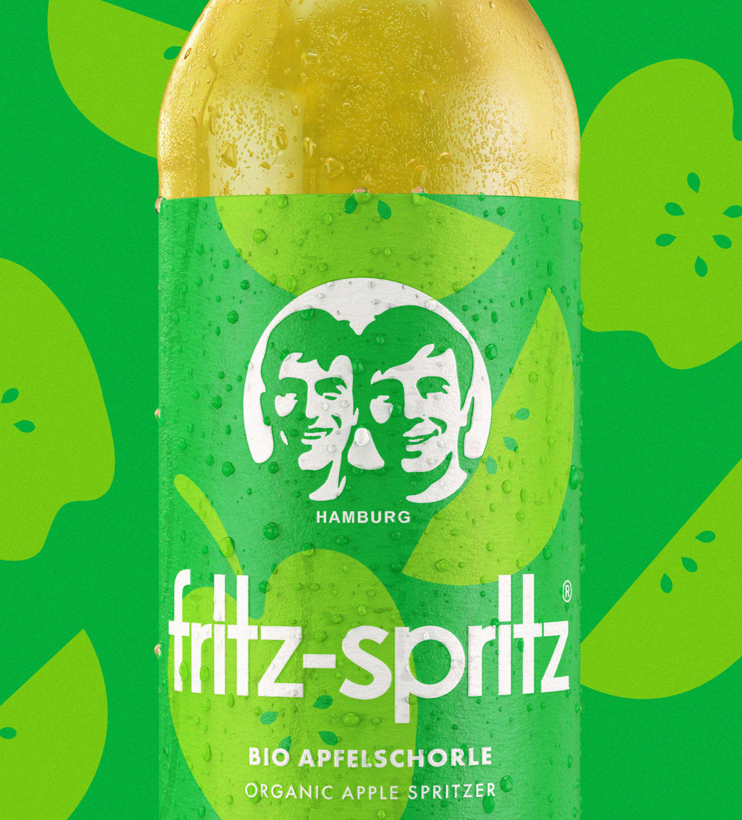
Additionally, a new range segmentation strategy has been implemented that aims to better differentiate between the fritz-kola, fritz-limo, and fritz-spritz ranges.
“We unified fritz-kola under a black imprint to ensure there was a consistent structure and design hierarchy – making it easy to find a fritz-kola wherever you are in the world,” explains Robot Food’s design director, Chris Shuttleworth.
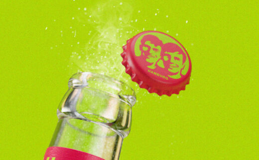
Packaging changes include updated labels, with the bottle messaging refocused “to hero the passion and underdog attitude of the people behind fritz-kola”.
Robot Food
www.robot-food.com


