Rightmove Gets New Logo Design by The Team
Rightmove, the UK’s number one property website, has unveiled a new logo and visual identity created by The Team.
Originally founded in 1999 by a group of developers and estate agents, Rightmove aims to “help people make the right move” and to “find their happy”.
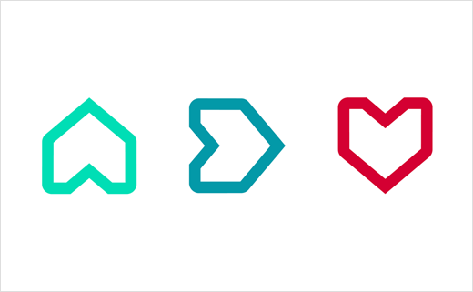
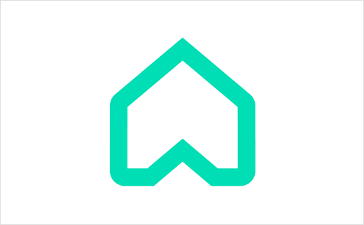
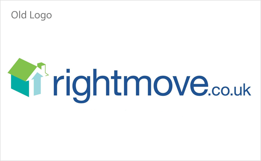
The Team says it has tried to encapsulate this concept with the new logo, which evolves the original design of an arrow and a house.
“We wanted to enhance the emotive human quality of the brand. Inspired by the sentiment of home is where the heart is, we realised the new logo could tell the story of helping people find their happy with a simple rotation,” explains Dan Dufour, brand strategy director at The Team.
Like the refreshed house symbol, the accompanying wordmark also gets softened edges and is now set in Effra typeface.
To add further “human warmth and charm”, the colour palette has been revised too. While the green has been replaced with turquoise, the addition of cherry red also makes the home symbol look like a heart when it is turned upside down.
The new identity will officially roll out from 13 December.
The Team
www.theteam.co.uk


