Renault Logo History: 117 Years of Brand Identity
In 2015, Renault has deployed what it likes to call “a new brand universe”. The French carmaker updated its brand identity with a new logo and a new brand signature dubbed ‘Renault – Passion for life’ earlier in April of this year.
A logo is a key component of corporate identity, and Renault is often referred to as the ‘diamond brand’. For the past 90 years, the brand identity has been summed up by the letters in the name ‘Renault’ and by the diamond-shaped logo.
We decided to look back at 117 years of logos and brand identity that have changed the company with its times.
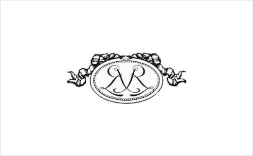
Renault was founded in 1898 by the three brothers Louis, Marcel and Fernand Renault. The company was initially called “Renault-Frères” and the first logo in 1900 featured the brother’s initials, with two entwined Rs in an “Art Nouveau” medallion. Used primarily on internal documents, this emblem was not used on brand vehicles, which could be recognised only by the name “Renault-Frères” on the running board and the initials LR (for Louis Renault) carved onto the wheel hubs.
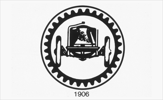
In 1906, the medallion was replaced by an image of the Renault that won the first French Grand Prix, shown inside a gear wheel. On becoming the sole manager of the company, Louis Renault changed the name from “Renault-Frères” to “Société des Automobiles Renault” in 1910.
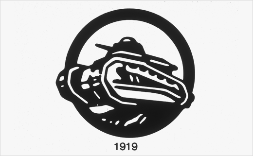
At the end of the First World War, due to its contribution to the Allied victory by producing FT17 tanks, Renault modified its logo to feature the armoured vehicle. In 1922, Louis Renault changed again the name of its company to “Société Anonyme des Usines Renault”.
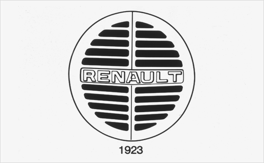
In 1923, Renault decided for the first time to place a front-end logo on its vehicles to make them more easily identifiable. It adopted a round grille with the name of Renault in the centre.
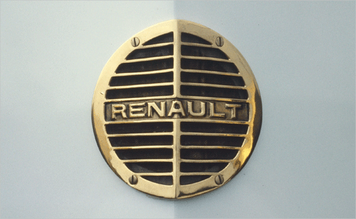
This logo was both functional and essential since behind the grille at the front of the bonnet was… the horn! Regulations required this function to be positioned at the front behind a metal grille. Tailored to the specific snout shape of Renault’s “Alligator” bonnet, the logo was split in two by a central line.
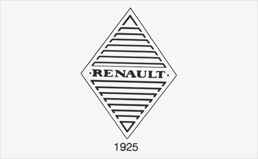
The round logo of 1923 soon gained more angular contours, better suited to the dihedral-shaped bonnets with their two plane faces and central dividing line.
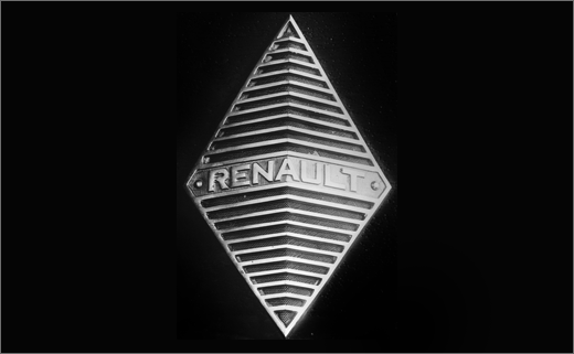
The diamond was used alongside the round grille from 1924, appearing on the front of the 40-CV Type NM executive tourer. This geometrical symbol was definitively adopted in 1925. In the first instance, the diamond was used exclusively on luxury sports vehicles identified by the name Stella from 1929.
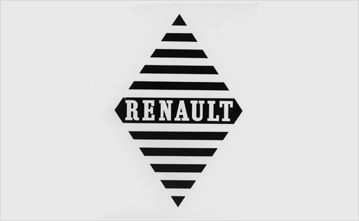
Over the 1930s, the identity evolved gradually and was progressively adopted across the company. During this period, the company also gained a new brand signature: “Renault, l’Automobile de France” (“Renault, The Automobile of France”).
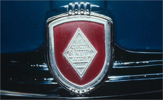
The nationalisation of Renault on January 16, 1945 marked a change in status. The company became the Régie Nationale des Usines Renault. The name “Renault” was used as the commercial brand. The brand signature evolved to become: “Plus que jamais, Renault, l’Automobile de France” (“More than ever, Renault, the Automobile of France”).
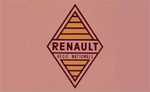
From 1946, these changes were also reflected in the diamond logo, which was published in colour for the first time on official documents. Yellow became the emblematic colour of the brand.
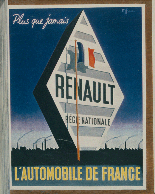
The diamond became indissociable from Renault and was included in all documents and adverts.
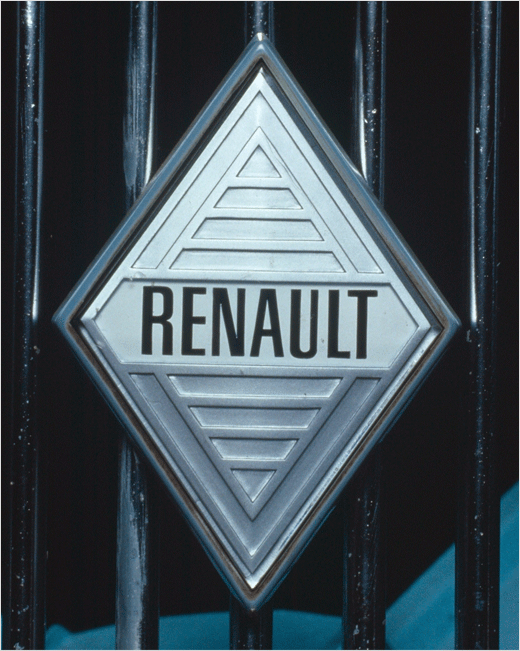
In 1959, from the Renault 4, the cars and the sales network began to use a new, narrower logo called the Pointe de Diamant or diamond tip. The emblem still included the name “Renault” etched in slimmer lettering but the words “Régie Nationale” disappeared.
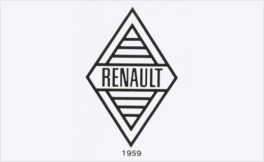
Positioned in some cases on the right of the asymmetric grille (as on the Renault 8, for example), the logo was also used as a decorative feature on the body sides (particularly on the rear wings of the Renault 16). On internal documents, the black-and-white logo always had a yellow background.
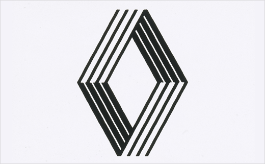
In an attempt to further underline the strength of the diamond, the company decided in 1972 to make it wider with cleaner lines. The diamond became more prominent and the name of Renault was no longer included.
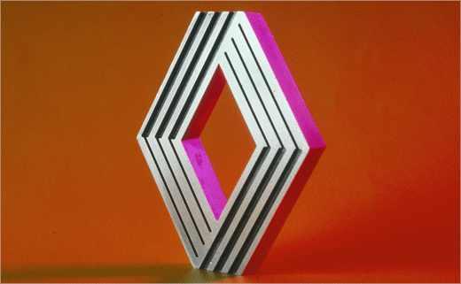
The company decided to bring into play its Art & Industry policy, set up in 1967, with contributors including painter and visual artist Victor Vasarely. Working with his son Yvaral, the founder of op art created a logo based on parallel lines. The Renault 5 became the first model to feature the “new diamond”.
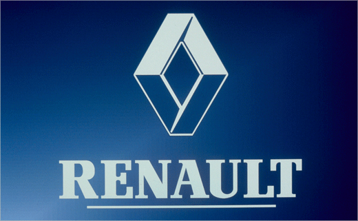
Twenty years after the Vasarely logo, Renault decided to review its visual identity. The 1992 logo was simpler and more prominent with its 3D relief. Renault’s name also appeared under the diamond in each document or advert.
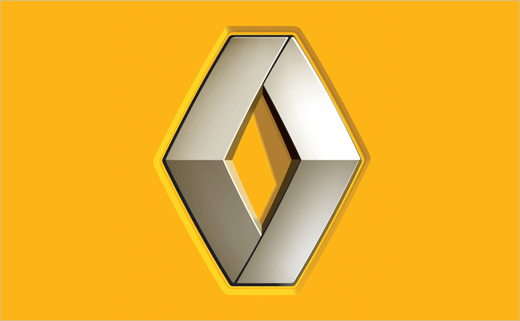
In 2004 the visual identity was again updated, with the diamond symbol being placed inside a yellow square to bring out its relief. Three years later, in 2007, the brand’s international signature also became “RENAULT – Drive the Change”, heralding the company’s introduction of a new electric vehicle range.
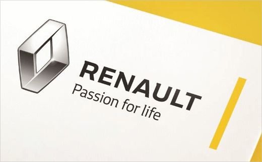
With the design renewal of its current vehicle range underway, Renault has this year chosen to launch a new brand signature, namely, ‘RENAULT – Passion for life’.
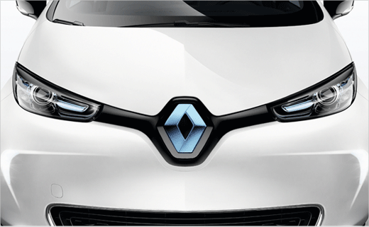
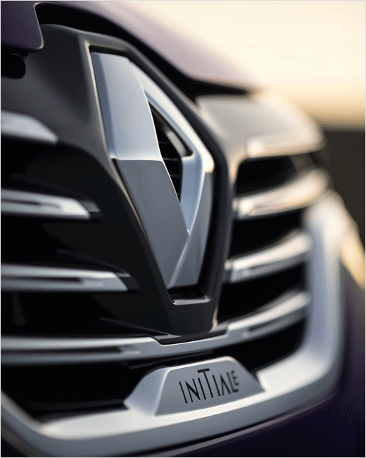
The diamond logo has been made bolder and has been freed from the confinement of its surrounding outline – it now shares the attributes of the verticalised and enlarged logo that takes up a fundamental and dominant position on the front grille of the brand’s latest models.
Source: Renault


