Rebrand for ‘Speed Communications’ by Soapbox & Sons

Rebrand for ‘Speed Communications’ by Soapbox & Sons

Following a merger with KTB PR in 2012, Speed Communications felt a brand refresh would help unite the two agencies.

On the back of this new brand repositioning, they briefed Jenny Theolin, creative director at London-based design studio Soapbox & Sons, to give the business a fresh look.

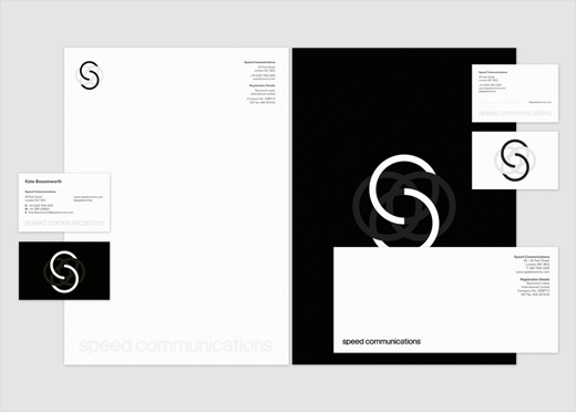
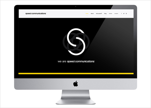
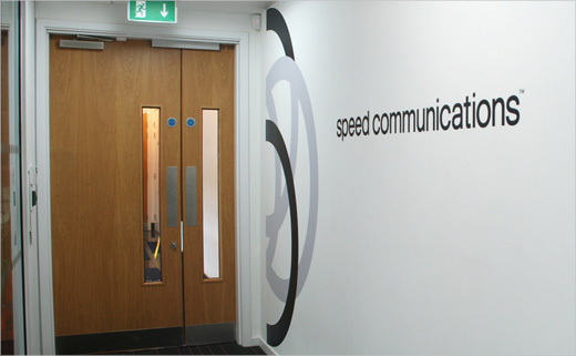
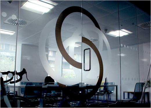
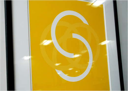
The new logo design is based around an ‘S’, which is split to show both the ‘S’ and ‘C’ of the name, aiming to reference the idea of ‘connecting’ inherent to a PR company.

“The ‘S’ also symbolises a united family and internally referred as their very own seal of quality, their Kitemark,” explains Jenny.

While the new identity is primarily set in mono, a bold secondary colour palette has also been adopted for increased flexibility and longevity.


Speed-Communications-logo-design-branding-Soapbox-&-Sons-Jenny-Theolin-6

Speed-Communications-logo-design-branding-Soapbox-&-Sons-Jenny-Theolin-4

Speed-Communications-logo-design-branding-Soapbox-&-Sons-Jenny-Theolin-7

Speed-Communications-logo-design-branding-Soapbox-&-Sons-Jenny-Theolin-8

Speed-Communications-logo-design-branding-Soapbox-&-Sons-Jenny-Theolin-9

Speed-Communications-logo-design-branding-Soapbox-&-Sons-Jenny-Theolin-2

Speed-Communications-logo-design-branding-Soapbox-&-Sons-Jenny-Theolin-3

Speed-Communications-logo-design-branding-Soapbox-&-Sons-Jenny-Theolin-10

Speed-Communications-logo-design-branding-Soapbox-&-Sons-Jenny-Theolin-12

Speed-Communications-logo-design-branding-Soapbox-&-Sons-Jenny-Theolin-11

Speed-Communications-logo-design-branding-Soapbox-&-Sons-Jenny-Theolin-5

Soapbox & Sons
www.soapboxandsons.com