Ramblers Charity Gets New Logo and Identity by BrandOpus
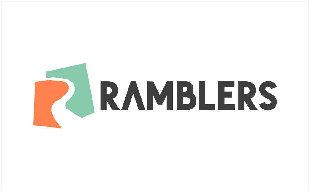
British walking charity, the Ramblers, has unveiled a new logo and identity system with design by global branding agency, BrandOpus.
The 86-year-old organisation hopes the visual refresh will help it to attract more people to the world of walking. In an era of Covid restrictions, UK citizens are said to be increasingly looking towards the outdoors for both fitness and wellbeing purposes.
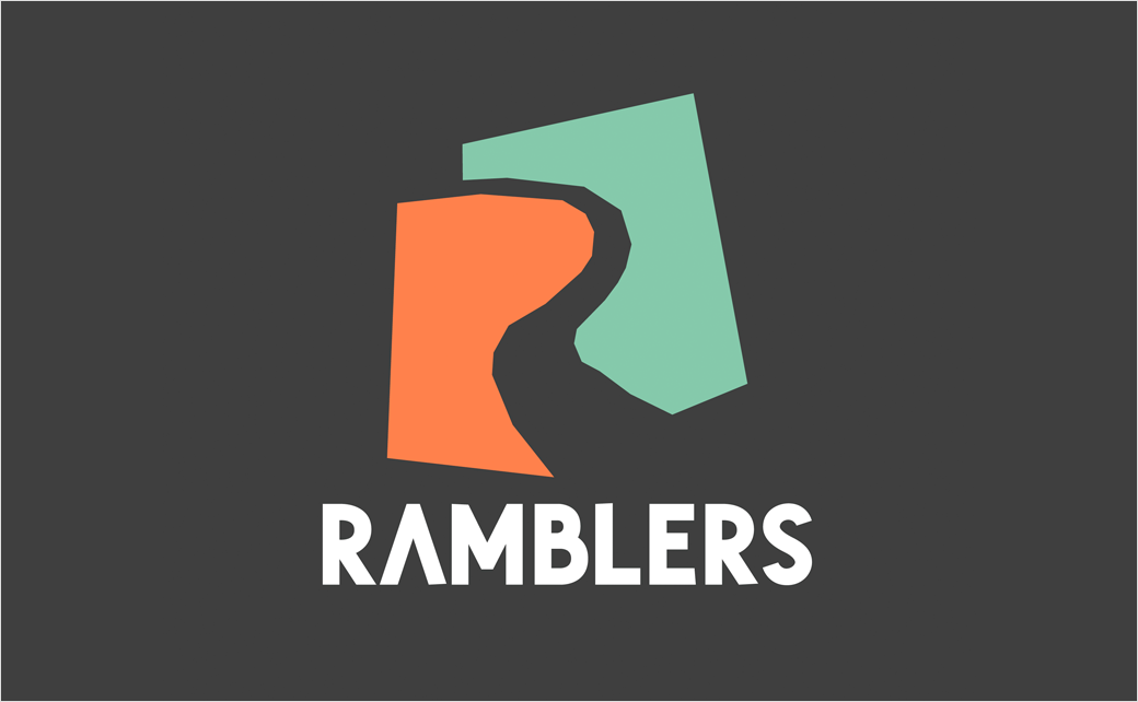
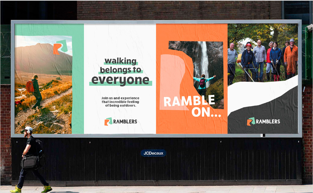
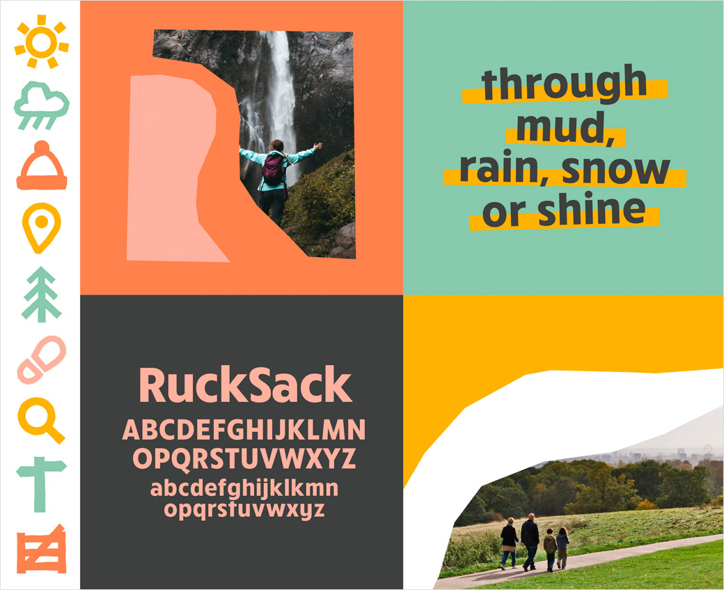
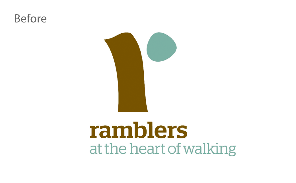
“Rooted in the idea of ‘opening the way’, the fresh identity comprises a papercut that crafts an open ‘R’ path, symbolising that anyone can create their own way through the landscape. A refreshed colour palette of upbeat earthy tones and a bold, rounded typeface [‘RuckSack’ by Jeff Schreiber], appeals to walkers by emulating the outdoors and bringing the open and active characteristics of the Ramblers to life,” says the design team at BrandOpus.
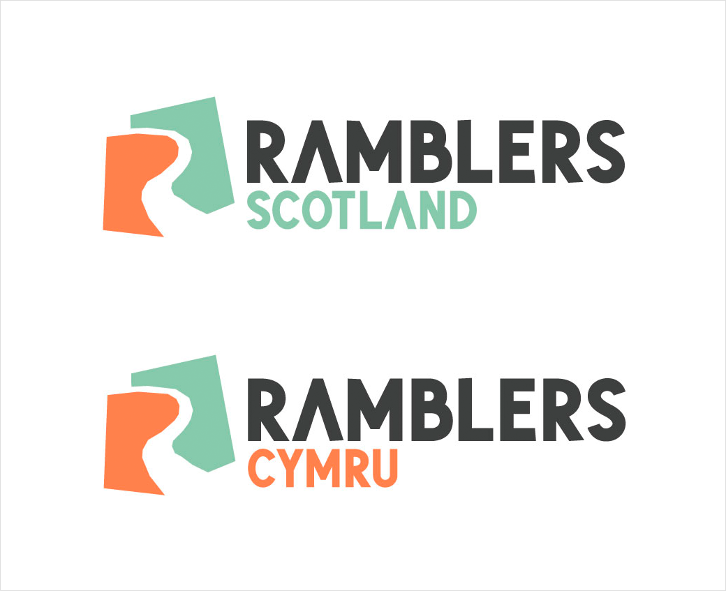
Adding: “Not only has the Ramblers look and feel across the groups’ and nations’ logos been unified, the ‘Walking for Health’ initiative has been rebranded to ‘Wellbeing Walks’ to feel part of the Ramblers family.”
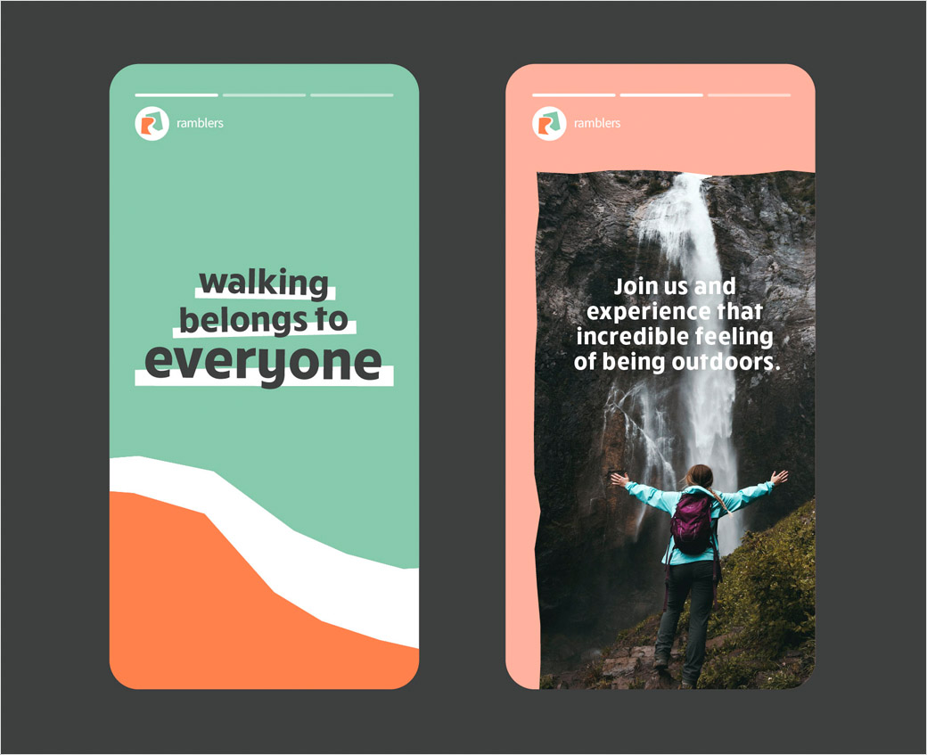
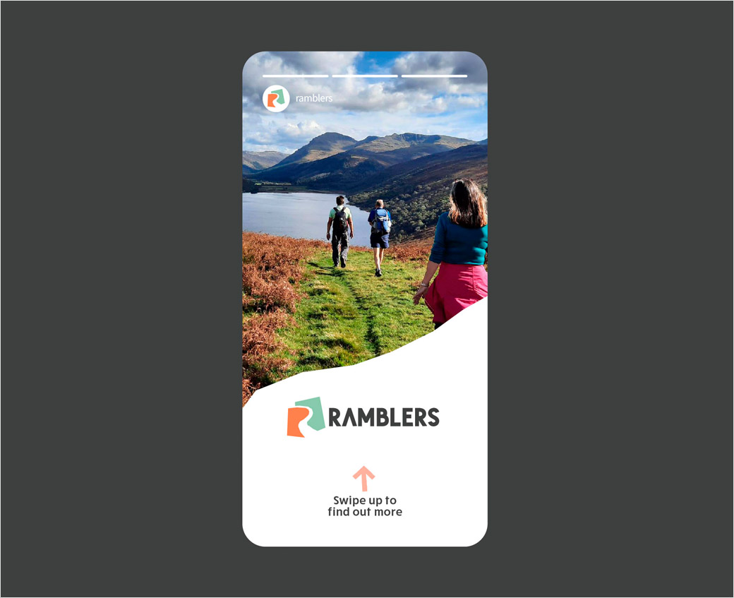
Additional design details include a photography style described as “natural and open”, which aims to show how the Ramblers come from all walks of life and venture out across all kinds of terrain.
“We set out to open up the Ramblers to a wider audience by bringing an open path into the identity. The refreshingly bold identity system not only champions all the wonderful campaigning work that the Ramblers does, but also provides a welcoming and open way for others to join,” explains Ellen Munro, creative director at BrandOpus.


BrandOpus
www.brandopus.com


