Rakuten Unveils New Logos to Unify Global Brands
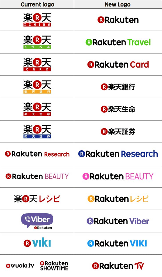
Japanese e-commerce and internet giant Rakuten has revealed a series of new logo designs as part of plans to unify its global branding.
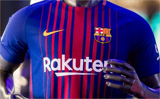
The rebranding coincides with the company’s 20th anniversary and with the launch of a new £47m a year shirt sponsorship deal with Barcelona football club.
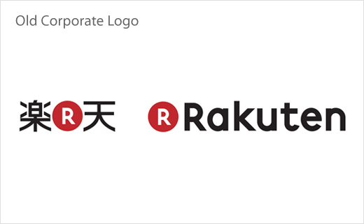
The new look includes a more compact execution for the Rakuten corporate logo and what the company says is “a more consistent and unified approach” to the branding of services in Japan and around the world, reflected in Roman alphabet logo executions and an updated, more colourful logo palette.
As a core part of the new colour scheme, the execution of the popular “Circle R” icon will also appear for the first time in multiple colours, from blue to green to yellow.
The rebranding and logo changes include executions on mobile and PC websites and apps, as well as offline branding in locations such as convenience stores and ATMs.
At the same time, Rakuten has developed a special version of the Rakuten logo solely for FC Barcelona jerseys in the 2017-18 La Liga season. The customised logo features a horizontal line that is said to have been inspired by a calligraphy version of the Japanese character for the number “1”.
Source: Rakuten


