Ragged Edge Unveils New Look for ‘Applied Studio’ Architects
Integrated branding agency Ragged Edge has created a new brand identity for architecture practice Applied Studio, which was formerly known as PAC Architecture.
The agency says it developed the new look around an idea dubbed “creative works”, which gave rise to both the new name and visual identity.
“Applied Studio brings together exciting, emotive design, with a hands-on, collaborative approach. It creates beautiful, pioneering spaces for people to enjoy. Places that work, effortlessly. We zeroed in on this visionary, yet practical ethos to coin the proposition ‘creative works’,” says Max Ottignon, co-founder of Ragged Edge.
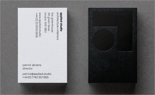
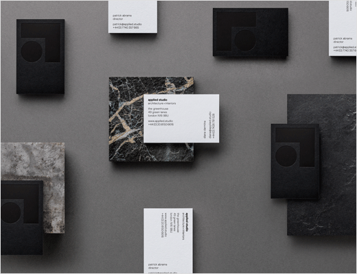
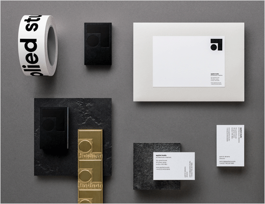
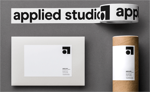
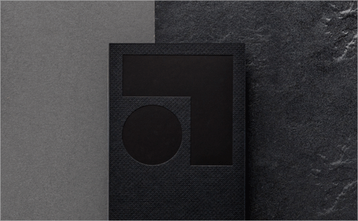
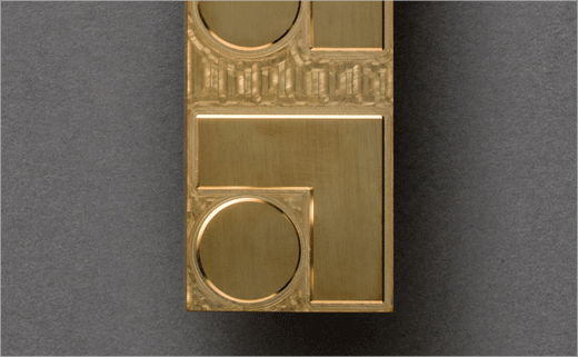
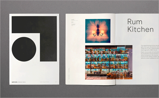
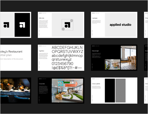
“Visually the new logo communicates the bringing together of creativity and practicality. The circle denotes the playfulness and freedom of design; the right angle shows functionality. And the way these elements interact reflect how space can be considered and created,” further explain the designers.
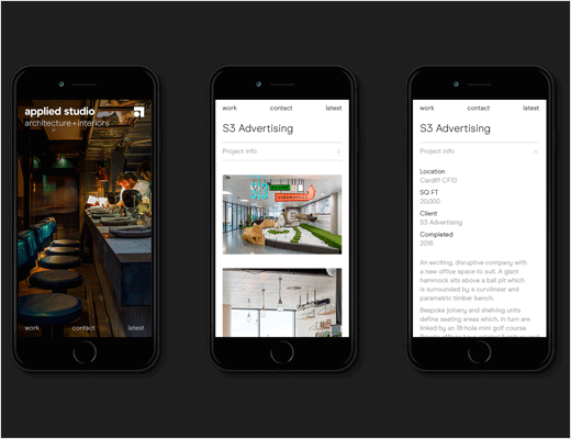
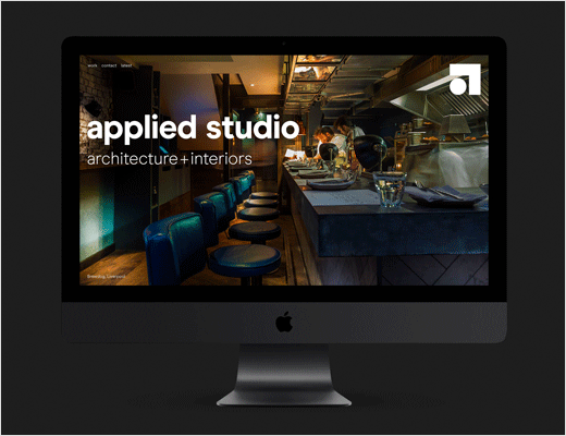
A suite of printed brand assets and a new website accompany the logo, with the website landing page also featuring an animated version of the logo marque.

Ragged Edge
www.raggededge.com


