Ragged Edge Creates Branding for Foley’s Restaurant
Integrated branding agency Ragged Edge has created the branding and visual identity for Foley’s, a new restaurant located on Foley Street in Fitzrovia, London.
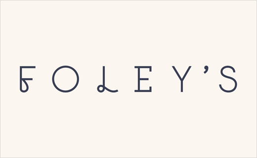
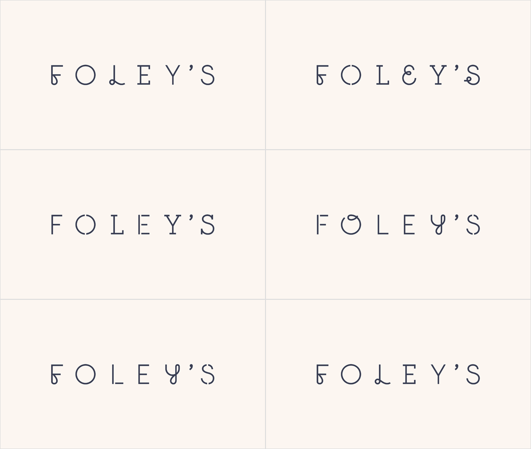
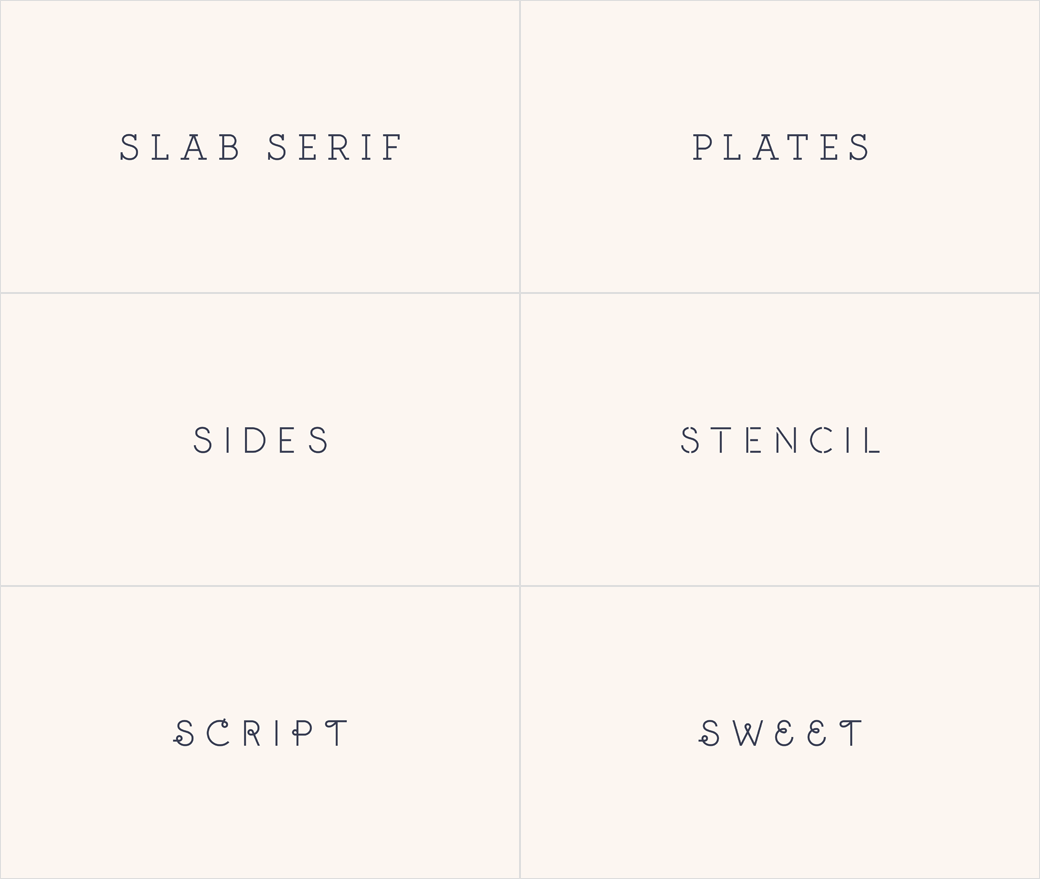
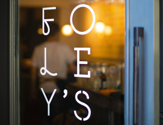
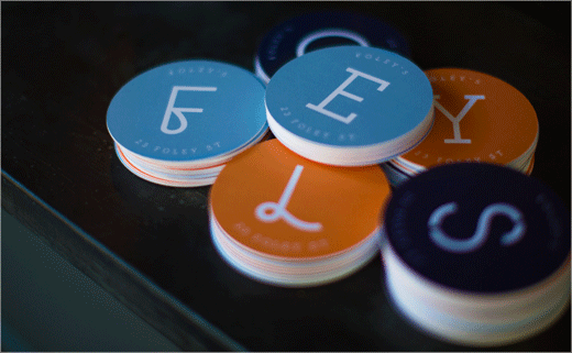
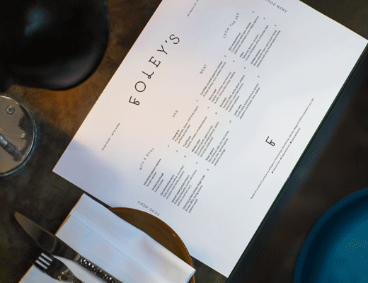
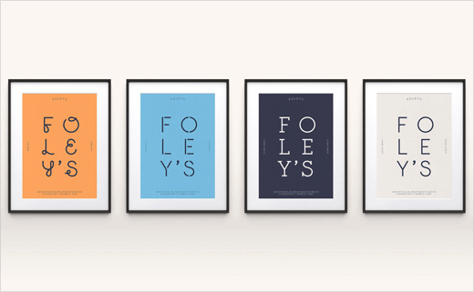
The design is centred around four different hand drawn typefaces that the designers claim mirror the restaurant’s “unexpectedly diverse offer”.
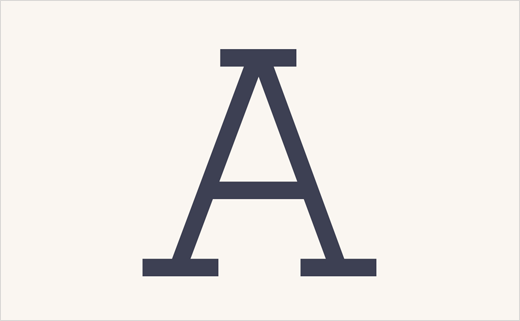
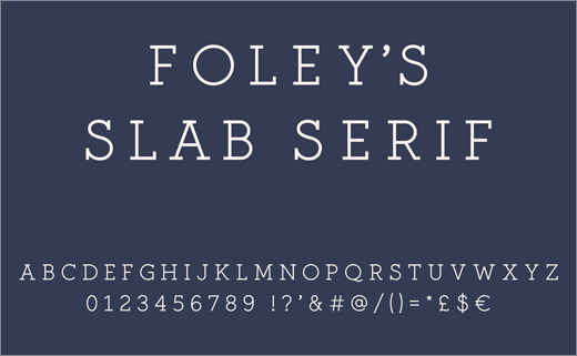
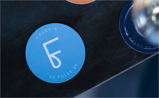
The typefaces, which include a sans serif, slab serif, script and stencil weight, are supported by a paired back design system that features a neutral colour palette, complemented by bright blue and orange highlights.
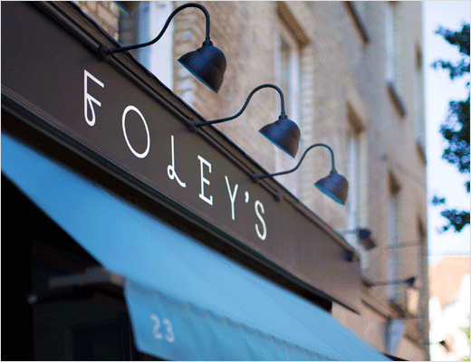
“The restaurant’s anything goes approach led us to a brand idea that was rich in creative possibilities: bringing good things together,” explains Max Ottignon, co-founder of Ragged Edge. “The logo, which features letters set in each of the typefaces, is the perfect expression of Foley’s disruptive approach. The simple, paired back nature of the rest of the identity system came from a desire to remove any barriers between the customer and the food.”
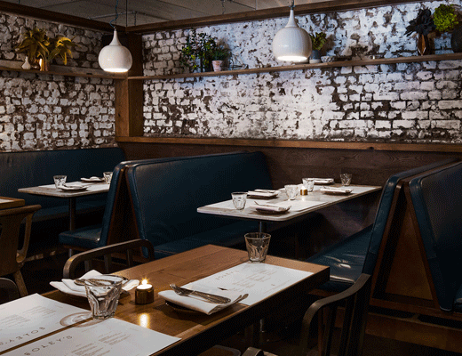
As well as delivering brand strategy and visual identity, the consultancy also provided interiors consultation by teaming up with PAC Architecture.
Ragged Edge
www.raggededge.com


