Ragged Edge Creates Identity for Crisps Restaurant – ‘HIPCHIPS’
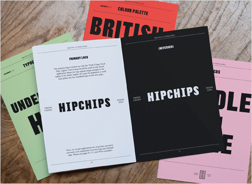
Integrated branding agency Ragged Edge has developed a new brand and visual identity for Hipchips, which is claimed to be London’s first “gourmet crisps restaurant”.
Ragged Edge delivered the brand positioning and strategy alongside a visual and verbal identity. The agency was also responsible for creating the packaging and signage.
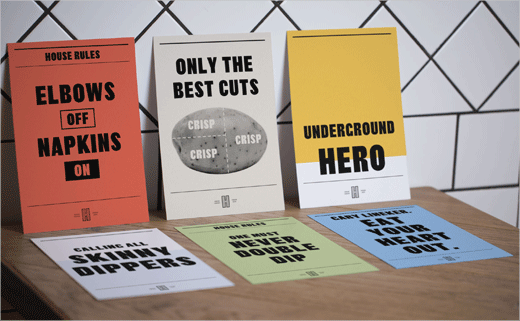
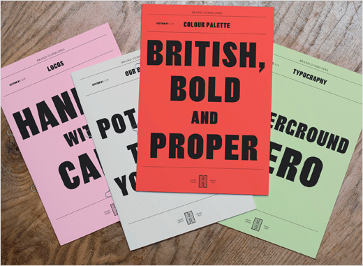
“Ragged Edge’s brand strategy for Hipchips was designed to allow the restaurant to transform Britain’s best-loved snack from a predictable staple into a gourmet shared food experience,” say the designers. “The brand idea – ‘Fresh Traditions’ – brought this to life by playfully reinterpreting British rituals, design and food for a millennial audience.”
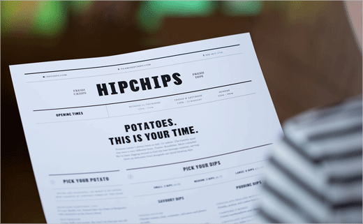
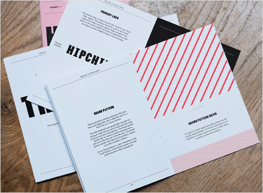
The visual identity references the origins of crisps – which first rose to popularity in the 1830s – by using two traditional British typefaces: Thorowgood Sans and Kings Caslon.
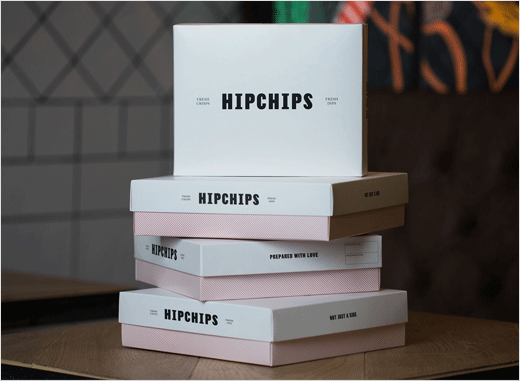
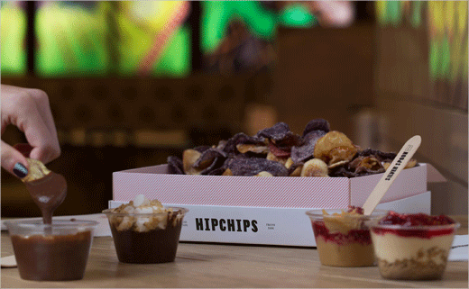
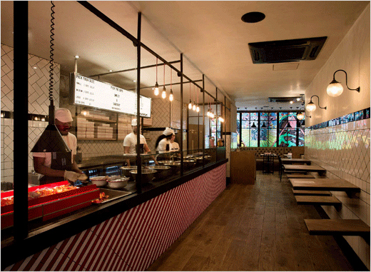
Additional design details include a traditional British pinstripe given a 45-degree twist. And instead of packets, the crisps are served up in a variety of sharing boxes. Tone of voice also goes British via messages such as ‘Dip for victory’ and ‘One does not double dip’.
Applied Studio, meanwhile, delivered the interiors, while the Hipchips internal creative team also worked on the brand across a range of touchpoints.
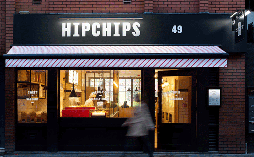
The flagship Hipchips restaurant opened this month at 49 Old Compton Street, Soho. The owners say they also have plans to roll the concept out.



Ragged Edge
www.raggededge.com


