R-Design Unveils New Logo for Morrisons’ ‘Eat Smart’ Range
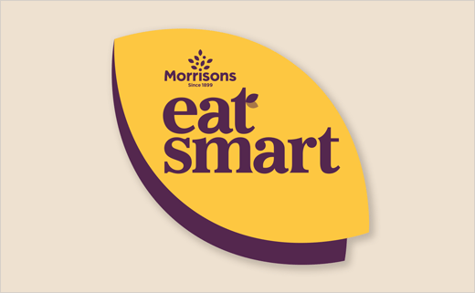
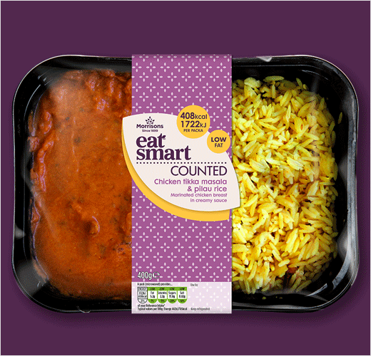
R Design has renamed and rebranded Morrisons healthy eating range from NuMe to Eat Smart in an effort to create greater product clarity.
“There was confusion around whether it was specifically a diet range, or a healthy-eating range,” says R Design boss Dave Richmond. “People also read it as one word – ‘Nume’.”
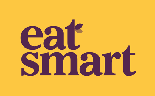
The new look features a logo set within a leaf shape, which takes it inspiration from Morrisons’ new branding that was unveiled last year. The latter included a refreshed logo that incorporated a tree-come-leaf icon forming part of the “i” in Morrisons.
A modified version of Baskerville has also been used for the revised logotype, which Richmond says is “friendlier” than the previous typeface. Further leaf shapes can be found in the negative space in the letter “a”, as well as in the cross forming the letter “t”.
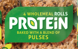
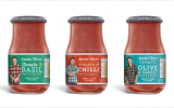
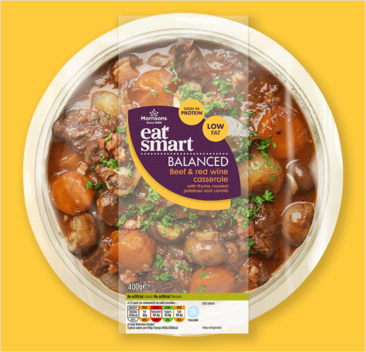
In terms of colour, both the new logo and redesigned packaging sees a colour palette primarily made up of yellow, white and an “aubergine” purple, which the designers claim communicate both “brightness” and “an earthy tone”. Eat Smart features two main sub-ranges, Balanced and Counted, which are now differentiated via the use of colour, with purple and yellow being used for Balanced and yellow and white for Counted.
The new branding and packaging is currently being rolled out both online and on in-store products.
R Design
www.r-design.co.uk


