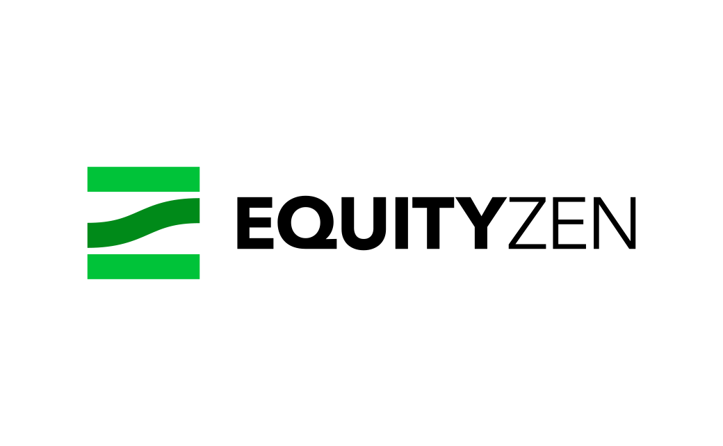
EquityZen Reveals New Logo Design
Private equity investing specialist, EquityZen, has unveiled a new logo and redesigned website as part of a branding overhaul.
The American firm functions as an online marketplace that enables investors to buy into what are deemed ‘hot’ pre-IPO shares, or pre-Initial Public Offerings (essentially a method of investing in private companies before they go public).
Indeed, the company says its new look marks “10 years of bringing ‘Private Markets to the Public'”.
The refreshed visual identity has been created by No Filter Creative, whose team started with a logo that reportedly draws inspiration from Zen philosophy, even incorporating the concept of “The Middle Way”.
“For the math geeks within the company and community – and there are many – it also evokes the triple bar indicating equivalence and ‘the power of three’, also signifying the commitment to equality through the democratisation of access,” says the New York-headquartered company.
“The full EquityZen team has embraced and been committed to this new, client-centred approach from the moment they first were introduced to the research findings and design language,” further comments Jean Brandolini Lamb, head of marketing for EquityZen.
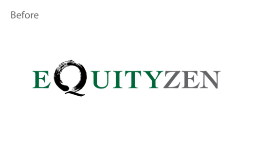
Source: EquityZen


