PhotoShelter Reveals New Logo and Branding
PhotoShelter, a web platform that enables professional photographers as well as creative teams to showcase, archive and sell their work, has announced a new brand framework and identity.
The brand refresh reportedly sets the stage for a series of new product launches and capabilities, including SEO enhancements for photographer websites, collaboration tools, workflow integrations and artificial intelligence.
The rebrand brings together both of PhotoShelter’s product lines under one name and one mark. From now on, the company’s digital asset management tool for creative teams will be called PhotoShelter for Brands, replacing the name Libris by PhotoShelter. Meanwhile, the single user product for photographers becomes PhotoShelter for Photographers.
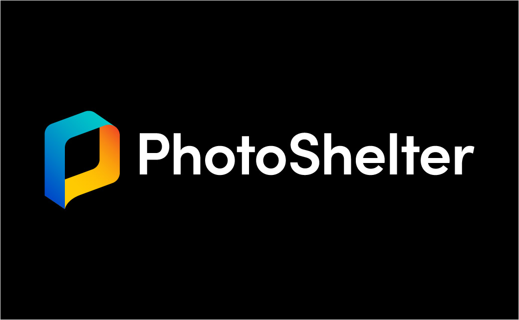
The new look and feel also includes new logo designs across both products.
“While the new logo is a nod to PhotoShelter’s “P Cube”, it symbolises more than just a shelter. It is designed to signify both a complete loop and a portal to share moments and visual stories with the world,” says the American company.
“In 2020, PhotoShelter is celebrating our 15th anniversary, and this moment presented a unique opportunity to take a good look at the company we are and the one we aspire to be,” adds Andrew Fingerman, CEO of PhotoShelter. “As we drive innovation designed to radically transform how photographers and creative teams manage their media, our identity needs to evolve, as well. Our new visual identity reflects how our members and clients truly see us.”
The rebrand was officially announced during The PhotoShelter Summit for Brands, a virtual event bringing together creative leaders from major brands.


Source: PhotoShelter


