Pet Care Brand YuMOVE Reveals New Logo and Packaging by Robot Food
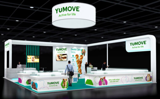
Pet care brand YuMOVE has unveiled an all-new look with design by branding agency, Robot Food.
With a mission of ‘giving pets an active life for life’, the brand is owned by pet nutritional supplements specialist Lintbells, whose internal team were reportedly struggling with how to categorise its products.
In the past, YuMOVE (the brand’s joint formula) was positioned alongside a number of other variants such as YuDerm (skin and coat care) and YuCalm.
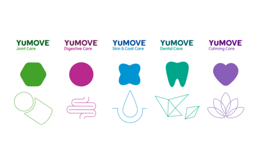
However, owing to YuMOVE accounting for 70% of sales, Robot Food decided to unite all of the products under the singular YuMOVE name and masterbrand.
“Our job was to rationalise the strategic direction and provide a clear approach that would help the business move forward in agreement and unify the team around a central idea,” explains Emma Collingswood, Robot Food senior account manager. “We helped demonstrate to the client that YuMOVE aligned with their brand mission – it made sense commercially, and to consumers. One URL, one brand for all of your dogs’ needs.”
The brand refresh is said to have come at a time when the market has seen a change in people’s relationship with their pets.
Traditionally, YuMOVE’s core buyers were ‘traditional’ dog owners, as a result of larger breed types like Labradors being prone to joint issues.
With the more recent growth in ownership of smaller dogs and an increase in younger, city-based pet owners, the packaging designs now need to appeal to a wider audience.
“Pet owners have been replaced by ‘pet parents’, with a greater degree of emotional connection with their pets, and as a result the spend per animal has increased,” says Robot Food senior designer, Julia Allan.
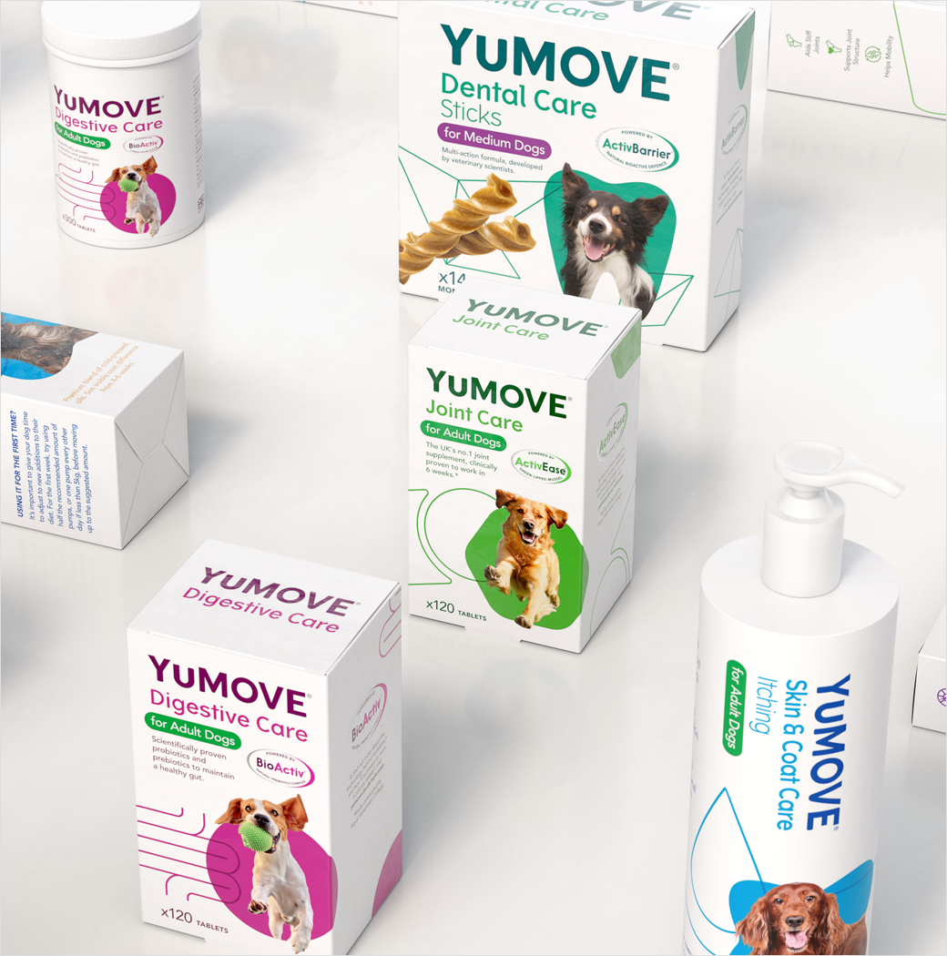
Adding: “We decluttered the packs as much as possible to help consumers shop both on and offline. We had to simplify them and amplify what mattered – care for your pets.”
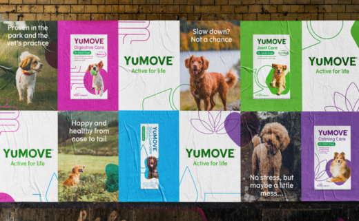
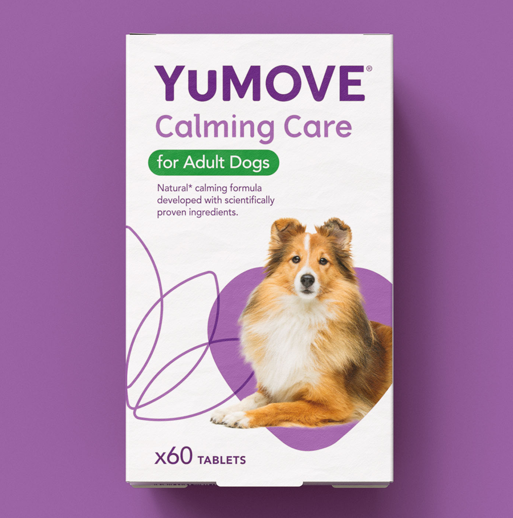
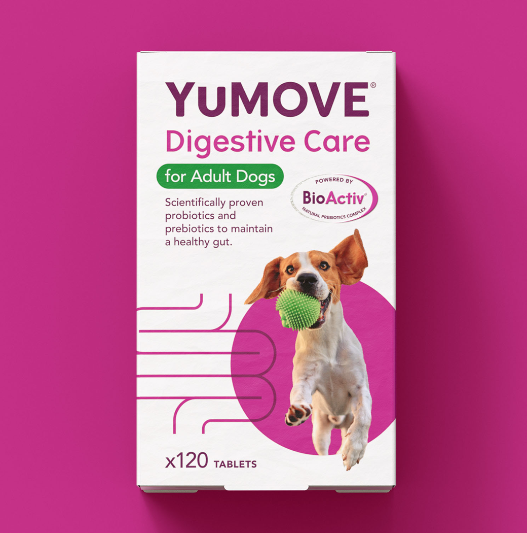
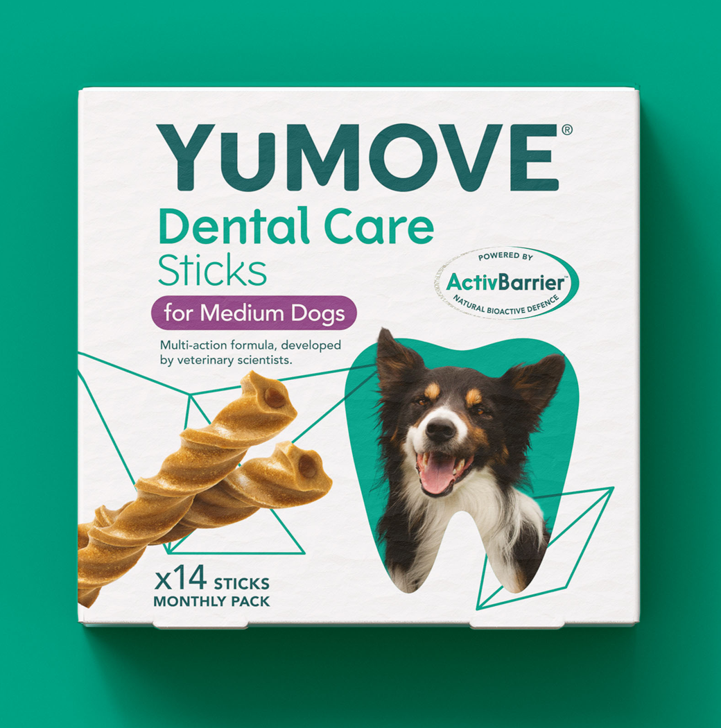
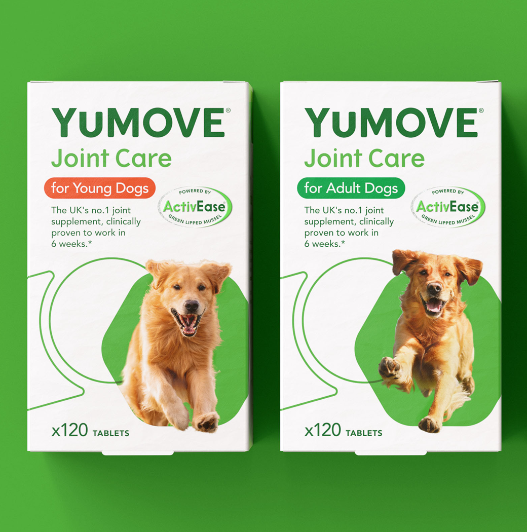
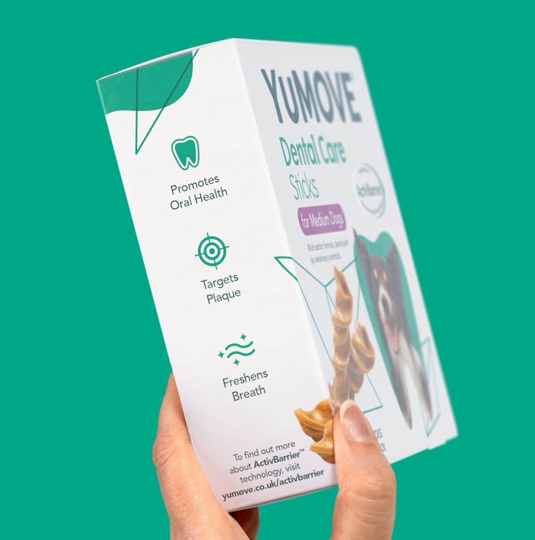
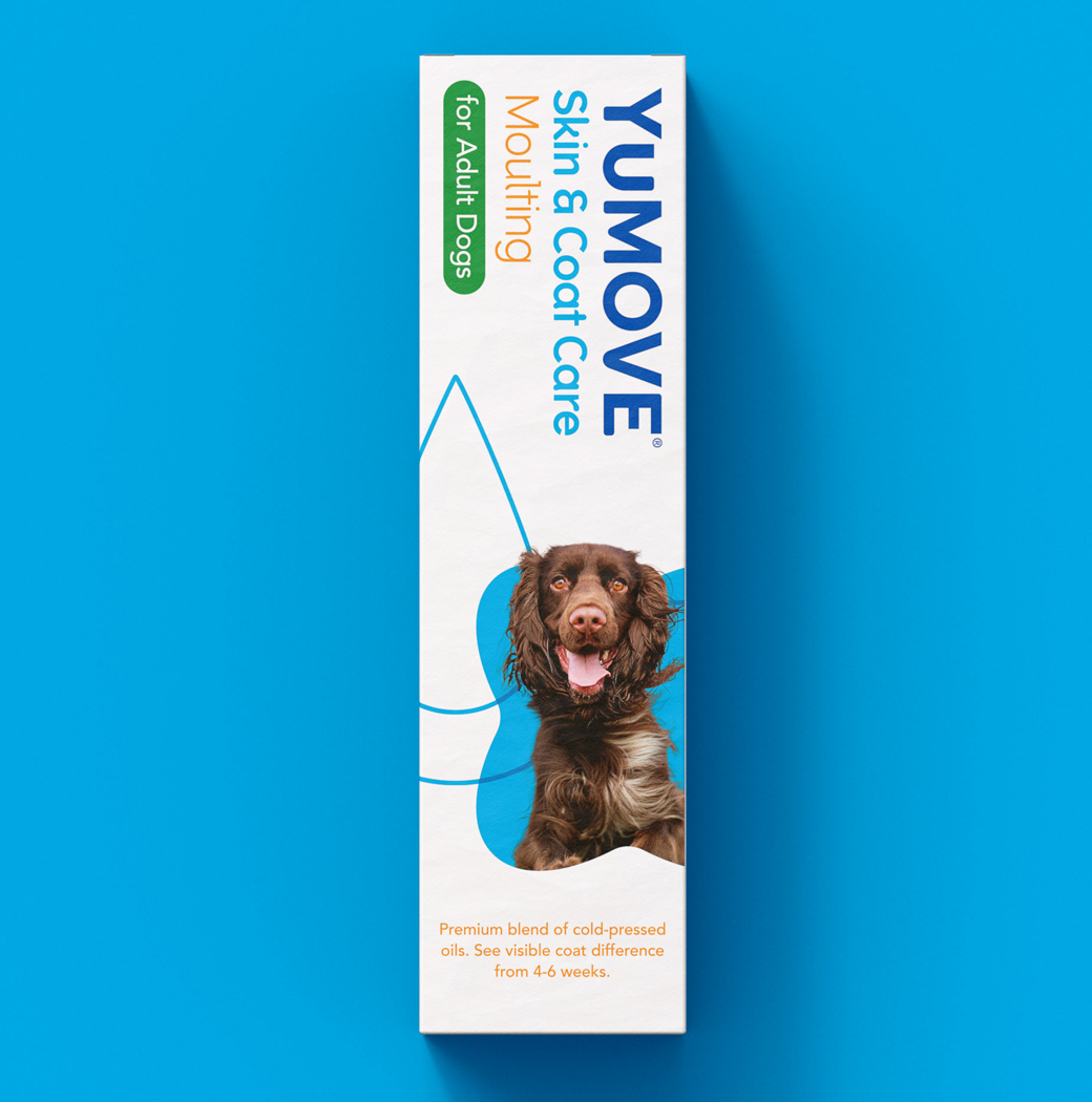
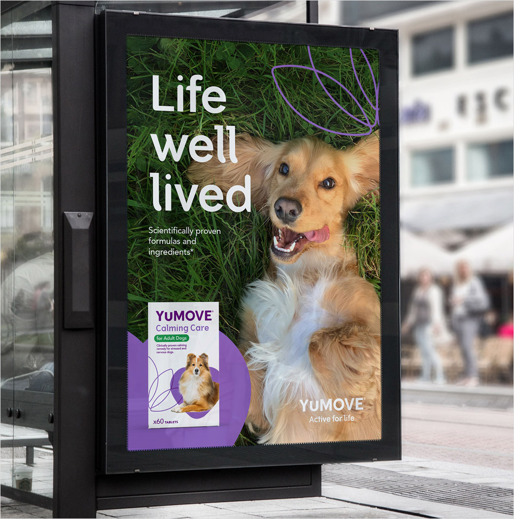
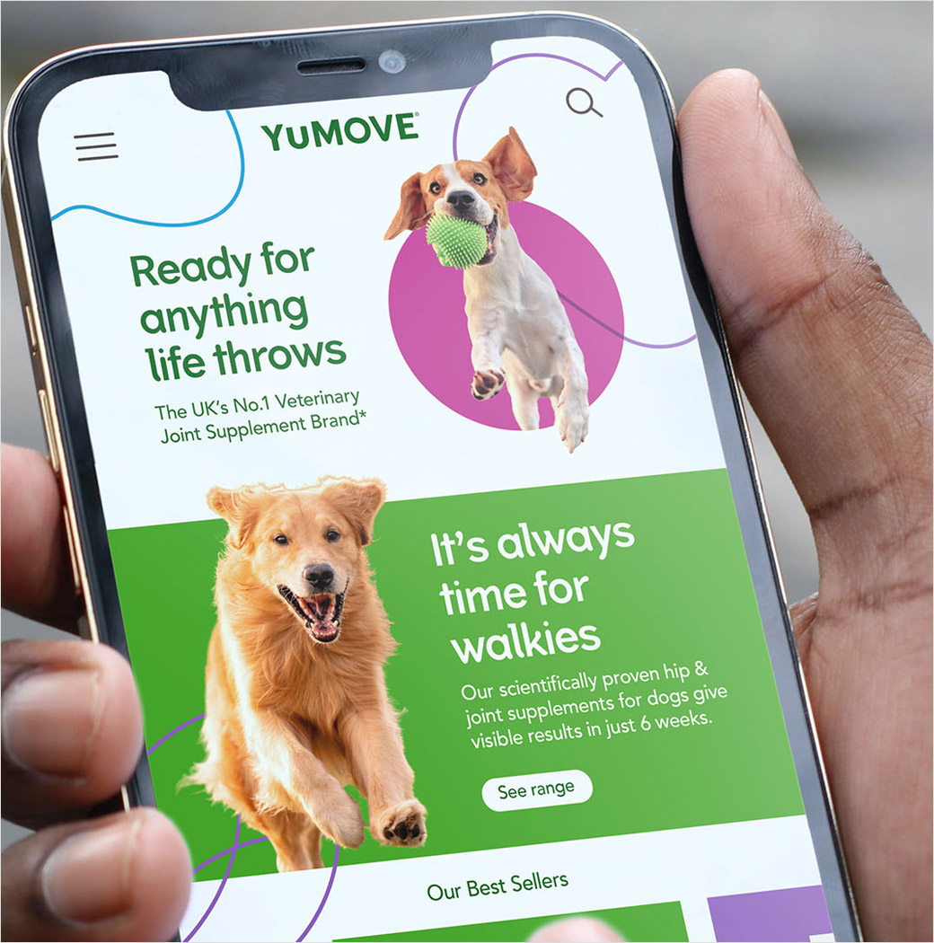
The new logo is described as being “a more contemporary, impactful” version of the old design, while the overall design system is based around using visual segmentation to highlight each product’s benefits via the use of certain shapes and colours, such as a purple lotus flower on the calming product and a blue polygon for dental care.
“Design details inspired by the wider world of wellness brands – such as playful, freer layouts and a more approachable colour palette – are used on the packs to create a friendlier look and feel that maintains the sense of efficacy,” say the designers at Robot Food.
“We’ve seen products with a medical ‘need’ becoming increasingly accessible, and categories that once relied purely on scientific efficacy now employing more everyday lifestyle cues – pet care is not immune from this,” expounds Collingswood.
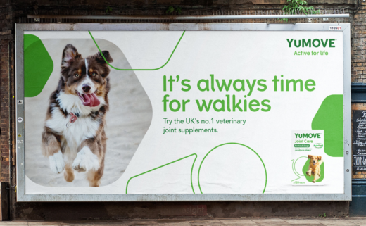
Additional details include the incorporation of photos of dogs with “fur colours that pop” in order to help “bring the packs to life”.
Editor’s Note: Motion graphic elements can be viewed here.
Robot Food
www.robot-food.com


