People’s Trust for Endangered Species Reveals New Brand Identity Created by Colourful
Colourful Design Strategy has created a new brand identity for the conservation charity People’s Trust for Endangered Species. The aim of the rebrand is to increase awareness, supporter engagement, and fundraising. The organisation is concerned with joining up scientific research with real action on the ground, but the charity felt it needed to present a friendlier and more recognisable brand to its non-scientific community of supporters.
Approximately one in ten British species faces extinction, and the likes of hedgehogs and dormice could soon be gone for good. With its tens of thousands of volunteers across the UK, PTES monitors these species and takes action to protect them. Its activities include the reintroduction of dormice to the wild and the promotion of wildlife-friendly orchard management.
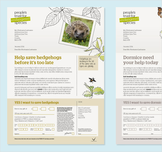
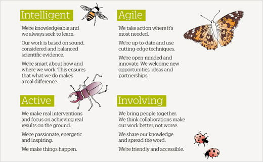
Colourful worked with the client team to establish a set of brand values before developing the brand identity, tone of voice, illustrations, core leaflet, and brand guidelines. It is currently working on the annual report and supporter magazine.
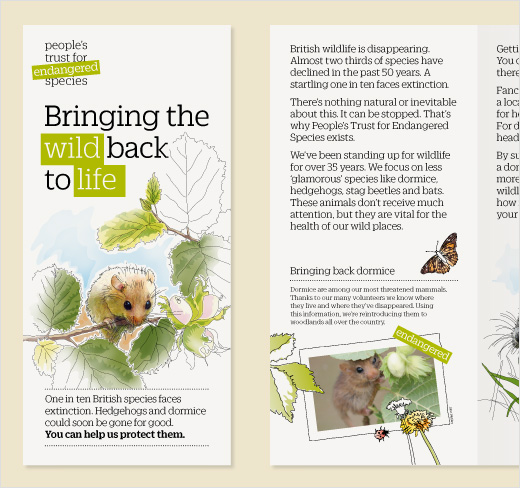
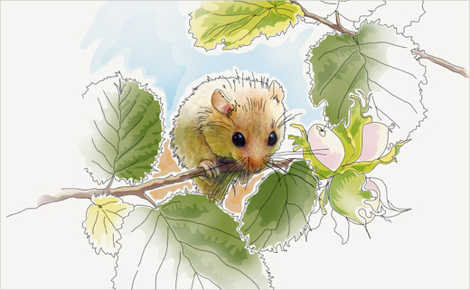
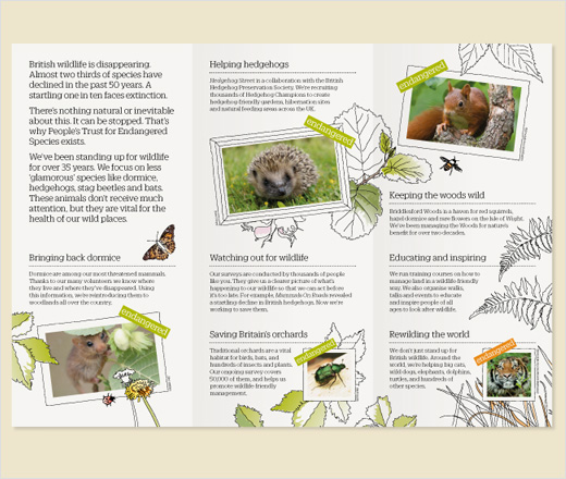
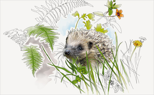
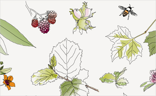
At the core of the design concept is the new strap-line ‘Bringing the wild back to life’ which is highlighted through illustrations created by Colourful associate Hayley Cove.
Emily Penny, Brand Consultant and Founder of Colourful says: “For many people, the prospect of losing British wildlife is hugely emotive. We wanted to tap into the sentiment attached to species like hedgehogs. Currently the charity is mostly supported by people in rural communities, but with the new brand there’s scope to attract a wider base of donors who care about these issues.”
Phillip Southgate, Associate Designer at Colourful says: “All wildlife charities use lots of photography. We wanted the brand to stand out by using illustration. Our approach shows colour draining from or re-entering the environment, and the core look is very British to differentiate it from international conservation charities. We’ve created hand-drawn frames for photographic content to make them distinctive. It’s a style that will help the charity to be much more recognisable.”
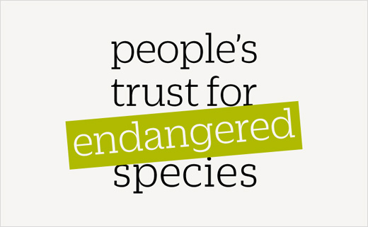
Within the logo itself, a green banner holds the word ‘endangered’, highlighting the cause. This is re-purposed as a device in campaigns, reminding audiences of species at risk.
Colourful won the project in a competitive credentials pitch in December 2013.
Colourful Design Strategy
www.becolourful.co.uk


