Pentagram’s Shake Shack Identity Helps Launch $1.6B Brand
Following a recent IPO that has valued the company at a staggering $1.6 billion, American hamburger chain Shake Shack plans to expand to over 400 locations in the next decade.
From its roots as a hot dog stand in New York’s Madison Square Park, the company has so far grown into a chain of 63 restaurants from Chicago to Dubai.
Founded by New York restaurateur Danny Meyer and his Union Square Hospitality Group, Shake Shack is inspired by roadside stands that offer simple food like hamburgers, hot dogs, shakes and fries, but made with ‘premium’ ingredients.
The first Shack was conceived as an installation to help support the refurbishment of Madison Square Park. Beginning in 1999, the Madison Square Park Conservancy led a major effort, supported by local businesses and public funds, to restore the park to its 19th-century luster. The park is located across the street from Pentagram’s New York offices, and the conservancy approached Paula Scher in 2003 to design a graphic identity for the park. Comprised of geometric patterns that change seasonally, the identity is still in use today.
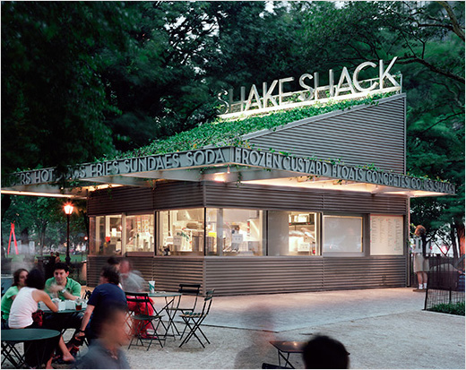
Opened in 2004, the kiosk was designed by architect James Wines and his team at SITE as a riff on the American hamburger stands of the 1950s and 60s, but in one of Manhattan’s most famous 19th-century parks.
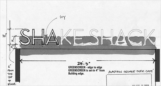
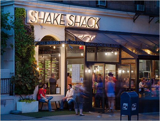
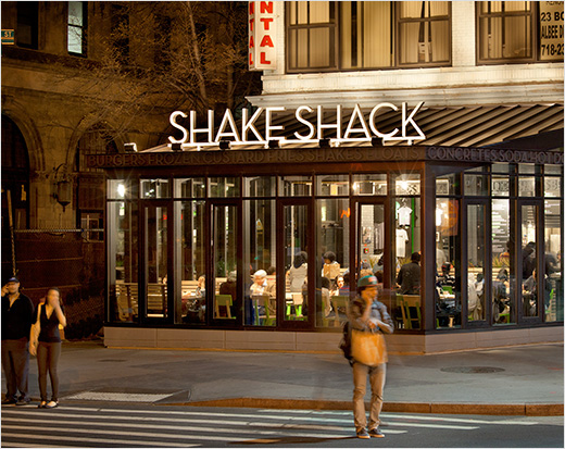
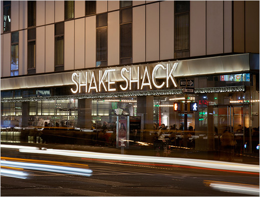
Scher’s graphics for the original kiosk signage aimed to combine the aesthetics of the area’s art deco heritage with the direct appeal of the typical fast food stand. “The signage typography was designed to look playfully heroic in terms of scale: ‘Shake Shack’ was rendered in Coney Island-sized letters across the roof, but in elegant and modern stainless steel,” explains Scher. Set in Neutraface, this initial logo still appears as exterior signage on all the Shacks around the world.
When Meyer decided to open a second Shack on Columbus Avenue in Manhattan’s Upper West Side in 2006, the challenge was translating a design originally intended as an architectural intervention in an urban park to a less distinctive venue. Scher says the environmental graphics became the key for creating a consistent experience.
“The second Shack was especially difficult because the building had little recognisable architectural character, except for a band for the signage,” explains Scher. Wines did not consult on the subsequent restaurants, but elements of his design for the original kiosk including the zinc colour, rib-like surfaces and bar of type have been retained in all the Shacks.
With future expansion in mind, Meyer asked Scher to design a new iteration of the Shack identity that looked more like “fast-food retail” but still maintained a clean, modern look.
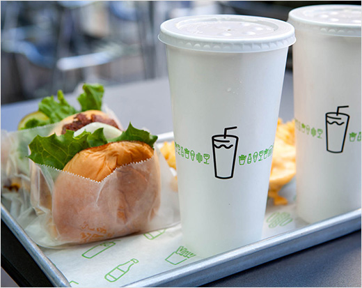
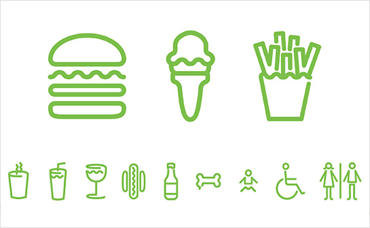
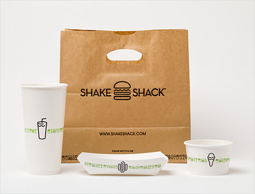
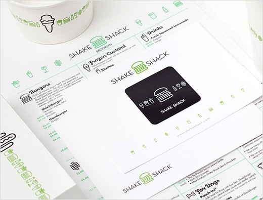
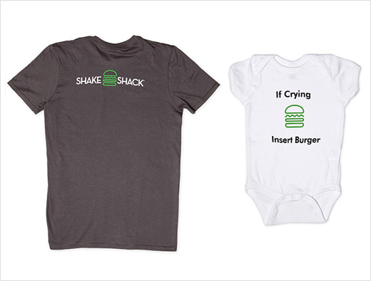
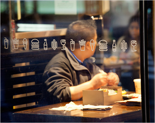
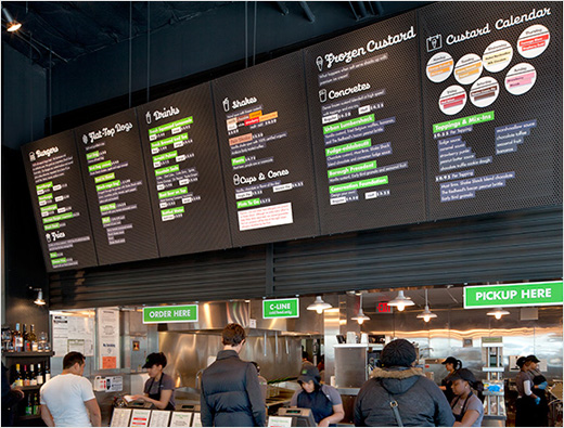
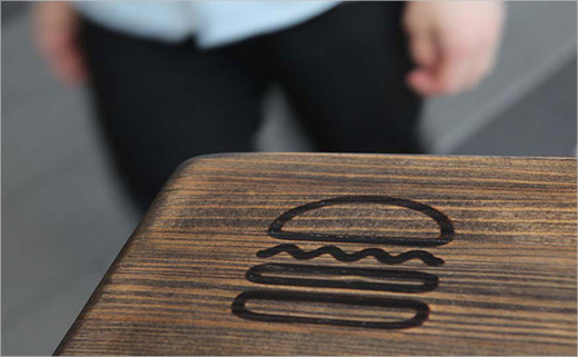
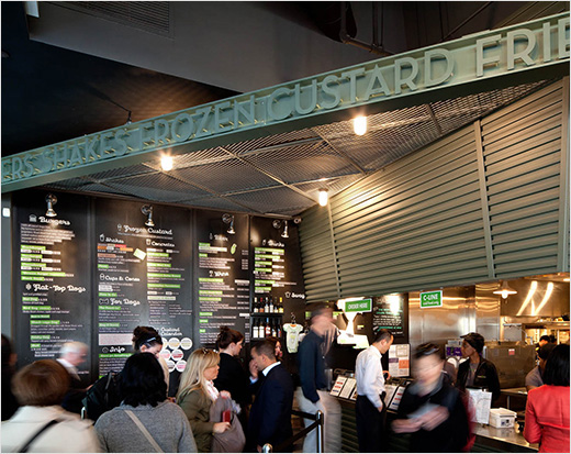
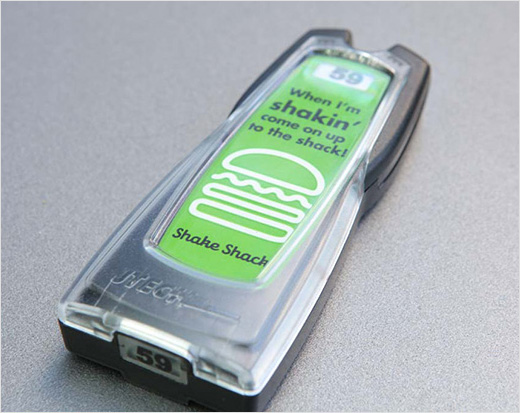
Scher subsequently developed a system of curvy, neon-like icons of menu items, accompanied by script type set in Galaxie Cassiopeia. The team also designed a format for the menu boards, which serve as the graphic focus in all of the restaurant interiors. Futura is used as the secondary typeface. Meyer’s in-house team has also applied the identity to ‘swag’ like t-shirts, hats and watches.
Originally conceived for a single location, Scher claims the graphics have responded to the chain’s growth with a flexible system that can be adapted to different sites around the world, from stand-alone restaurants to locations at airports and stadiums.
Pentagram
www.pentagram.com


