Pentagram ‘Simplifies’ Mastercard Logo and Identity
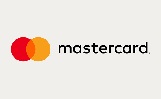
Pentagram has updated the logo and identity design of Mastercard, whose red and yellow intersecting circles are arguably one of the world’s most recognised brands.
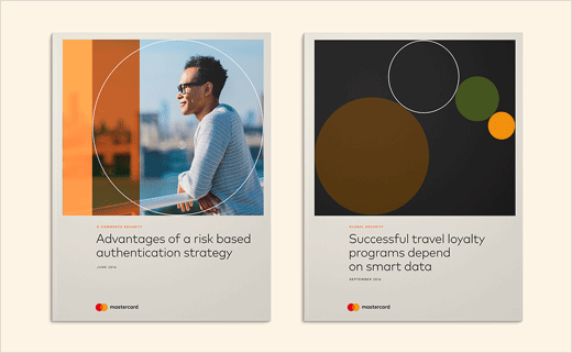
Designed by Pentagram’s Michael Bierut, Luke Hayman and their teams, the new identity aims to bring simplicity and clarity with an added emphasis on the interlocking circles, and is optimised for use in digital contexts, which is becoming an increasingly important part of Mastercard’s business.
“Through decades of exposure, the interlocking circles have become so recognisable that they can be reduced to their essence and still communicate Mastercard, at scales large and small, analogue and digital, and ultimately, even without words,” says Bierut.
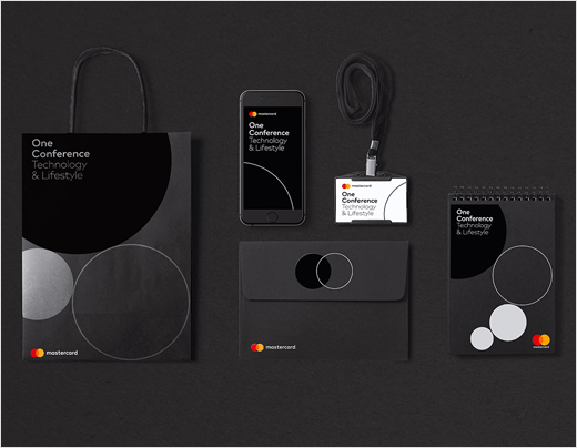
The entire identity is subsequently built using the core elements found in the logo, namely, geometry and colour.
“Mastercard’s new symbol returns the brand to its fundamental roots,” says Hayman. “At the same time, its basic characteristics have been used to generate a completely coordinated system of shapes, colours, and typography.”
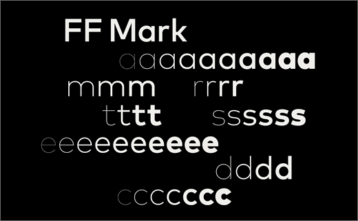
The wordmark is set in the sans serif font FF Mark, which the team says was inspired by a version of the logo used in 1979 that featured typography with a circular structure. The new typography plays on the circular forms of the mark, with rounded letterforms that each contain a portion of the circle (even “m” and “t”).
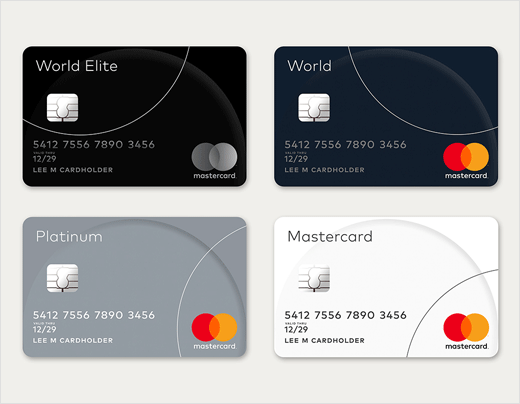
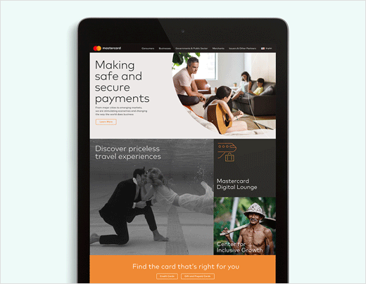
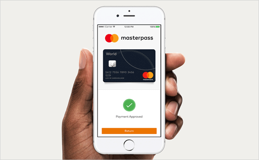
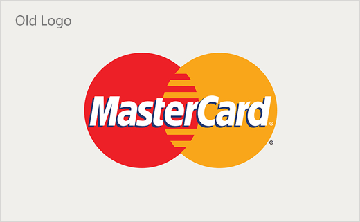
The new logo represents both Mastercard the company and the full suite of Mastercard products and services, creating a single brand system for the entire organisation as well as its existing and future products. This replaces a 2006 version of the logo that was meant to distinguish Mastercard corporate from the consumer-facing image. The new brand mark will be used across every touchpoint of the Mastercard brand, from the cards carried by consumers, to signage at Mastercard headquarters, to the digital payment system on smartphones.
Pentagram
www.pentagram.com


