Pentagram Rebrands Spanish Lighting Company, ‘Vibia’
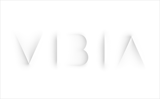
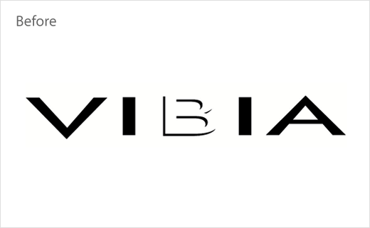
Pentagram's London studio has refreshed the logo and branding of Spanish lighting company, Vibia.
The agency says it worked closely with the Barcelona-based business to develop a brand strategy, tone of voice and visual identity which aims to present Vibia as "an innovative lighting technology company" that "strikes a balance between product and experience, lighting design and its subsequent behaviour".
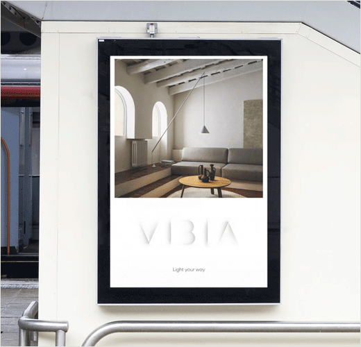
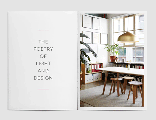
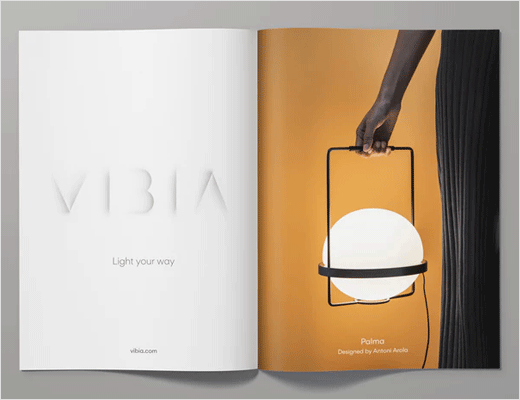
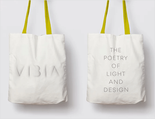
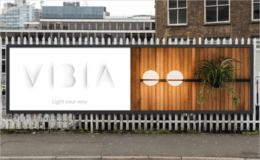
The branding has been developed around an idea of 'The Orchestra of Light and Design', which has been applied throughout all aspects of the identity. A strapline, 'Light your way', has also been introduced to serve as a "public-facing manifesto".
"Pentagram observed a tendency for competitor identities to feature the embedded forms of lightbulbs, lamps and beams of light. As well as this, colour palettes are overwhelmingly bold and stark, with a somewhat understandable focus on light’s functionality, rather than its behaviour or consequence," explain the designers. "The new VIbia brand identity moves away from away from these played out clichés, focusing instead on light’s value, and its symbiotic relationship with human knowledge, emotion and sense making."
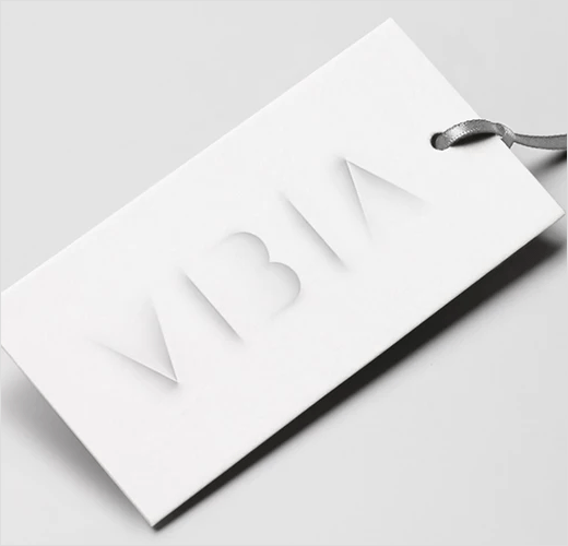
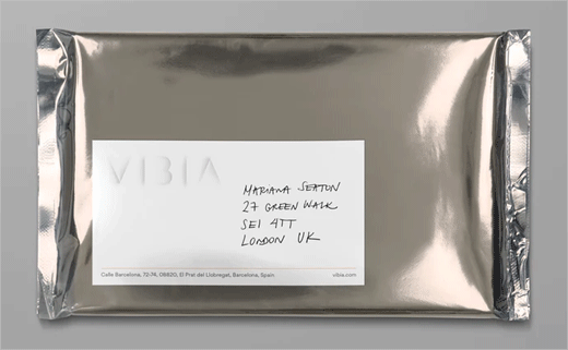
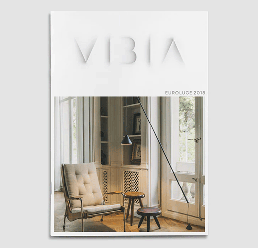
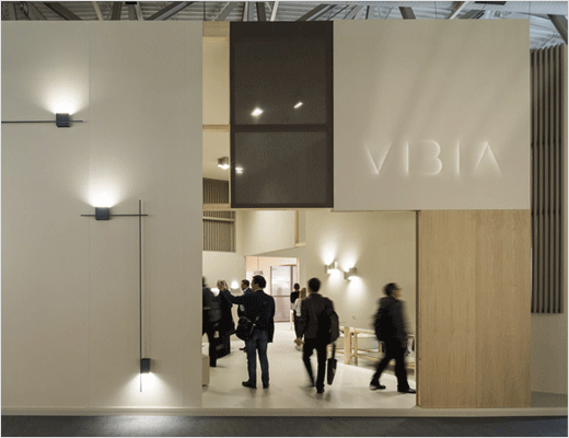
Claimed to evoke the visual language of an ancient sundial, the new logo – in its animated guise at least – uses evolving shadows to convey the company’s "deep and fundamental connection to natural light", while the brand system utilises a "soft and delicate" colour palette in an effort to create a "minimal and modernist aesthetic".
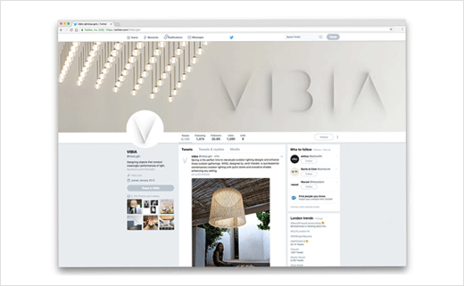
Pentagram has also redesigned the company’s website wireframe and UI, as well as its social media profiles.
Pentagram
www.pentagram.com


