Pentagram Designs New Identity for Bike New York
In time for the cycling season, Pentagram’s Emily Oberman and her team have rolled out a new identity for Bike New York.
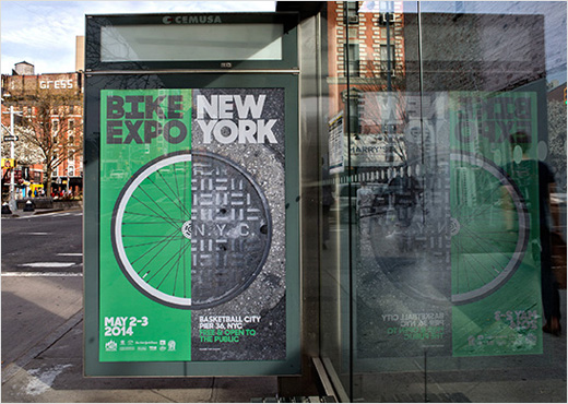
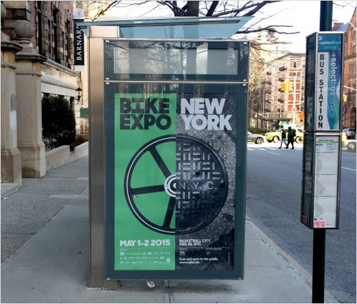
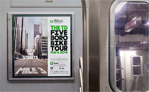
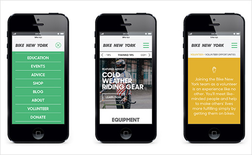
Along with the identity, the update includes a redesign of the Bike New York website, cycling guides and other collateral, and looks ahead to the organisation’s biggest events, the TD Five Boro Bike Tour and Bike Expo New York, scheduled for May 1-3.
With a growing network of over 900 miles of bike lanes and the recent launch of the Citi Bike bike-share program, cycling in New York is said to be becoming more popular. Over the past year and a half, Oberman and her team have been working with Bike New York on elements of its brand identity and messaging, with the goal of helping the non-profit organisation better engage and connect with New York’s riders. While creating the new identity, the team designed the promotional campaigns for last year’s Tour and Expo, which previewed the new look.
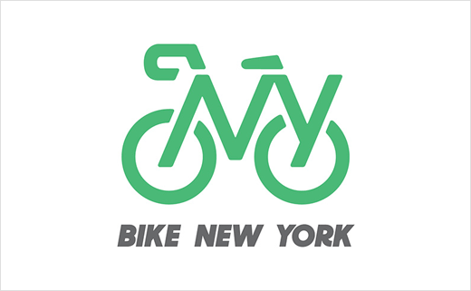
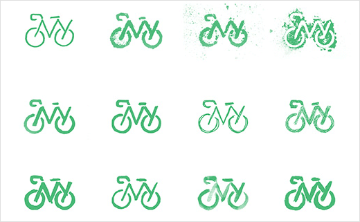
Inspired by visual icons of street signage, the letter-based logo is composed of stencil-like shapes that literally illustrate the organisation’s name: The letters “NY” form the frame of a bike. The designers also created a series of hand-drawn versions, which have been animated on the Bike New York website.
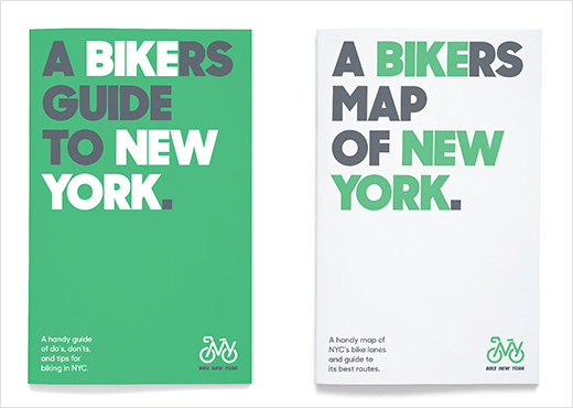
Typography is set in Sharp Sans, with the wordmark appearing in italics for a “sense of motion”. Oberman worked with Bike New York to reconfigure copy so the words that make up its name—”bike” and “New York”—can be set off in the messaging of various applications like riders guides and the Bike New York website.
The designers say the colour palette is inspired by riding in the streets: the program uses the same green as New York’s bike lanes, accompanied by the slate grey of pavement, the yellow of lane markers, and for accents, a safety orange and a sky blue.



Pentagram
www.pentagram.com


