November 9, 2016
Categories:
Communication, Computer & Internet
Pentagram Designs New Identity for Upworthy
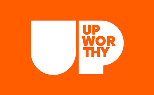
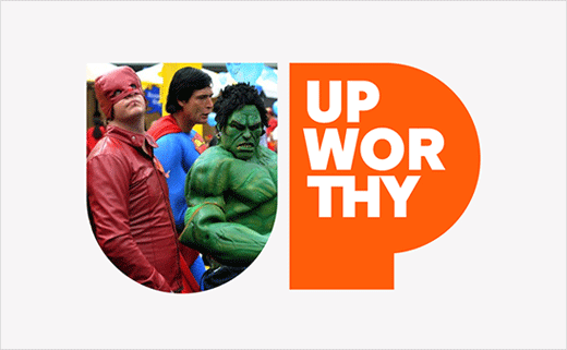
Pentagram’s Michael Bierut and his team have designed a new identity for popular social media-orientated website, Upworthy.
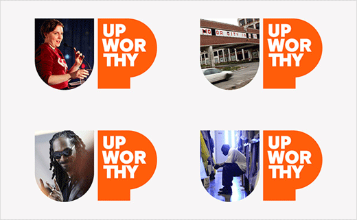
The new logotype emphasises the UP in the name, with the U used as a container for imagery.
An animated version of the logo has also been created to serve as a bumper at the end of Upworthy’s video content, complete with audio design by Todd Goldstein.
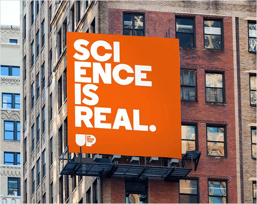
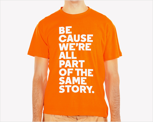
The main brand colour, meanwhile, is a bright orange, while the primary typography is set in Regular Black. The latter shares geometric qualities with the logotype, according to the designers.

Pentagram
www.pentagram.com


