Pentagram Creates New Identity and Branding for Snap Kitchen
Pentagram’s Paula Scher and her team have created a new brand identity for take-away chain Snap Kitchen. The launch of the new identity is being introduced with the Austin-based company’s expansion to the East Coast, where it is opening seven new locations in Philadelphia this year.
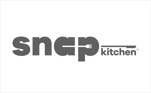
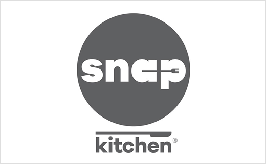
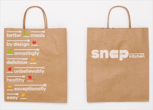
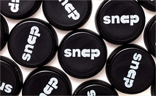
The new Snap Kitchen logo pairs a wordmark with utensils found in a kitchen: the circular letterforms of the “a” and “p” are connected by the handle of a fork, while “kitchen” is anchored by a knife. The logotype is set in Galano Grotesque, a geometric sans serif designed by Rene Bieder that the designers say is easy to read. The secondary logo features “Snap” knocked out of a plate-like circle, with “Kitchen” stacked underneath the form.
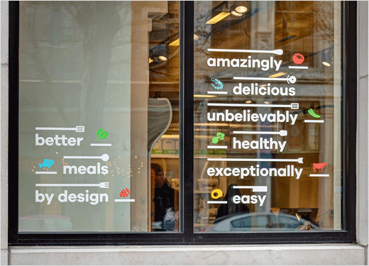
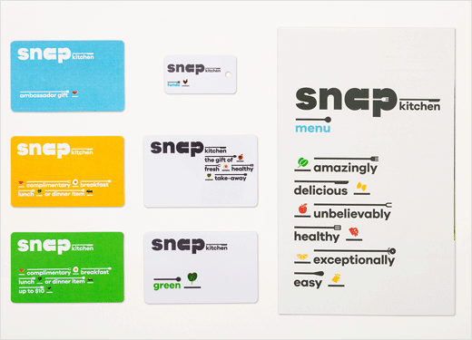
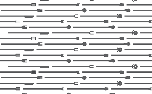
The logo has been further devised to accommodate different subsets of the brand, like Snap Blog or Snap Nutrition, by anchoring the name to different utensils. The lines of the handles can hold text, or they can be used to form architectural patterning in stores.
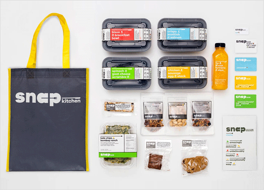
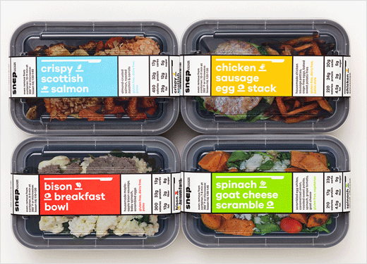
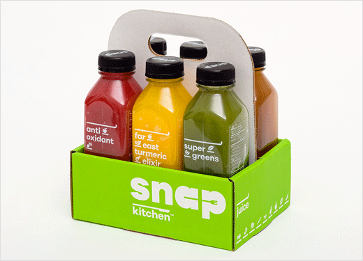
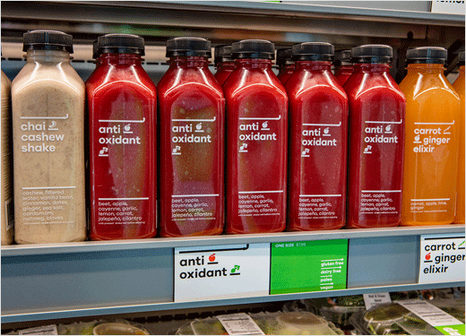
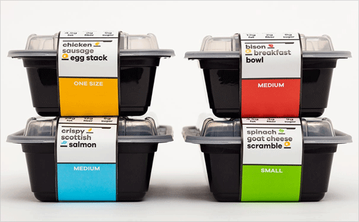
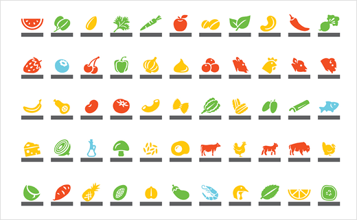
The overall identity is composed of simple graphic ingredients that provide a kit of parts for applications ranging from menus to packaging. The branding is built of elements that are used in the preparation of meals, while the colour system uses yellow for poultry, red for meat, blue for seafood, and green for vegetarian.
“The identity is a complete system, just like the menu,” says Scher. “It emphasizes the purity of the food and the flexibility of the concept while was also being fun, lively and appealing.”
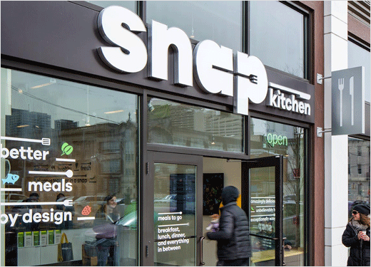
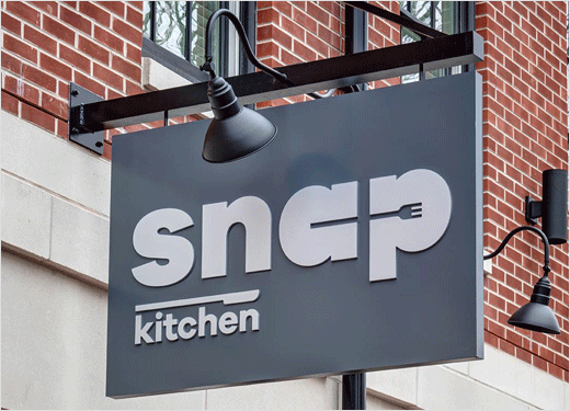
Scher and her team have also designed the interior and exterior signage, which can be customised for urban storefronts or stand-alone shops, and may be adjusted for factors like size, lighting, and retail mix. The designers are currently working on digital menu boards that will animate the iconography in dynamic displays.
Pentagram
www.pentagram.com


