Pearlfisher Rebrands ‘Wild West’ and ‘Cruga’ Meat Snacks
Pearlfisher has created a new look for Wild West and Cruga, which both form part of the Meatsnacks Group.
Founded in 2015, the company is said to be Europe’s largest manufacturer of meat snacks, and is a major producer and distributor of biltong and jerky here in the UK.
“Having risen to market dominance through acquisitions, the group’s portfolio of brands had become fragmented and incohesive, and was in need of alignment and strategic direction,” says Pearlfisher.
The agency therefore kicked off a portfolio-wide visual overhaul with the rebrand of Cruga and Wild West, the group’s two most successful brands.
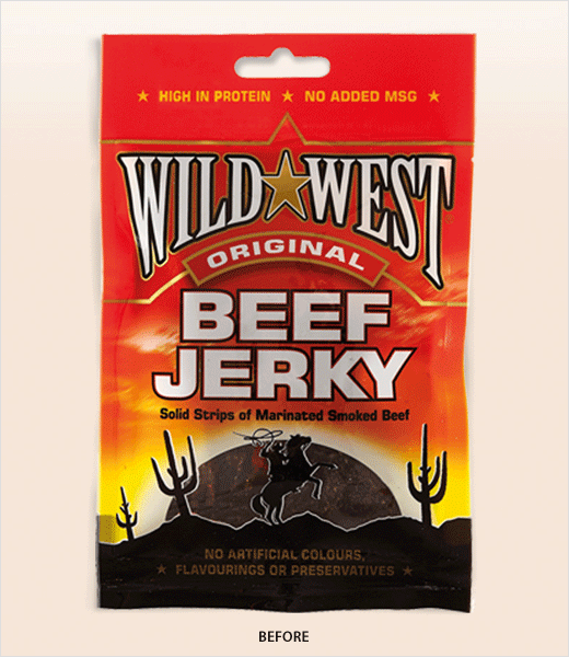
“The UK’s original and leading jerky brand, Wild West embodies American masculinity and a spirit of discovery, but the identity and pack design, characterised by clichéd expressions of Americana, were failing to do this meaning justice,” say the designers.
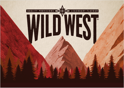
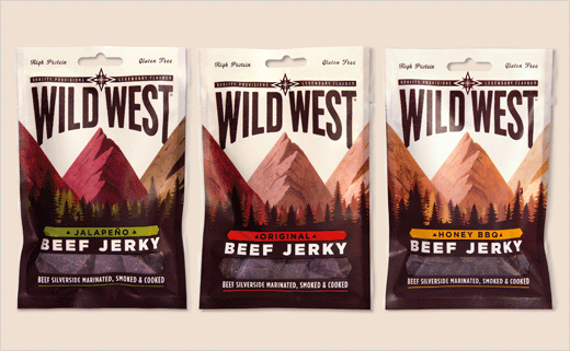
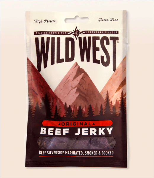
With a new look said to have been inspired by the idea of ‘Expanding Horizons’, the refreshed design for Wild West aims to evoke both “rugged wilderness and urban exploration”.
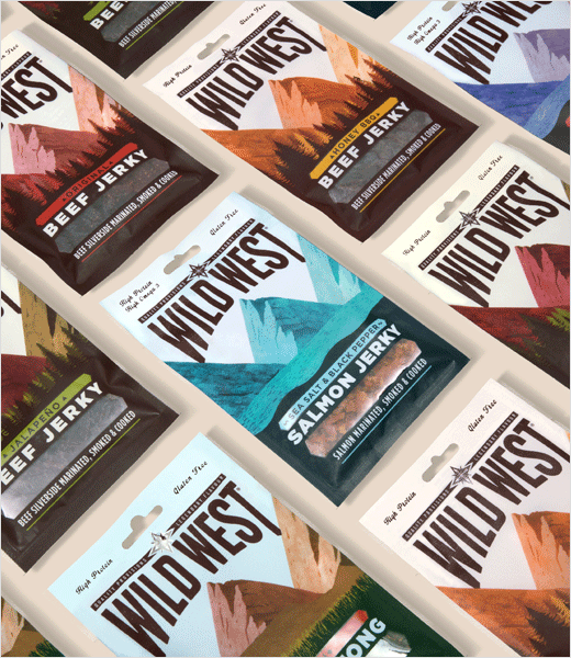
“To take Wild West on a journey from ‘one-dimensional cowboy’ to ‘modern explorer,’ we centralised the design around an illustrated graphic of a mountainous landscape, which varies slightly for each of the eight variants. We re-appropriated the brand’s most distinctive equities, retaining the ‘swing’ of the logo but adding experience through texture and grit, and evolving the sheriff’s badge into a fourpoint compass star with a leftward-pointing arrow, which nods back to the old wild west,” explains Jon Vallance, associate creative director for brand and graphics at Pearlfisher. “To reinforce a sense of exploration, we incorporated elements for the consumer to discover on pack: a ‘W’ in the negative space between the peaks; a person interacting with the landscape; a cityscape on the back of pack to contrast urban and outdoor exploration.”
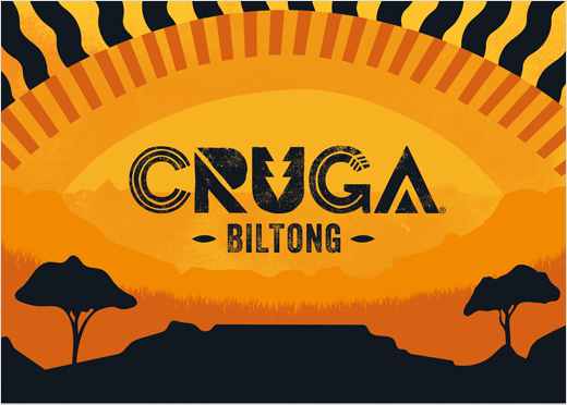
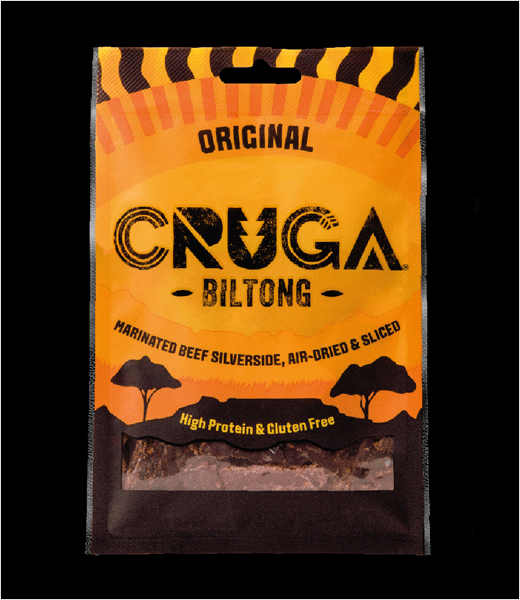
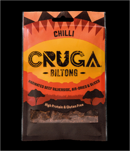
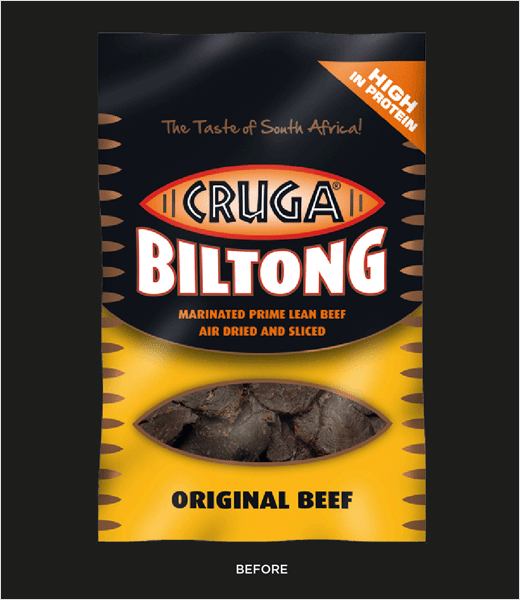
Cruga, on the other hand, being rooted in a South African recipe, featured too many stereotypical African motifs according to the designers, who felt the brand was in danger of appearing “contrived and inauthentic” as a result.
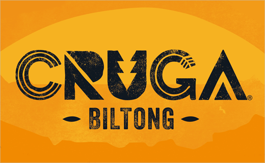
“We developed an ownable logotype for Cruga that can be boldly activated in communication, and have used colour and texture to move Cruga’s message and aesthetic from ‘African tribe’ to ‘African tactility’,” says Vallance. “We’ve also used tribal patterns to signal flavour (triangles take on a more of a chilli shape for that variant, for example) instead of evoking a one-dimensional and stereotypical feeling of ‘Africa,’ as they did before”.
Both the Cruga and Wild West ranges have now launched in stores across the UK.
Pearlfisher
www.pearlfisher.com


