Pearlfisher Creates New Look for ‘NibMor’ Dark Chocolate
NibMor was founded by two nutritionists with a love for dark chocolate, who wanted to promote the health benefits of chocolate as part of an active lifestyle.
The challenge for NibMor was how to create a cohesive brand message that was enticing to consumers, expressing their healthy point of difference in a desirable way.
Pearlfisher New York was commissioned to both redesign and reposition NibMor, with the aim being to unify the health benefits of dark chocolate with the personality behind the brand in a new way, creating a new visual and verbal language in the process.
The project scope covered brand strategy, identity, words and packaging design.
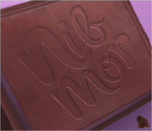
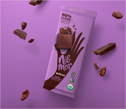
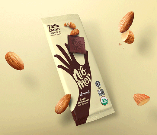
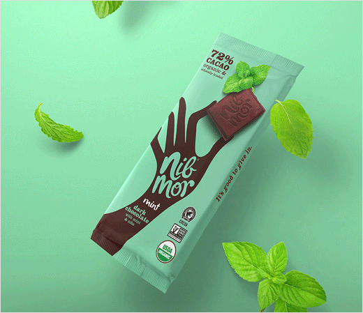
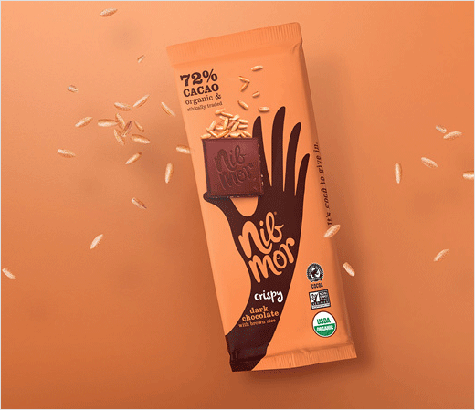
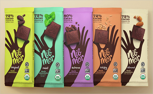
Design elements include a handwritten word mark that Pearlfisher says reflects the personal touch that NibMor impart into each bar of their chocolate.
As portion control is important to NibMor’s food philosophy, the designers also used a hand to suggest the correct portion size for each product in the range.
“Our new design for NibMor does away with the idea of guilty pleasure, making NibMor chocolate an everyday indulgence that you can feel good about,” says Hamish Campbell, creative director at Pearlfisher New York.
Pearlfisher
www.pearlfisher.com


