Pearlfisher Creates Identity for Organic Dairy Brand, ‘Stonyfield’
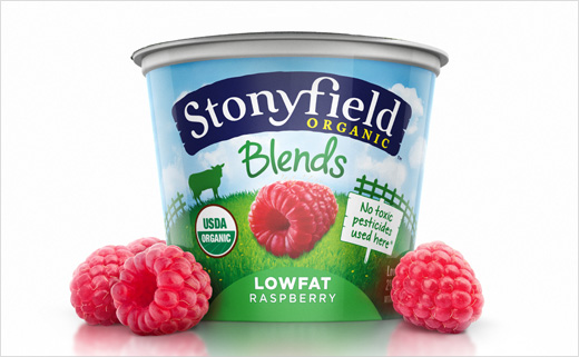
Pearlfisher New York has created the new brand architecture, identity, and packaging design for organic yogurt maker Stonyfield.
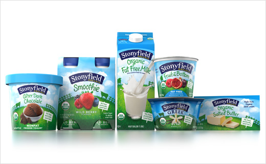
Pearlfisher’s challenge was to help unify the growing portfolio of baby and kids yogurts, traditional and Greek yogurts, frozen yogurts, milk and cream; and to convey Stonyfield’s distinct organic proposition.
Stonyfield’s packaging appeared as a house of niche brands; the goal was to bring those niche brands together with a unifying design principle.
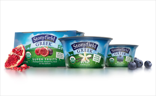
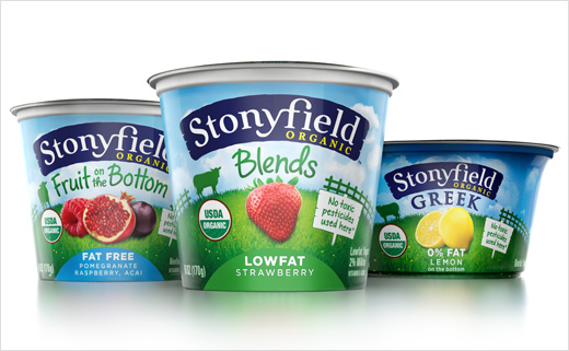
Hamish Campbell, Creative Director at Pearlfisher New York comments, “As the Stonyfield portfolio expanded, many of their organic equities became overshadowed by complicated messaging. We brought out the bold lushness of their farms, bringing it to the forefront of the design and helping to celebrate the personality and vibrancy behind the brand.”
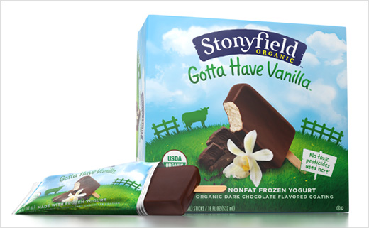
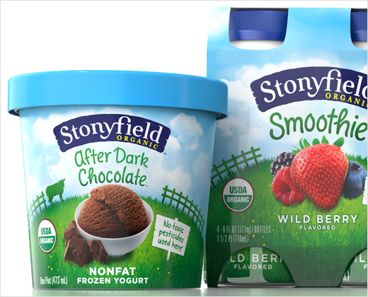
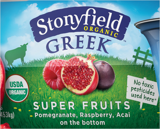
To unify the portfolio, Pearlfisher elevated Stonyfield’s primary equities–the field and sky–incorporating sunlit food photography, an ownable illustration style, and two bespoke typefaces with an aim to infuse the brand with character and personality, while the revised identity aspires to speak to the brand’s organic equities, evoking farm-fresh ingredients.
Pearlfisher is hoping the new design establishes Stonyfield as a leader in the yogurt category.
Tess Wicksteed, Executive Vice President at Pearlfisher New York explains, “Stonyfield is a healthy business that makes healthy food to help grow healthy people while cherishing a healthy planet. We expressed this holistic approach through the filter of Stonyfield ‘celebrating the fullness of life.’ Our redesign brings this highly motivating idea to life and we look forward to seeing it increasing their influence in the organic market.”
Pearlfisher
www.pearlfisher.com


