Pearlfisher Brands Interflora’s New ‘Orangeri’ Chocolates
Pearlfisher’s Copenhagen studio has recently worked with Interflora Denmark to develop and design its latest complementary product, Orangeri chocolates.
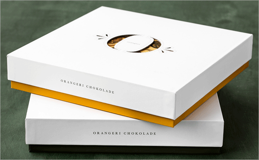
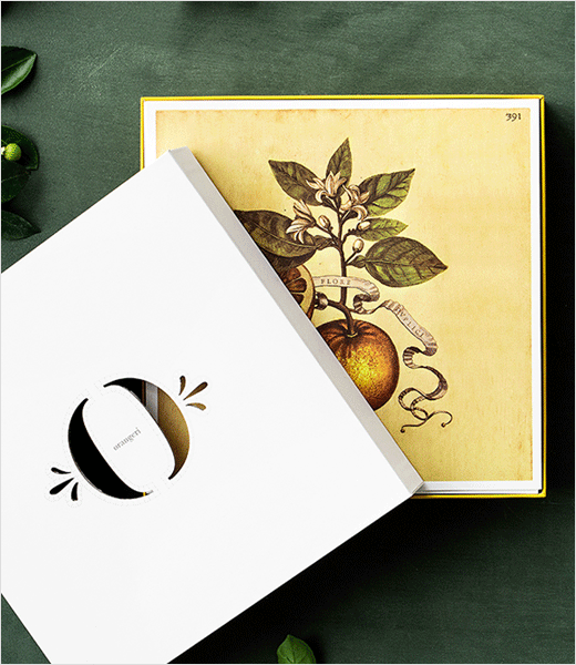
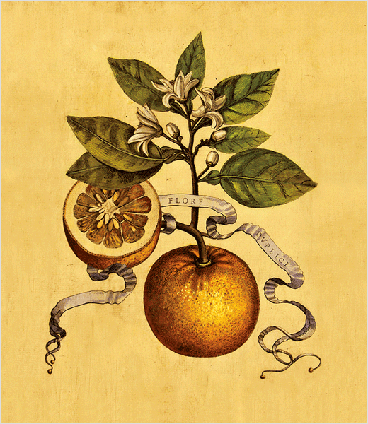
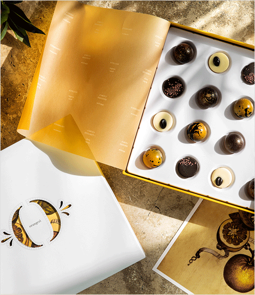
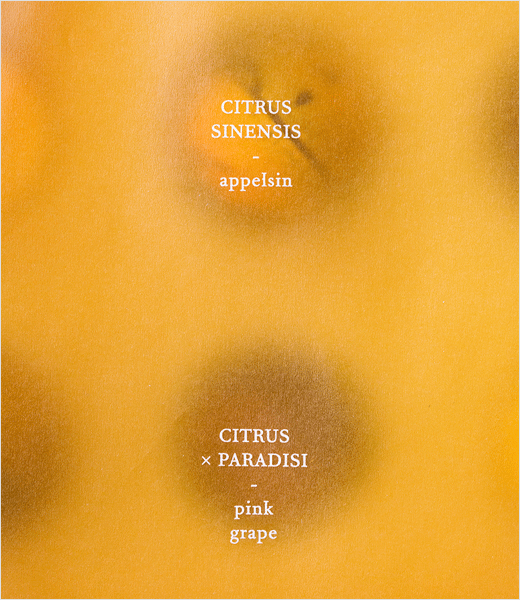
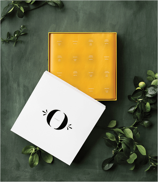
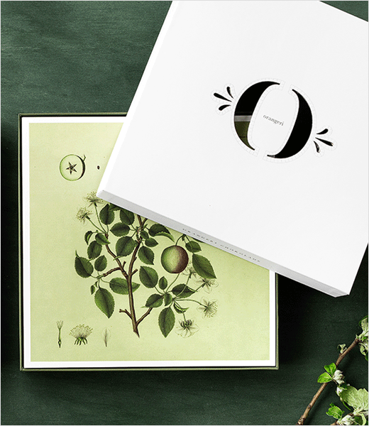
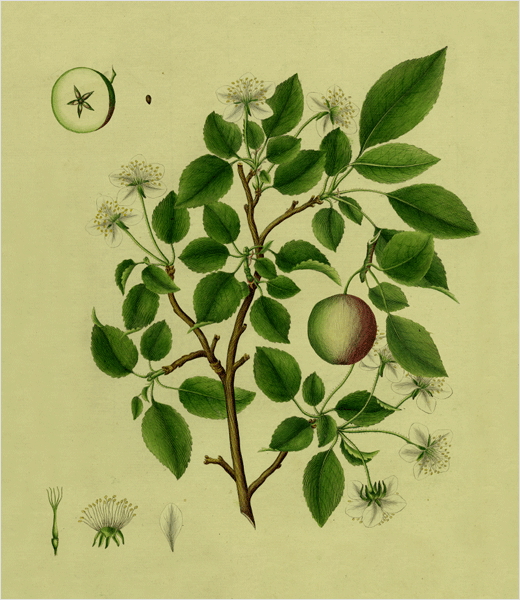
The name ‘Orangeri’ is inspired by “orangeries of old”, says the agency, while the packaging is designed to reveal layers of the product and brand, with the square box opening to reveal a series of ‘postcards’ featuring botanical-style illustrations as well as copy that tells the story of a fruit – an apple or an orange – and its role in Nordic culture.
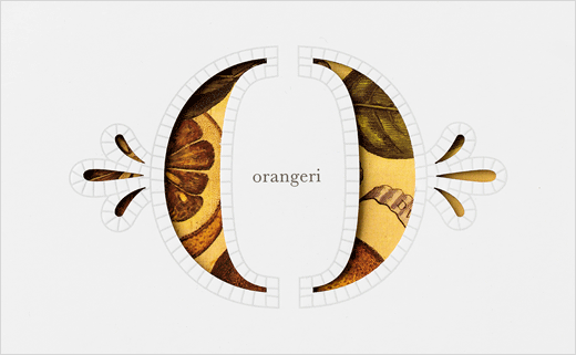
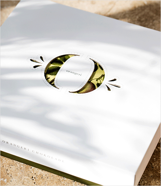
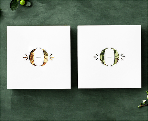
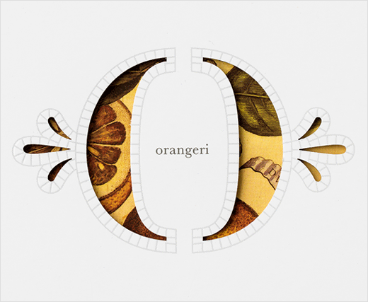
“A segmented ‘O’ with simple floral side markings – evokes a feeling of heritage, nostalgia and prestige – and is outlined by simple squares reflecting the mosaic floors commonly found in orangeries,” explains Jesper von Wieding, strategic creative director at Pearlfisher Copenhagen. “The logo mark is cut into the lid of the box, providing a window into the botanical universe depicted within.”
The four variants of the chocolate box are also designed to evoke what Pearlfisher calls are “the four-different taste directions”, in other words, North, East, West and South.
For example, with citrus flavours as its base, the ‘South’ box is a yellow-orange, inspired by the sun, while the ‘North’ box, for which apple forms the prominent flavour, is green in colour.
Orangeri chocolates are now available to purchase at all of the global flower delivery network’s Danish branches.
Pearlfisher
www.pearlfisher.com


