PayPal Gets Brand Refresh, Unveils New Logo Design
For the first time PayPal is unveiling a global brand platform and campaign. Called “The People Economy”, the campaign also includes a refreshed logo and identity design.
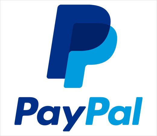
The new logo has been designed with the help of Yves Béhar of industrial design and brand development firm fuseproject.
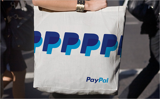
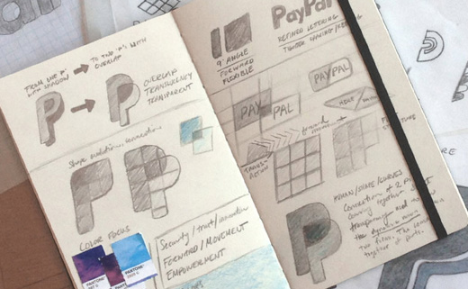
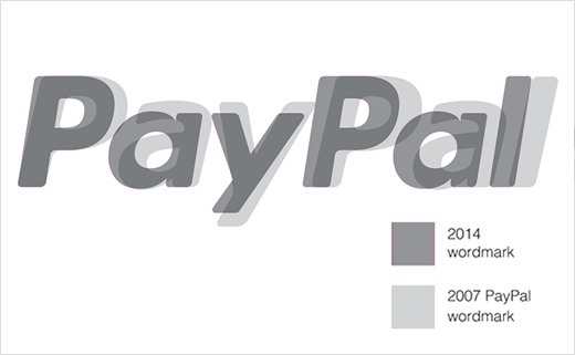
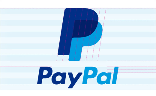
“We focused on two key themes for design: connection and forwardness. For connection, we designed a new monogram with overlapping double P and transparent effect to emphasise human connection. For forwardness, we strengthened the italics that have always been a part of the PayPal logo — harking back to the brand’s heritage, and affirming a forward thinking spirit,” explained Béhar.
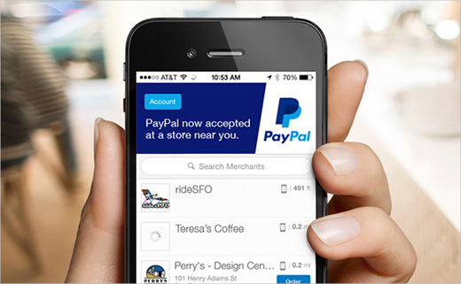
PayPal says the new design is more legible and recognisable in both type and colours and will extend to be usable across the look and feel of various systems, including in-store and on mobile.
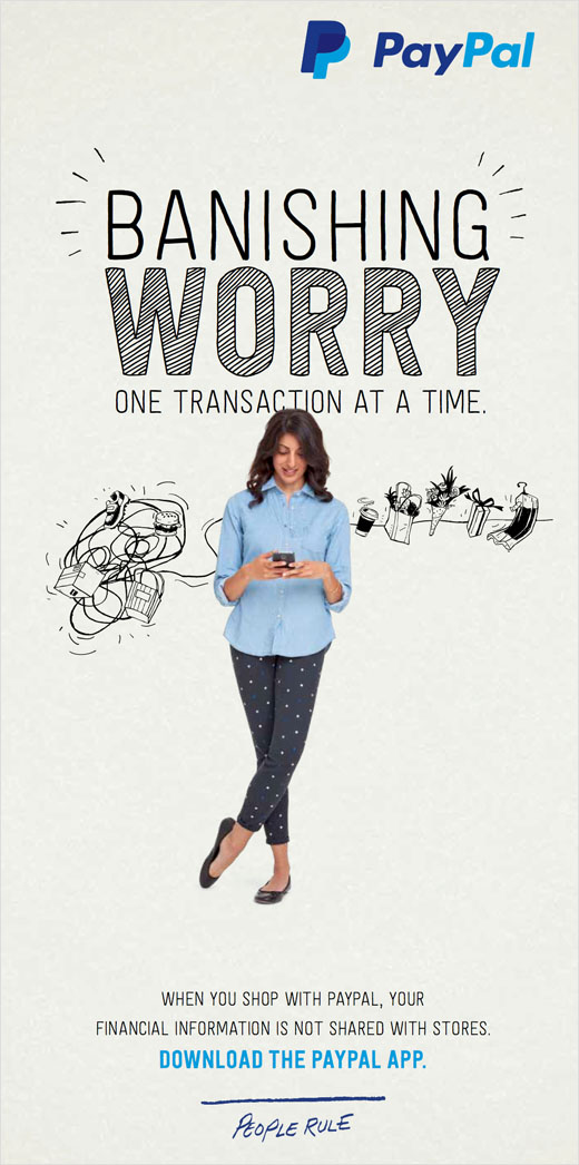
“Our campaign will appear across all paid, shared, earned and owned channels — wherever in the world people see it. Our illustrative style is fresh, modern and human. Our type treatment has a hand-drawn feel that makes it friendly and populist,” said PayPal’s vice president of branding, Christina Smedley.
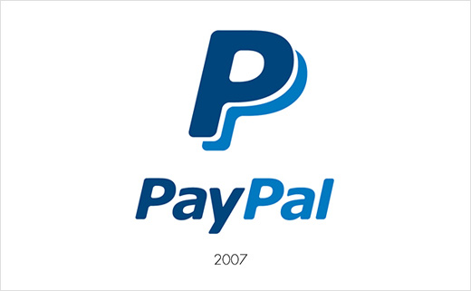
Source: PayPal


