Payments Processor, Yapstone, Unveils New Logo Design
Payment’s processor, Yapstone, has introduced a new logo design as part of a branding refresh that comes ahead of a planned global expansion.
Headquartered in San Francisco with offices in Santa Monica and Dublin in Ireland, the American firm was founded in 2009, and now claims to process over $20B in payment volume each year.
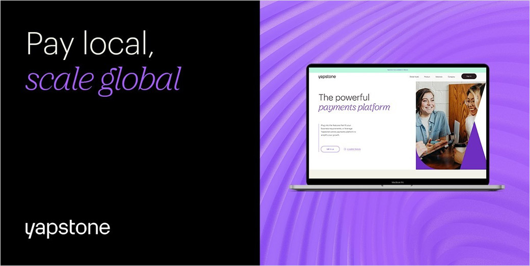
The company’s rebranding strategy is centred around a new wordmark, brand identity, and website. The design of the latter is said to have been inspired “by the transformation happening across the payments landscape”, with keydetails including a new typeface and updated colour palette.
“The new logo was carefully designed to focus on clarity and legibility, with the small details in the ‘Y’ of Yapstone tailored to create a recognisable, memorable, and iconic design. Beyond the Yapstone logo, colour is the most recognisable aspect of our new brand identity and creates a great energy across the new website. It’s an exciting milestone for the company and an opportunity to expand on our foundations and success that we’ve built over the years,” comments Mike Orlando, Yapstone’s current Chief Operating Officer.
“Enabling businesses to scale and reach more markets while giving consumers the financial control they deserve in this digital-focused world will forever be our primary objective at Yapstone. Now, we’re taking our payments platform to the next level and using our local payment method expertise to power payments across the globe. For our customers, this will mean we can connect them to hyperlocal payment methods in new regions and markets. This is the first step of the new, reimagined Yapstone, with plenty more exciting projects in the pipeline,” adds company CEO, Frank Mastrangelo.
Yapstone’s new look has been developed by Maltese design and branding studio, Hangar.


Source: Yapston
Hangar / www.hangar.co


