Panda Liquorice Unveils New Logo and Packaging by This Way Up
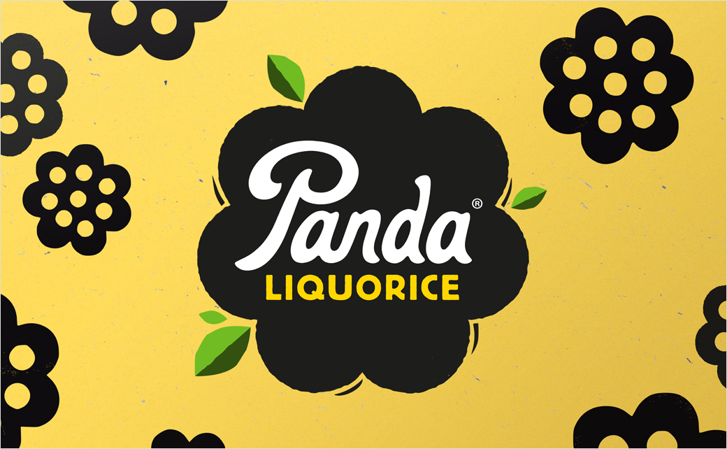
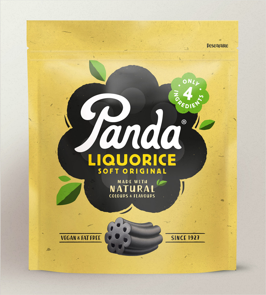
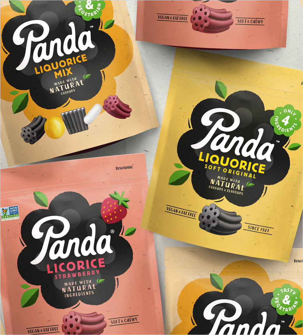
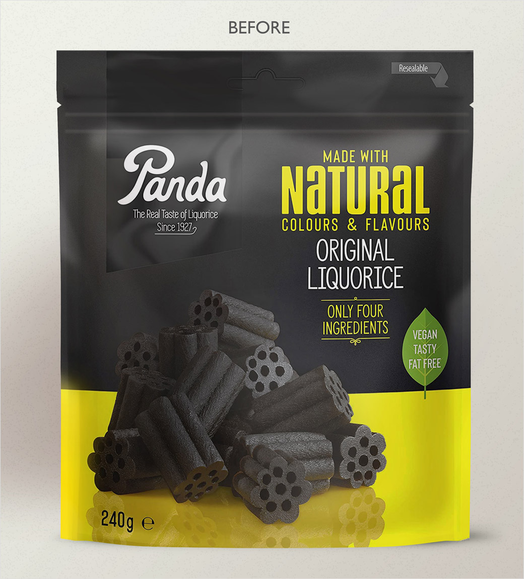
London-based agency This Way Up has created the new logo and packaging design for Panda Liquorice, which sells throughout Europe, the UK, the US, and Canada.
Specialising in branding healthier food and drink options, This Way Up was invited to refresh the nearly one hundred year old Finnish confectionery brand’s look in 2020, working across the visual identity, packaging, website, and wider brand world.
“Panda’s competitors all look very much the same: a round, black logo and white type,” says This Way Up creative director, David Pearman. “Panda is the original liquorice, and it needed to better communicate its role as a brand leader.”
“We needed to find the sweet spot between the familiar cues of the category and some of the more emergent codes of healthier indulgence,” adds Amber Hart, the account director at This Way Up who led on the Panda project. “Panda natural liquorice has a short ingredients list and there are no real nasties in there, so if you’re going to indulge in confectionery, Panda is a positive choice.”
Another key goal was to grab the attention of younger people, in an effort to dispel the perception that liquorice is for older people.
“We wanted to really play on being natural on pack without using brown paper bag effect like everyone else,” explains Pearman. “That can look very old-fashioned – a little bit ‘old school retro’ – and doesn’t play into capturing a younger audience.”
The shape of the actual product is also said to have influenced the graphics featured across the packaging, especially a ‘revolver’ element that serves as a lockup device for the new identity.
“Panda have a very distinctive product shape which actually makes it a better chew, so we wanted to really hero that,” says Pearman.
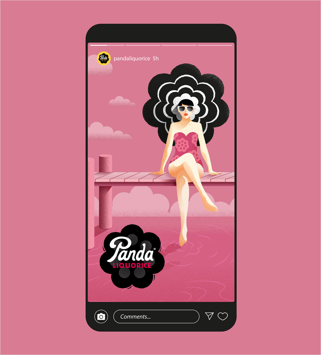
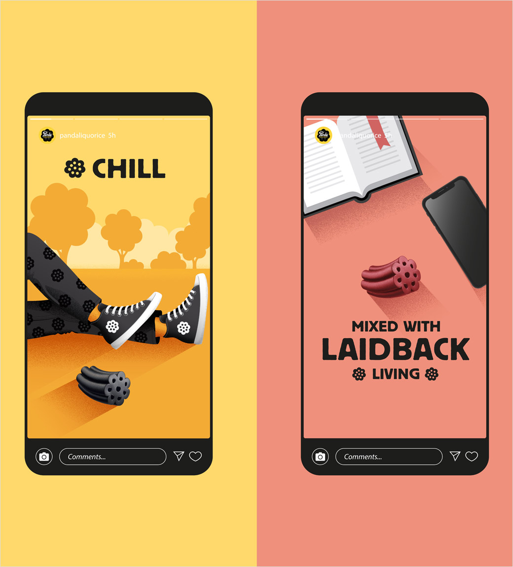
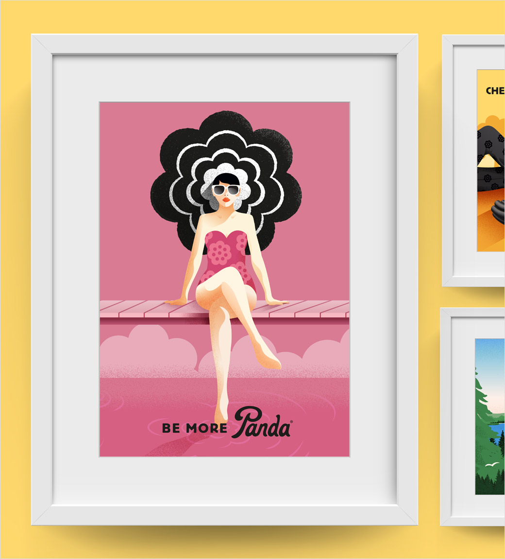
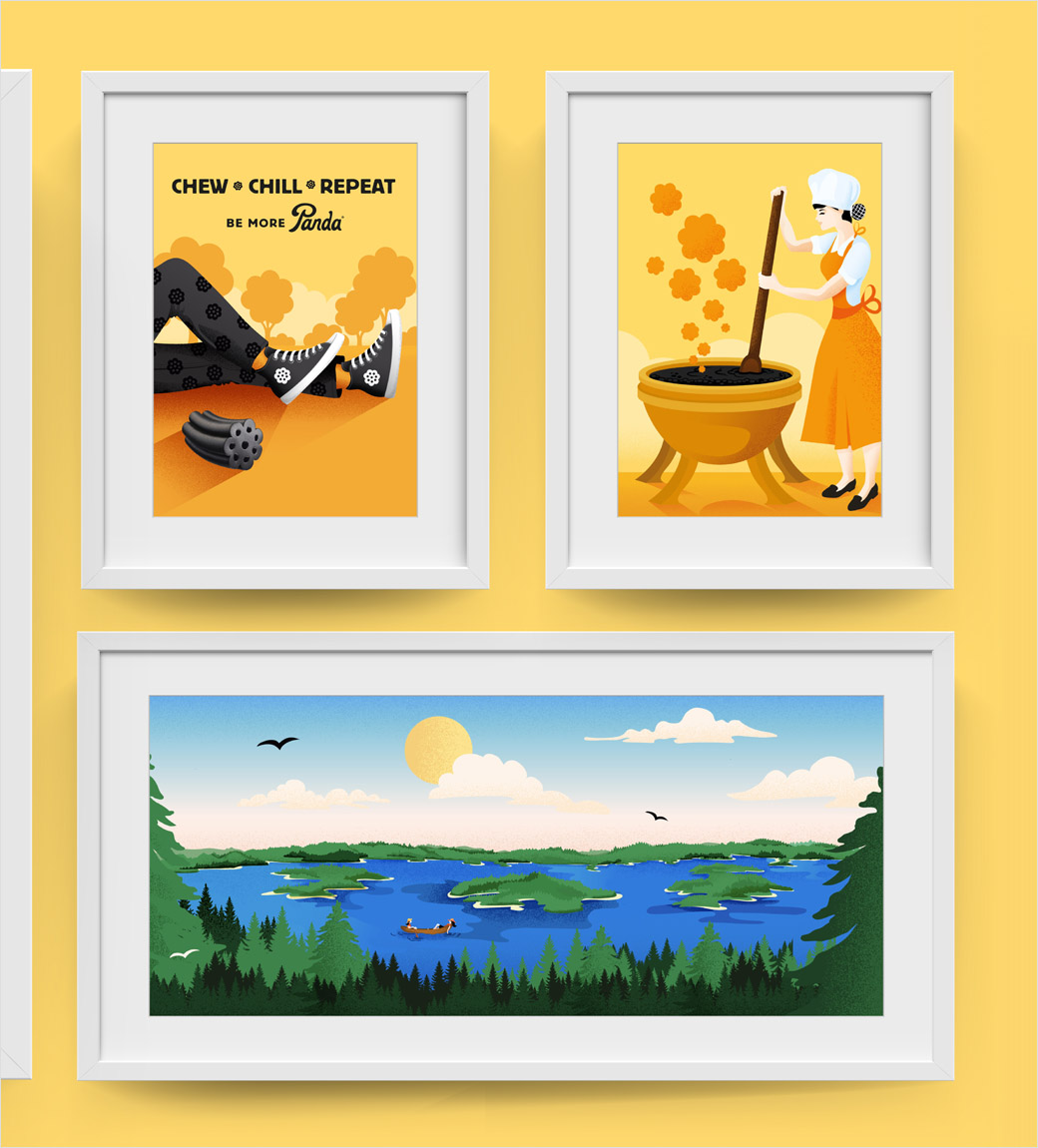
Additional design details include animations and illustrations, with the latter including a woman enjoying some time by the lakes as “a nod to the brand’s Finnish heritage”.
This Way Up
www.thiswayupdesign.com


