PaaSoo Technology Reveals New Logo Design
Global cloud communications company, PaaSoo Technology, has revealed a new logo design to mark what it says is a period of accelerated business growth, especially on the European front.
Originally founded in 2016, and now with offices in France, Ireland, India, Indonesia, Japan, Mainland China, Hong Kong, Taiwan, and the Philippines, PaaSoo’s cloud-based communications platform, or CPaaS (short for “Communications Platform as a Service”), enables companies to optimise – via APIs – the sending and receiving of text messages (SMS) for things such as one-time passwords, notifications, alerts, and promotional offers.
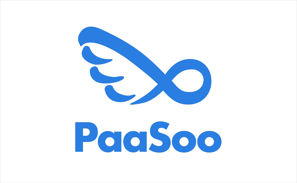
PaaSoo invited artist and illustrator Marion Decroocq, founder of Hong Kong-based studio Couleur Aube, to redesign its logo, in an effort to illustrate the brand’s “essence”.
“The smooth round-curved wing, also subtly interpreting an infinity symbol, with the brand PaaSoo, is modernly presented in refreshing yet calming electric blue,” say the company. “Colour choice always echoes a reflection. A fresh electric blue inspires confidence, responsibility, and harmony, that successfully associates PaaSoo’s stable service and its capability to communicate with the world.”
“I thought of Hermes, the messenger God who facilitated exchanges. I found it interesting to start working on the wings and on what they represent: lightness, speed, agility, and these match PaaSoo’s value,” adds Decroocq.
The firm’s new logo officially debuted this past month at what is considered to be the world’s biggest mobile event, namely, Mobile World Congress (MWC) Barcelona.

Source: PaaSoo Technology


