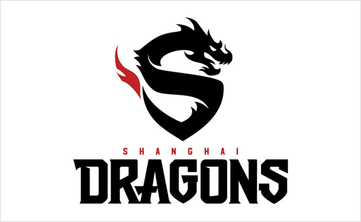
Overwatch League Unveils First Team Logo Design
Overwatch League, a professional e-sports league for multiplayer online video game Overwatch, has revealed the official branding of its first team – the Shanghai Dragons.
For its inaugural season, the newly-created league, which is claimed to be the first major global, city-based pro e-sports league in the world, plans to field 12 teams based in Asia, Europe, and North America. Each team will hire Overwatch gamers to compete in live arenas as well as via video streaming when the league officially kicks-off in January 2018.
The Shanghai franchise is currently owned and managed by Chinese internet giant NetEase, as officially announced earlier in July of this year.
“In Chinese culture, the dragon symbolises the spirit of that which is sacred, powerful, and supreme. The Shanghai Dragons’ logo combines the team’s name and a dragon figure to call upon the history of this symbol,” a spokesperson for the team explained. “The letter S outlined by the body of the dragon represents Shanghai, and the smooth line design is a nod to the strategic skill and flexibility of the team. Furthermore, red is present as a theme colour for the Shanghai Dragons’ logo in order to emphasise its Chinese connection.”
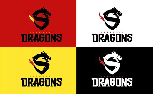
The logo additionally forms a shield-like shape to mimic more traditional physical sports brands such as football clubs, and also comes in both English and Chinese variants.
Created by American video game developer Blizzard Entertainment, Overwatch is said to have broken sales records in the category of buy-to-play PC-client games in mainland China when it launched back in May 2016. The first-person shooter-type title is claimed to have more than 30 million players.

Source: NetEase


