Aussie FinTech Giant eftpos Unveils New Look by Hulsbosch
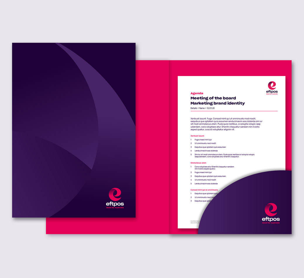
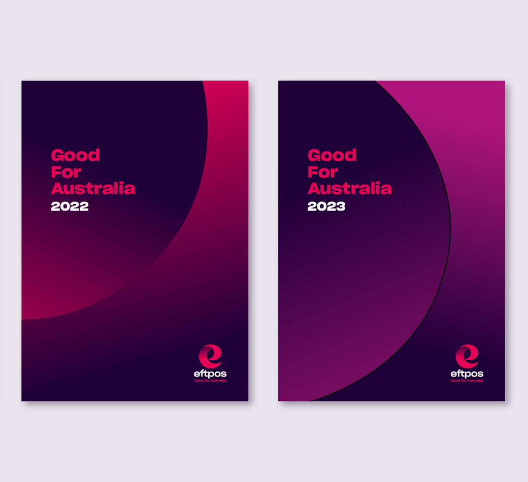
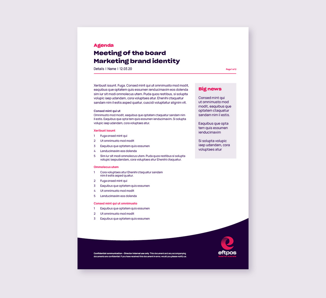
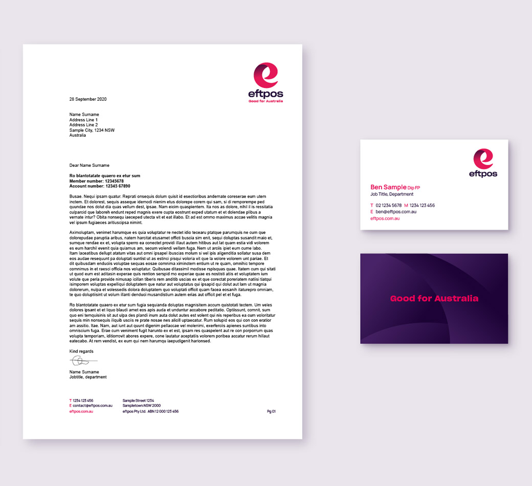
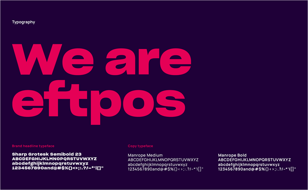
Australian electronic payment system, eftpos, has revealed a new brand identity, logo, and style guide by branding and design agency, Hulsbosch.
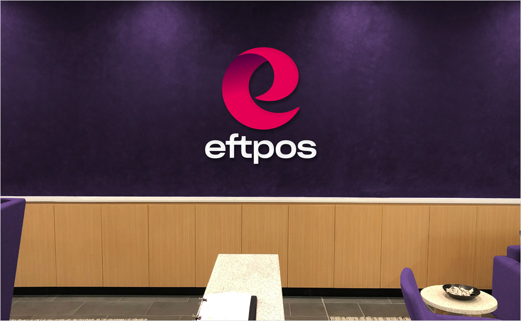
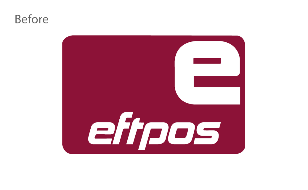
The refreshed logo is claimed to represent a modern take on eftpos’ original brand marque, while the new-look identity has been designed to be as flexible as possible for a wide range of platforms and digital environments.
“This iconic Australian brand is back with a defined brand story and a stand-out, relevant symbol. Our brief was to create an identity that evokes eftpos’ vision and values, and design a logo that anchors the brand in a powerful, distinct and easily identifiable way,” explains Jaid Hulsbosch, managing director at Hulsbosch.
Adding: “The retail environment is always so busy and cluttered, therefore our creative solution really needed to standout. A vibrant upgrade in colour and an evolved, stylised ‘digital e’ now perfectly represents the brand and its exciting future.”
“The new digital ‘e’ logo and fresh brand colours are an important nod to our past, while also incredibly relevant and modern, representing our evolution to position eftpos at the centre of the digital ecosystem,” further comments Anthony Dumont, head of brand and marketing at eftpos.
Although sharing the same name as the commonly used EFTPOS abbreviation, which stands for “Electronic Funds Transfer at Point Of Sale”, the Aussie outfit is a separate entity, having launched in 1984 and since then going on to become Australia’s national payments network; last year it reportedly processed over two billion debit card transactions worth an average of more than $300 million each day.
The company says its new brand rollout will be a phased out in stages starting in late March due to its extensive presence, with over 50 million cards to be updated along with hundreds of thousands of eftpos acceptance marks displayed by merchants across Australia.




Hulsbosch
www.hulsbosch.com.au


