Offthetopofmyhead Unveils New Logo Design for Beechdown
Design agency Offthetopofmyhead has refreshed the identity of health and fitness club, Beechdown.
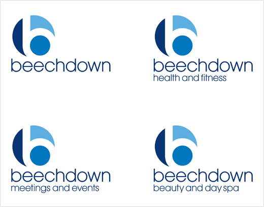
Set in three-and-a-half acres of landscaped gardens near Basingstoke, it is said to be the largest privately-owned members club in the region. It currently has three business divisions, namely, health and fitness, meetings and events, and beauty and day spa.
John Spencer, Offthetopofmyhead’s founder and creative director says, “Beechdown’s old logo and graphic identity needed a radical overhaul because they hadn’t kept pace with changes in the business and no longer reflected the club’s personality and ambitions.
“Their circular symbol is simple and direct, and echoes the club’s idiosyncratic, circular architecture which is quite unlike any other health and fitness club. Beechdown’s linked logos now show a clear relationship between their three business divisions.
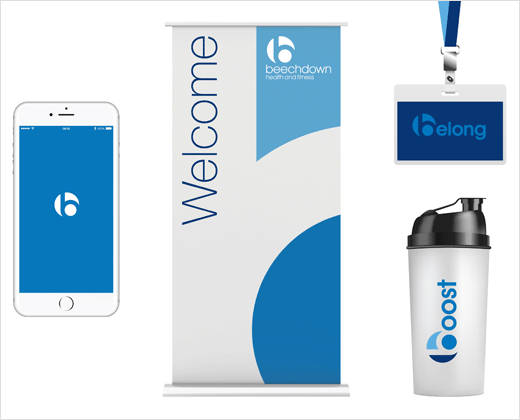
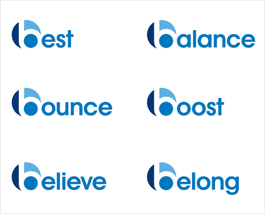
“B is for Beechdown but it’s also for belong, believe and best. So we’ve made the symbol a feature of the club’s language identity where aspirational b-words are used on a multitude of applications including merchandise.”
Beechdown’s all-new logo and graphic identity is being rolled out from this month.
Offthetopofmyhead
www.offthetopofmyhead.co.uk


