Norwich Castle Debuts New Logo and Branding by The Click
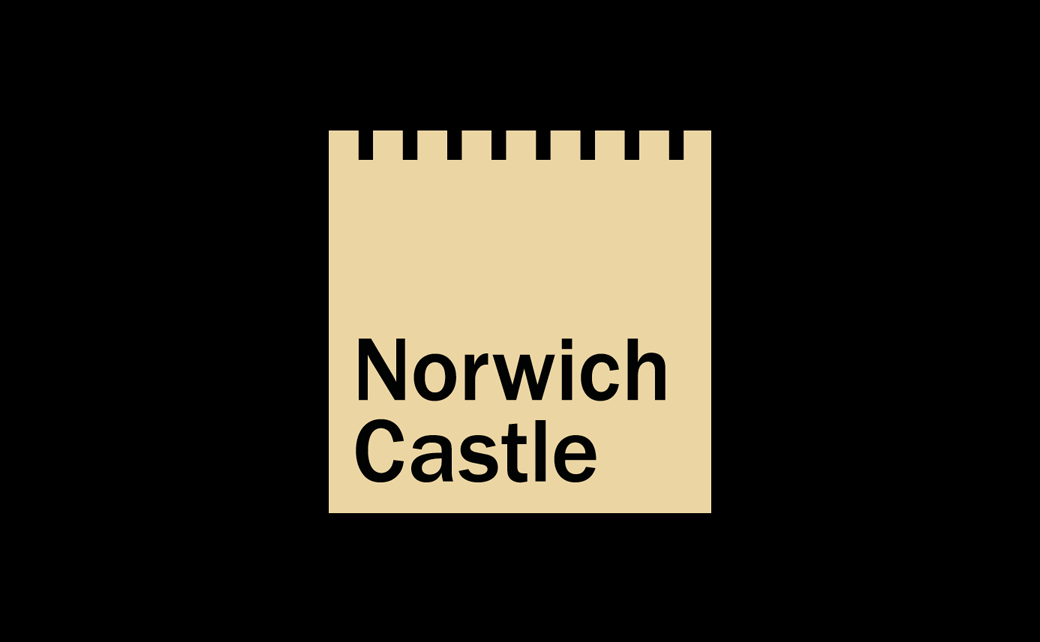
British design studio The Click has created the new logo and branding for Norwich Castle, one of the nation’s most historic landmarks.
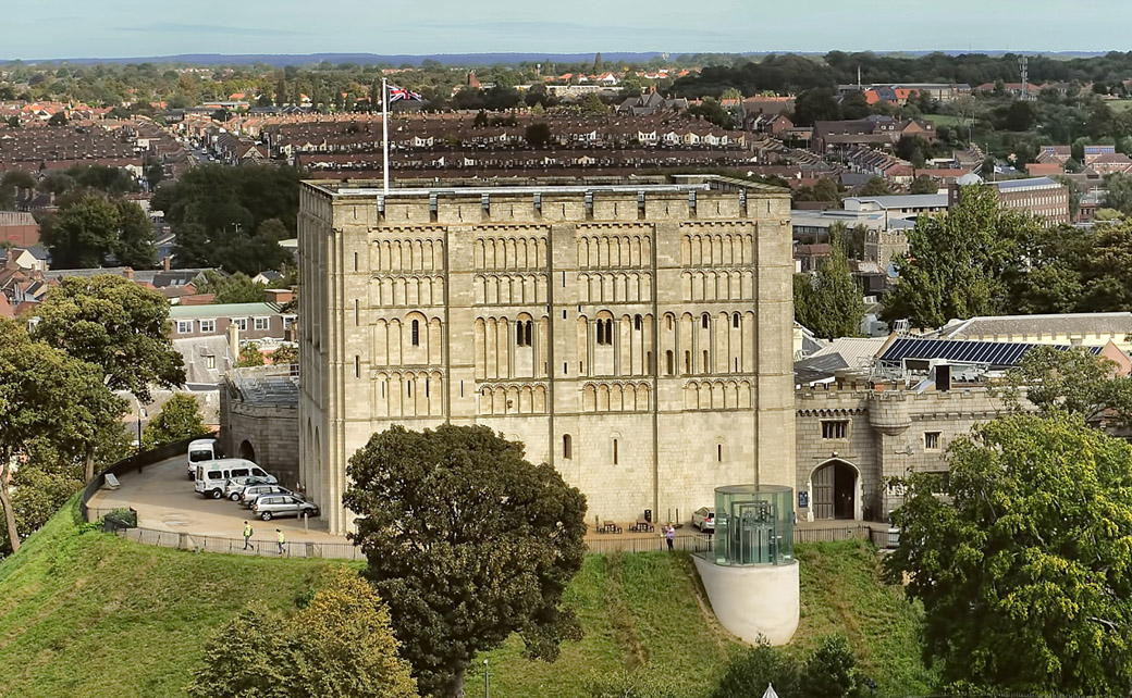
Nearly a thousand years old, the medieval building was constructed under the instructions of no less than William the Conqueror himself.
While it functioned in the past as a fortification, a royal palace, and even a prison, today it operates as a museum and art gallery, which is currently mid-way through a £13m overhaul.
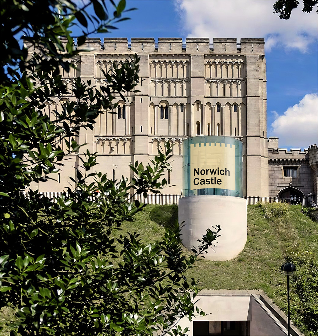
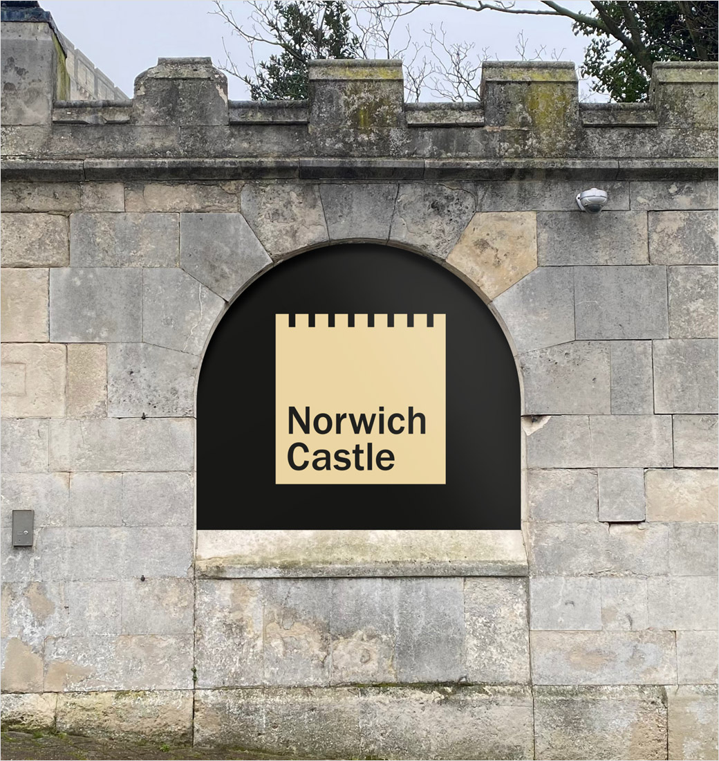
Unsurprisingly, the new logo and visual identity has been inspired by the distinct cube-like form of the building, with input from even laypersons.
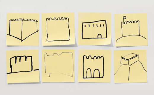
“We challenged members of the public to draw a picture of the castle purely from memory. We armed them with a pen and post-it note, giving them just ten seconds to complete the task. The results were hugely informative and in turn very much guided our thinking and creative execution,” explains the design team at The Click.
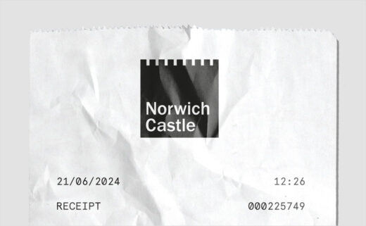
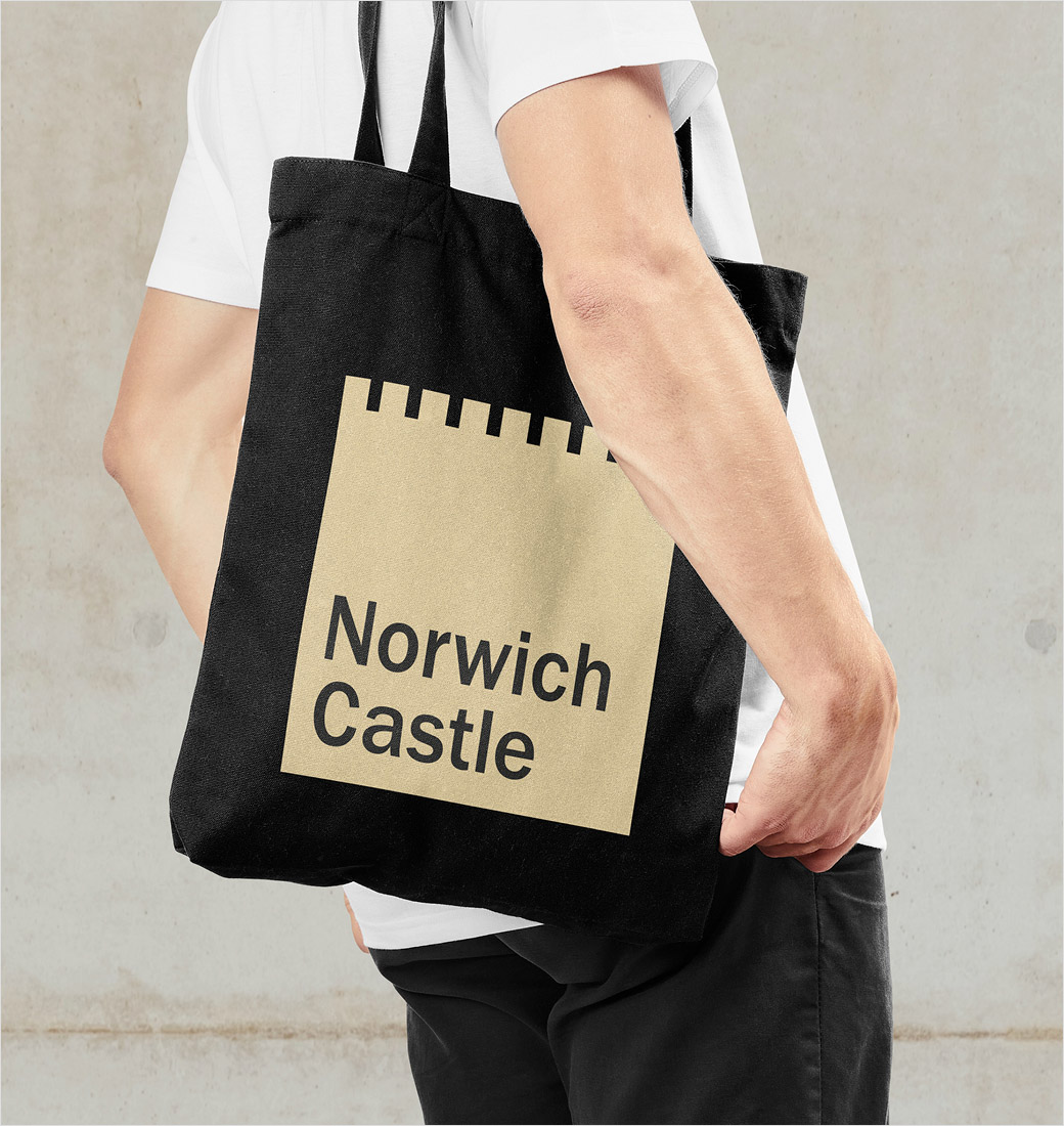
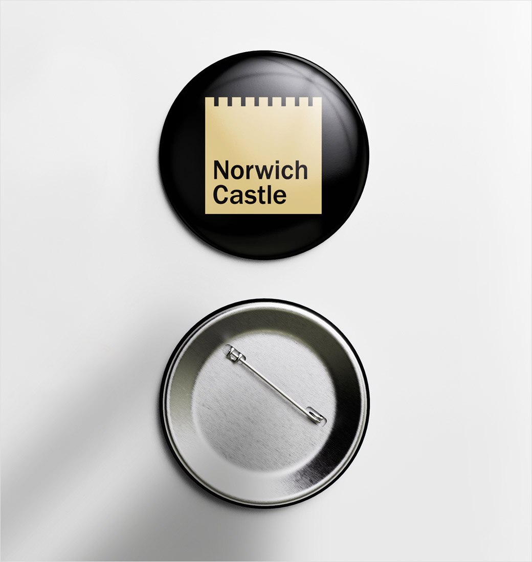
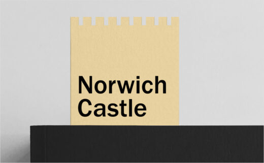
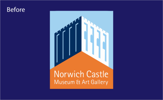
“We crafted an uncompromisingly simple mark – unmistakably portraying Norwich Castle. In isolation, the core brand logo is understated and intentionally unembellished. We removed everything from the previous brand logo that wasn’t needed – distilling the visual representation of the castle to its simplest and most iconic form. The geometry of the core brand logo directly informs a unique nine column grid system – referencing the number of merlons on each aspect of the castle,” further comments The Click’s design director, Adam Ewels.
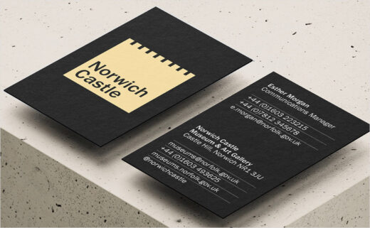
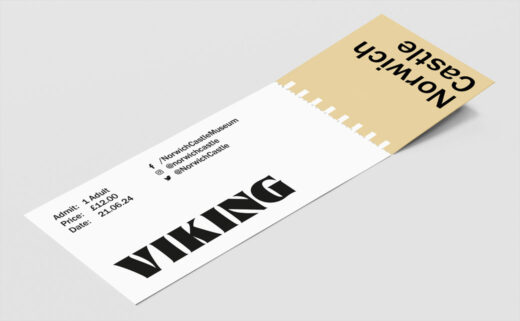
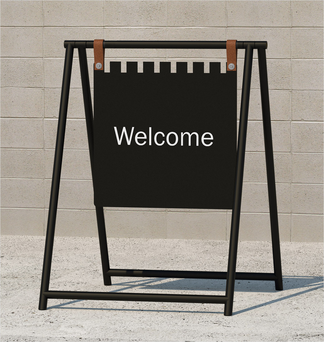
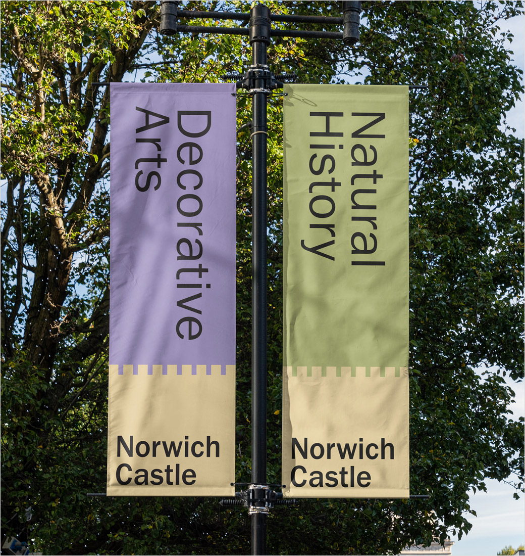
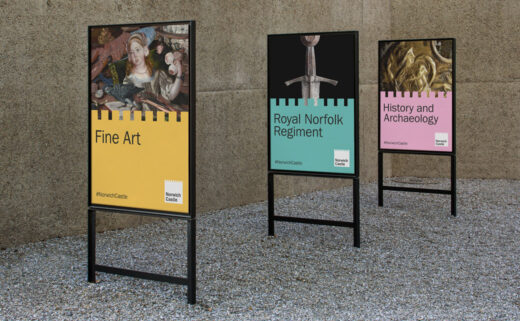
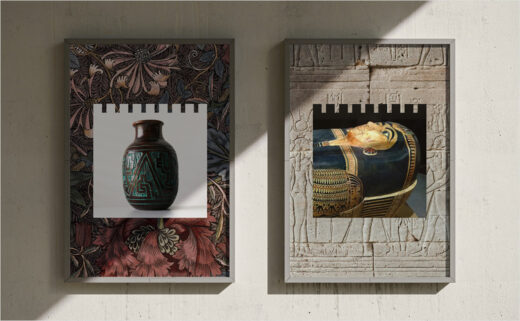
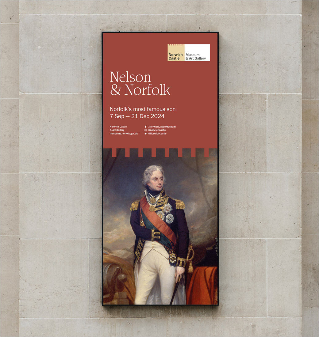
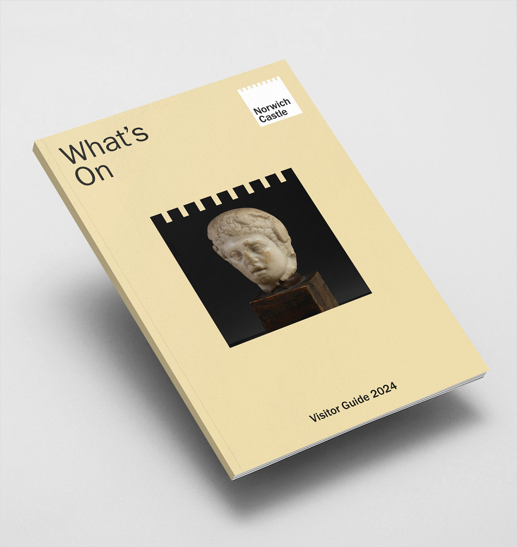
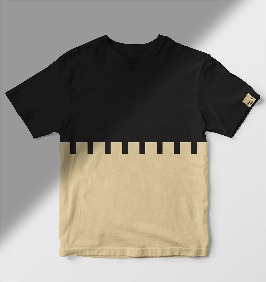
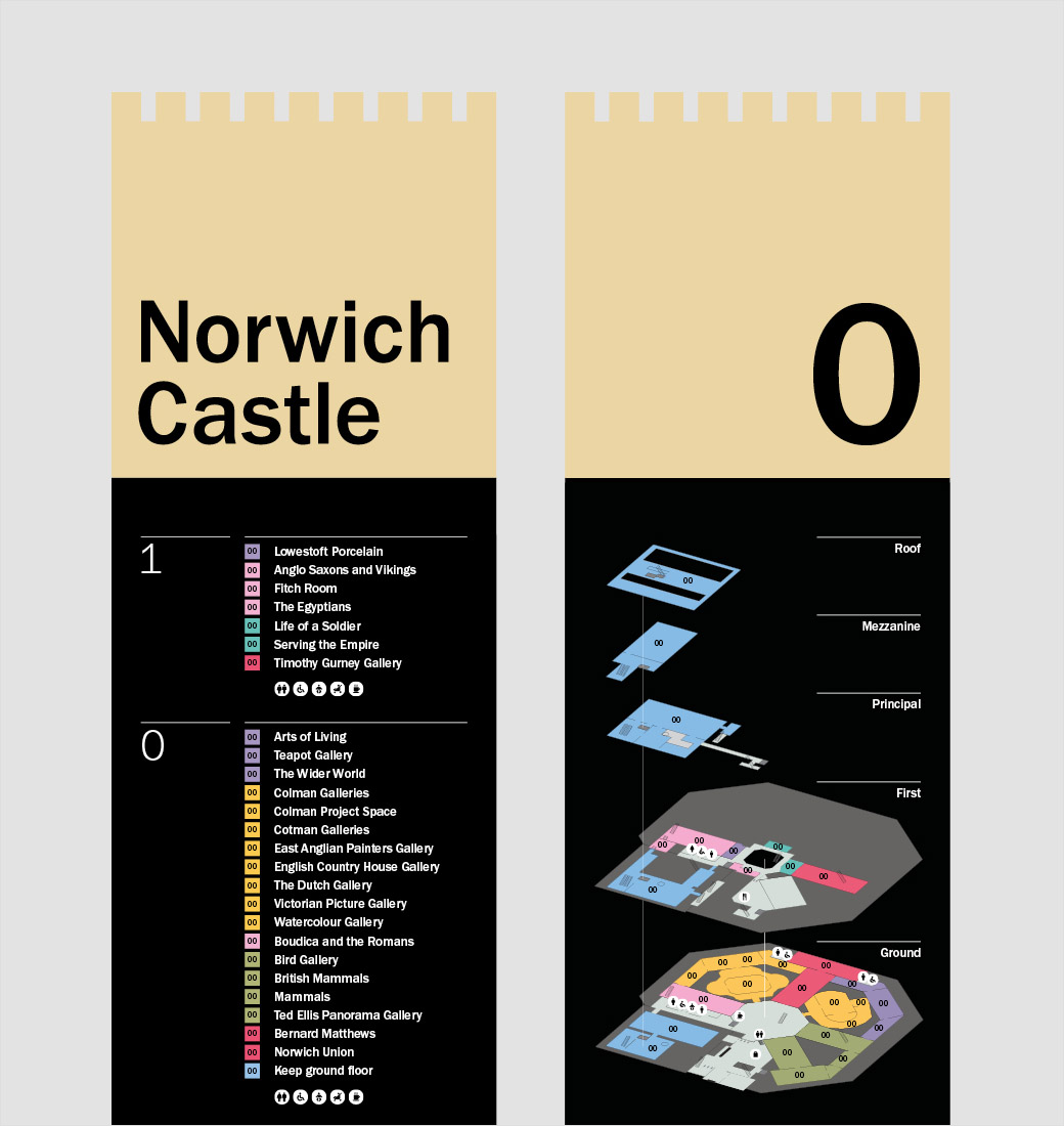
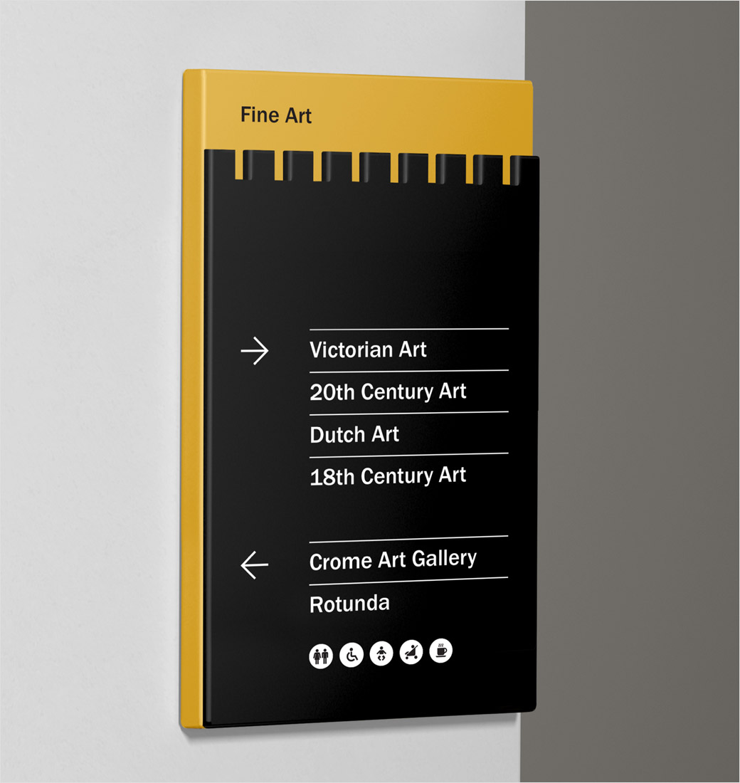
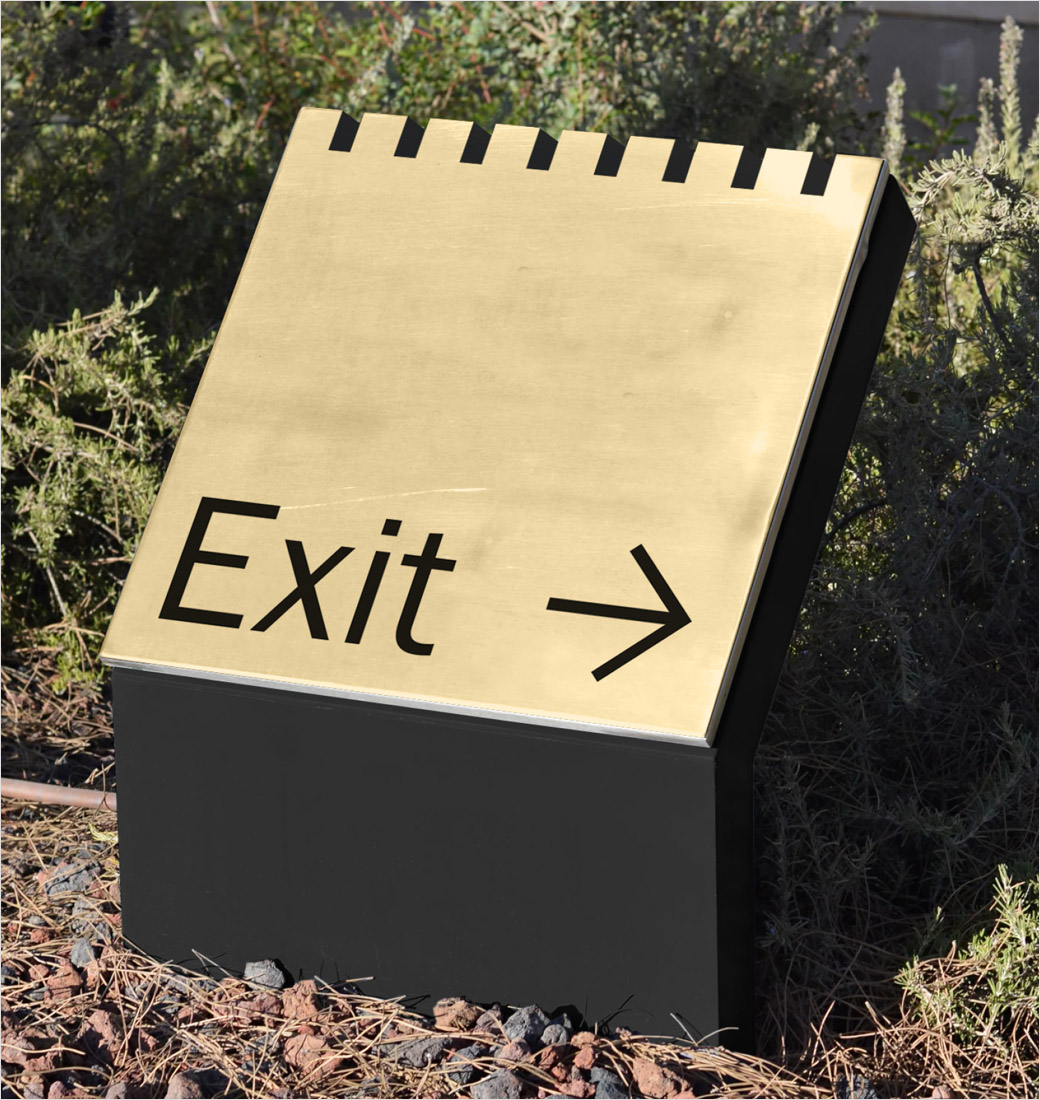
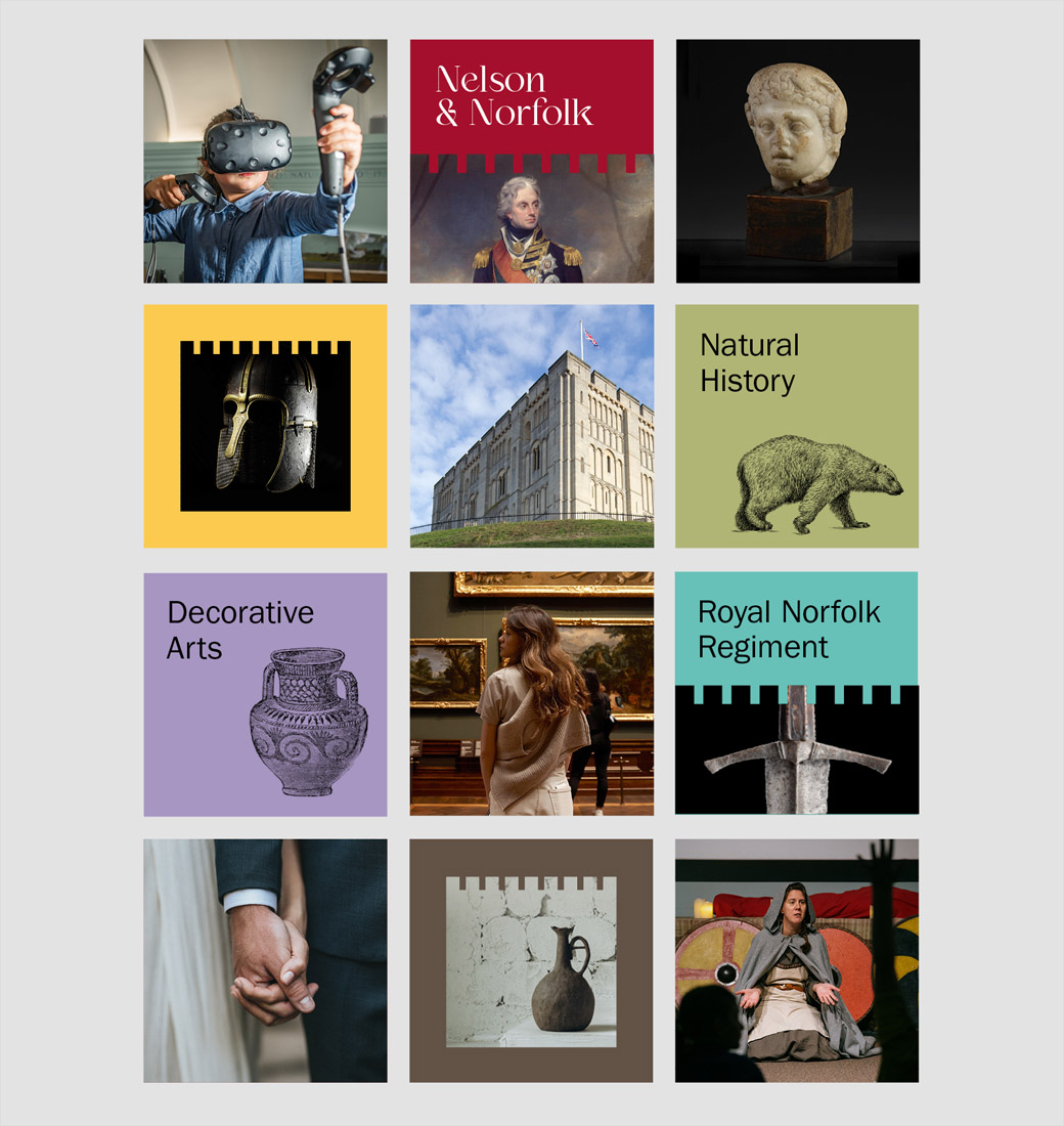
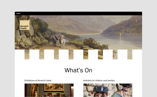
The crenelation device from the top of the brand logo is subsequently utilised as a graphic divider across multiple touchpoints including signage, campaigns, and digital applications.
The Click
www.theclickdesign.com


