Nick Faldo Unveils New Logo Design for Golf Brand
Nick Faldo, considered to be the most successful British golfer of all time with six Major titles, is marking a decade of knighthood by giving his Faldo Enterprises brand a facelift.
Launched 10 years after being invited to “Arise, Sir Nick” by Queen Elizabeth II in 2009, the new logo and modernised branding will be rolled out across all of Faldo’s business operations, including his global juniors’ programme, the Faldo Series, and golf course design business, Faldo Design.
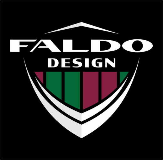
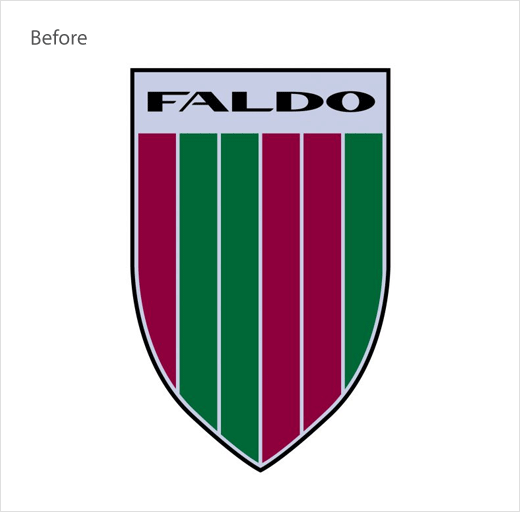
The refreshed logo design retains the trademark Faldo shield and six stripes that have become synonymous with the Faldo brand. While the shield is claimed to represent “heritage, knighthood and the symbol of a champion”, the stripes represent Sir Nick’s six Major Championship wins in order of occurrence. The claret stripes signify Open Championship wins in 1987, 1990 and 1992, with green representing Faldo’s Masters victories in 1989, 1990 and 1996.
Golf fans will first see the new logo featured across branding for the Faldo Series, set up by Faldo after his last Masters win in 1996, and regarded as the only global amateur series for junior boys and girls.
“The new logo and brand design marks the start of the next stage for Faldo Enterprises. Businesses evolve, so I felt it was an important transformation to undertake, especially with the ventures we have in the pipeline for Faldo Enterprises. For me, the new logo also acts as a celebration – it’s 10 years since I received my knighthood, we’ve got the 23rd edition of the Faldo Series Europe Grand Final and some exciting course design projects happening, so what better time to make the Faldo brand even more visible across the globe,” says Faldo, who was helped with the redesign by Surrey-headquartered Performance54, a specialist global golf sales and marketing agency.


Source: Faldo Enterprises


