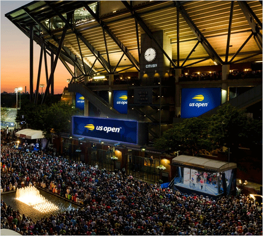
New Logo Unveiled for the US Open Tennis Championships
The United States Tennis Association (USTA) has unveiled an all-new logo design for the US Open, as the Grand Slam tournament marks its 50th anniversary.
Created by graphic design firm Chermayeff & Geismar & Haviv, the refreshed logo is being described as “a streamlined and modernised version of the tournament’s iconic flaming ball logo,” which was originally introduced back in 1997.
“The new mark is an evolution of the flaming ball idea, distilled to its essence to work as a simple icon,” explain the designers. “The result expresses the energy, spirit, and velocity of the flaming tennis ball and the US Open itself, while modernising the look, providing a more youthful appeal”.
“The new logo is bold and energetic and better captures and expresses the dynamism of the US Open,” says USTA chief marketing officer Amy Choyne. “We have enjoyed 50 years of greatness, and our new visual identity will better carry us forward for the next 50 years.”
“This year’s US Open is almost a new experience with the Louis Armstrong Stadium completion,” adds Nicole Kankam, managing director of marketing at the USTA. “So it will feel like a new venue, a new site, a new experience, and I think the logo will be a great depiction of that.”
A full line of products featuring the newly-designed logo are also scheduled to be launched later on this spring, and the USTA says it is further working with its licensees to create specific 50th Anniversary merchandise and products.
“This is a true milestone year for the USTA and the US Open,” says Katrina Adams, USTA chairman of the board and president. “With the completion of our five-year transformation of the USTA Billie Jean King National Tennis Center, we are now positioned to celebrate our tremendous history, while being poised for future growth.”


Source: USTA
Image Credits: Chermayeff & Geismar & Haviv


