New England World Cup Kit Gets Neville Brody Typeface
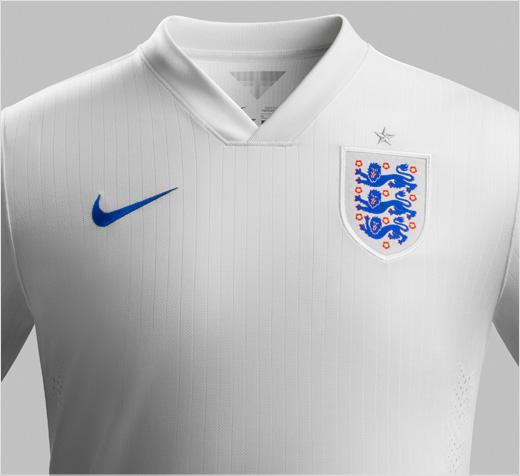
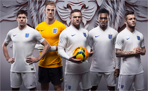
England and Nike have unveiled new home and away kits for 2014, revealing designs that they say focus on English football history and culture.
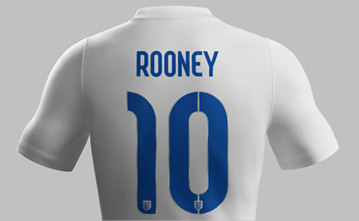
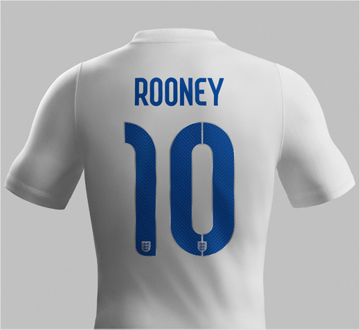
Nike has also collaborated with English typographer Neville Brody to create a new font for the names and numbers on the back of the jersey.
“It has been an extraordinary honour to design the fonts for the English jersey,” said Brody. “The core inspiration was to focus on the intersection between flair and workmanlike reliability. Small touches emphasise the idea of innovation, invention and surprise, built around a more geometric structure.”
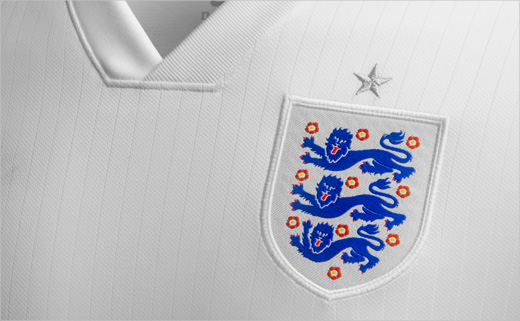
The 1970s inspired football shirt incorporates a pinstripe in the fabric, which is also carried through in the design of the typography.
“The industrialised suggestion of a stencil was simultaneously based on a pinstripe motif, combining style with no-frills efficiency,” explained Brody.
“Two references really stood out during the design process for the home kit – that stunning all-white kit England wore in Mexico in 1970 and the idea of the armour of English Knights,” added Martin Lotti, Nike Football Global Creative Director.
“You can see subtle references to the armour in the pinstripe, which carries a hint of shine, and in the white satin tape on the shoulders. We wanted to add some small detail that echoed the glow of the armour worn by St. George,” said Lotti.
Source: Nike


