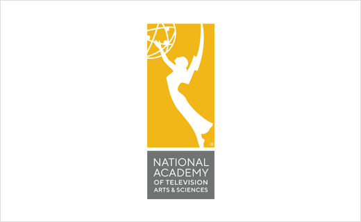
The Emmys Announce New Logo and Branding
The National Academy of Television Arts & Sciences (NATAS) has revealed a new logo featuring as its focal point the silhouette of the famous Emmy Award statue.
The latter, which depicts a winged woman holding an atom, was designed in 1948 by television engineer Louis McManus. NATAS itself was founded in 1955 in New York, where its headquarters remain to this day; it currently has 19 regional chapters across the USA.
“The new NATAS branding captures the long history of the iconic Emmy Award, now right at home in the digital age. It is a polished yet approachable design that evokes key themes of excellence, community, and transformation,” says Adam Sharp, NATAS President and CEO.
“This was a challenging project; it was an honour to be a part of it,” adds Bill Dawson, the lead designer on the project and founder of Los Angeles-based brand agency XK9. “National Academy of Television Arts & Sciences is a mouthful of a brand name. The design needed to balance this descriptive name with the Academy’s iconic symbol.
“The Emmy is a potent, timeless avatar for this vital organisation. Our goal was to present the Emmy—to amplify her beauty and energetic form. Here, the figure breaks from confinement and pushes beyond perceived limits. That’s an apt metaphor for the work of the Academy and the excellence it celebrates.”
As well as the new icon and logotype, NATAS’ primary font face has been updated to TT Norms Pro (designed by Ivan Gladkikh and Pavel Emelyanov).
Elements of the new identity have already been previewed backstage at the 40th Annual News & Documentary Emmy Awards and will be introduced fully over the coming months.


Source: NATAS


