Mozilla Unveils New Logo Design
Seven months since setting out to refresh its logo, internet brand Mozilla has revealed its finalised design.
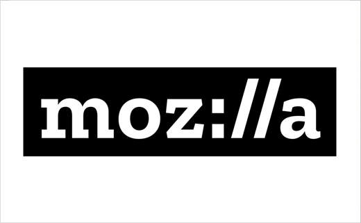
The new logo, with its nod to URL language, has been designed by Johnson Banks and was selected based on public feedback.
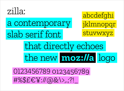
A custom typeface called “Zilla”, created by Dutch foundry Typotheque, is used for the wordmark and accompanying copy lines.
Said to have been inspired by Courier, the original default font used in coding, Zilla will also be made free to the public as part of the company’s “open-source” approach (the not-for-profit is best known for its free web browser, Firefox).
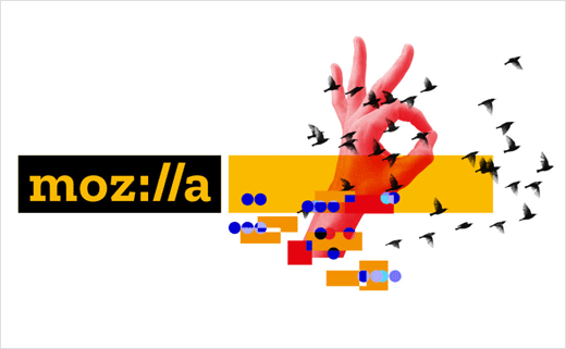
The black box surrounding the logo, meanwhile, echoes the way text looks once it’s been highlighted and selected in toolbars and programs.
“Our brand identity – our logo, our voice, our design – is an important signal of what we believe in and what we do,” explains creative director, Tim Murray. “And because we are so committed to ensuring the Internet is a healthy global public resource, open and accessible to everyone, we’ve designed the language of the Internet into our brand identity.”
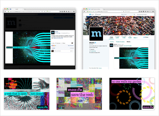
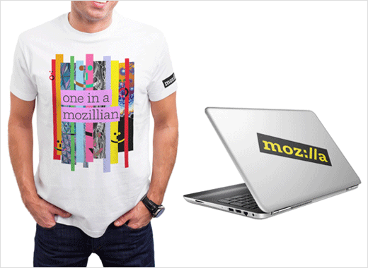
Mozilla says it plans to roll out the new brand identity in phases.
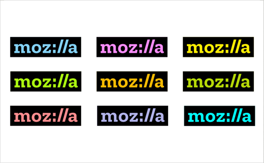
Source: Mozilla


