Microsoft Search Engine ‘Bing’ Rolls Out New Identity
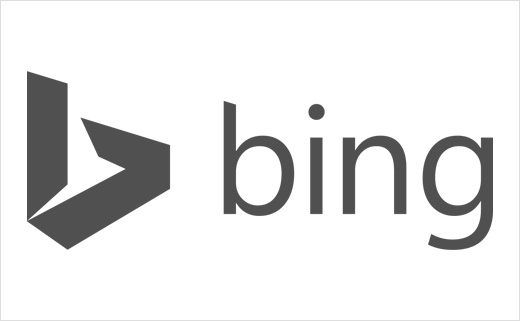
Hot on the heels of internet brands Yahoo and YouTube, Bing has unveiled a new logo design.
The revised wordmark features a customised version of Microsoft’s corporate font Segoe. However, in ‘tribute’ to the Bing logo heritage, the identity still retains the lowercase ‘b’. The descender on the ‘g’ has been slightly modified to curve upward and the cut on the top of the ‘b’ mirrors the angle on the cut of the ‘t’ in the Microsoft logo. The kerning pairs of the ‘i’ and the ‘n’ are exactly the same as the ‘i’ and the ‘n’ in the Windows wordmark. The colour, meanwhile, loosely pays tribute to the orange dot from the previous Bing logo while also embracing the Microsoft colour palette and borrowing from one quadrant of the corporate flag logo.
Speaking about the design, Scott Erickson, senior director of brand and creative at Bing, said: “The new Bing identity is more than a new logo and colour palette – it’s a system of brand architecture that allows us to strategically and visually evolve Bing in line with our mission and our products. We didn’t set out to just provide data via blue links on the web. We set out to provide clarity, decisions and insights. Bing is no longer just a search engine on a web page. It’s a brand that combines search technology across products you use every day to help empower you with insights. It’s time we all stepped out of the confines of the search box to stop searching and start finding.”
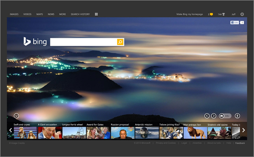
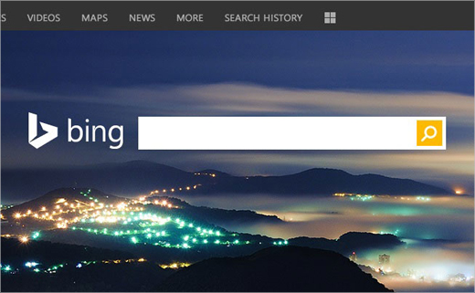
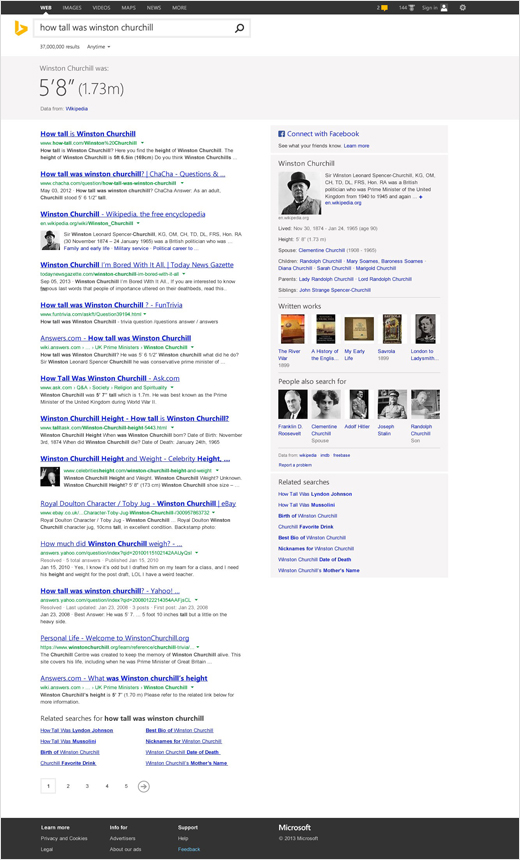
As well as updating the visual identity, Bing has also developed a new web design interface.
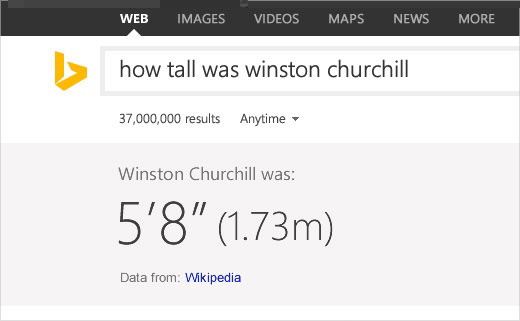
“With this release we’ve created a modern Bing.com experience – one that is faster, cleaner and more visually appealing. We believe that search can be beautiful as well as functional and efficient. With that as our goal, we evaluated fonts, spacing, color, visual scan patterns, the search box and even the underlying code,” explained Lawrence Ripsher, Bing’s current general manager of user experiences.
