Michigan Tech Reveals New Logo at Launch of Rebranding
After more than 130 years, Michigan Technological University has rolled out its first cohesive, University-wide brand.
A task force representing faculty, administrators, alumni and students conducted research before settling on the new logo, which was designed over an 18 month period.
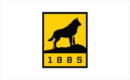
“The Husky statue has become the centre of campus, a gathering place and a symbol of Michigan Tech. Alumni identify themselves as ‘Huskies.’ The date 1885 is important to let people know that Tech is a real university that has been around for more than 130 years, not a new kid on the block nor a technical school. The rebranding is more than a logo change,” said President Glenn Mroz.
Michigan Tech’s sports department has also released a new visual identity to represent its 14 varsity athletics programs.
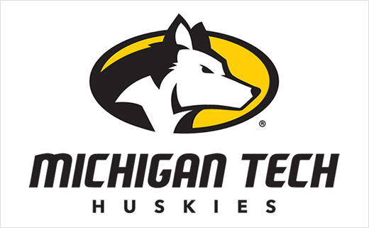
The new set of spirit marks includes a new dog head, type treatment and two levels of marks. It also includes a subtle update to the long-standing Huskies script.
“Feedback from our key stakeholders was the driving force behind this evolution,” said Michigan Tech Athletic director Suzanne Sanregret. “Our student-athletes, fans and coaches—the people who wear our apparel and represent our teams in competition—shaped and approved our new visual identity. We want to show pride in who we are and where we’re from while recognising the great traditions of our programs.”
Michigan Tech began exploring the possibilities of a new visual identity in 2014, and the result is a visual identity pyramid with a number of different marks to meet various needs for space and context.
The primary mark is a Husky head in an oval with the University name in a custom font. The secondary palate, which may also be used on its own, includes several different type treatments with the custom font as well as a pair of circular marks—one of which incorporates an outline of the Upper Peninsula.
A third palate, used in association with either a primary or secondary mark, includes an outline of the Upper Peninsula, the Husky head by itself, an “MTU” acronym and the Huskies script.
The script has roots with Michigan Tech athletics, particularly with the hockey program, which wore the design on its jerseys while winning NCAA Championships in 1962, 1965 and 1975.
“Our new system gives teams variety and flexibility to represent Michigan Tech and keep our brand consistent in any situation or application,” added Sanregret.
The creative team behind the design was Michigan Tech’s University Marketing and Communications department, headed by Ian Repp.
“The new look for Michigan Tech athletics honours our proud history as Huskies with a fiercely determined look to the future. We are excited to have this identity serve as the face of Michigan Tech Athletics,” said Repp.


Source: Michigan Tech


