Mercury GSE Unveils New Logo and Branding
Mercury GSE, a supplier of ground support equipment to the aviation industry, has revealed a new logo and identity as part of a major brand initiative.
Created by The Craftsman Agency, the new look is claimed to reflect the American firm’s “delivery of premium service and unrivalled support”.
“Inspired by our heritage and driven by our vision for the future, this rebranding is a reflection of our unwavering dedication to excellence,” says Jason Gendron, CEO of the California-headquartered company.
“While this new identity elevates the company’s brand while highlighting its leadership in the industry, it’s also a testament to its constant drive to surpass expectations,” adds Gina Michnowicz from The Craftsman Agency.
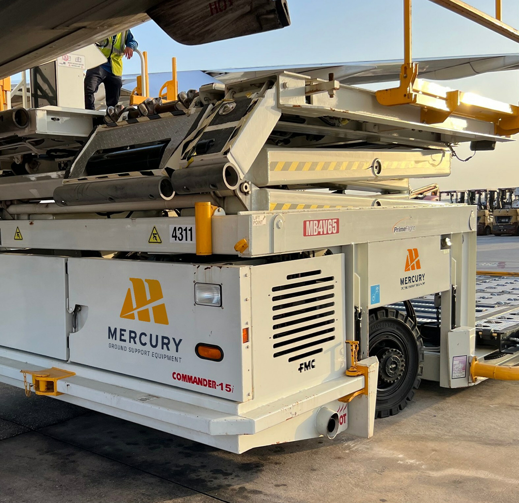
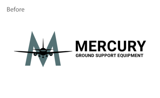
The refreshed branding encompasses a new wingtip logo, orange colour palette, and updated typography – all of which are designed to signify “strength and reliability while emphasising forward movement and speed”, according to the designers.
The new identity has already been rolled out on the company’s site as well as on the tarmac, and the new look was also featured last week at the Air Carriers Purchasing Conference (ACPC) that took place in New York.


The Craftsman Agency
www.thecraftsmanagency.com


