Memphis 901 FC Reveals Logo Design Ahead of USL Debut
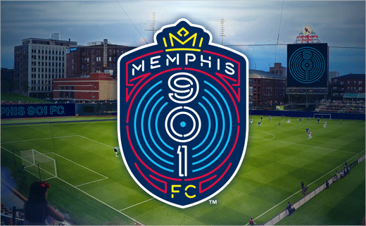
The name and logo design of Memphis’ newest professional sports team has been officially revealed.
Starting from next year, Memphis 901 FC will represent the famous Tennessee city in the United Soccer League (USL), the North American equivalent of the EFL Championship here in the UK.
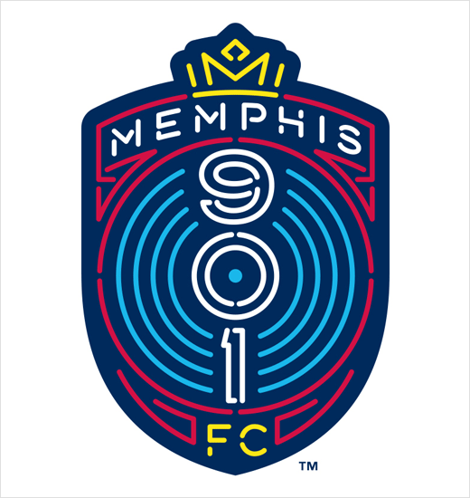
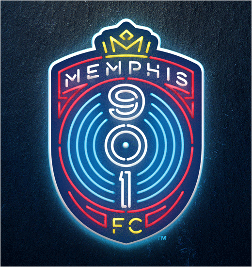
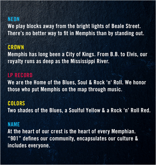
The club’s neon-inspired logo is said to pay homage to Memphis’ historic Beale Street located just blocks from the club’s stadium, complete with an LP record in the centre as a nod to the city’s distinguished music history, with a crown on top honouring the musical “kings” of Memphis such as Elvis Presley and B.B. King. The ‘901’, meanwhile, refers to the region’s area code and forms the foundation of the club.
“We can think of no better place to kick it all off than in the Mid-South, in a market as soulful and as passionate as Memphis, in a world-class downtown venue like AutoZone Park,” says the club’s owner, Peter Freund.
“Since we announced this team in January, we have constantly sought input from people in our community and the soccer world about what our team’s identity should be,” adds Memphis 901 FC president, Craig Unger. “All conversations led us to ‘901 FC.’ Our heart, and our uniqueness, is that we are Memphians. ‘901’ has come to define our community and is a rallying cry of our region. It quickly became clear that Memphis 901 FC was the perfect fit for the foundation of our club, which is Memphis’ club.”
“This identity is one that reflects the vision that the football club’s ownership and supporters share for bringing the community a sports experience that is ‘Authentically Memphis.’,” further explains Dan Simon – the head of Studio Simon, a Louisville-headquartered branding agency that was responsible for creating 901 FC’s new logo and identity, and which formerly designed the logo for the Memphis Redbirds baseball team, who 901 FC will be sharing AutoZone Park with from next March onwards.
Source: Memphis 901 FC


