Medicine Branding
Lili Koves is a young graphic design student from Budapest in Hungary (though she’s currently busy completing an academic term abroad in Finland).
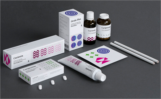
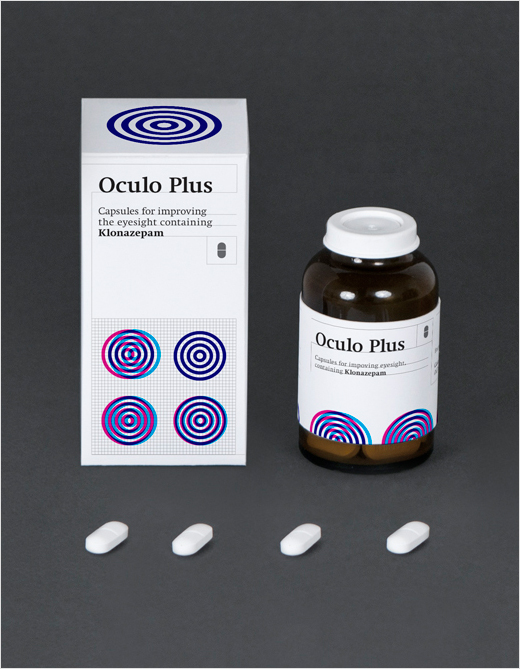
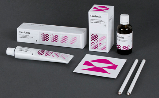
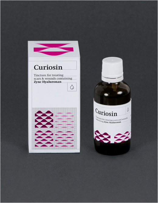
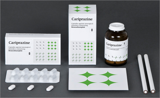
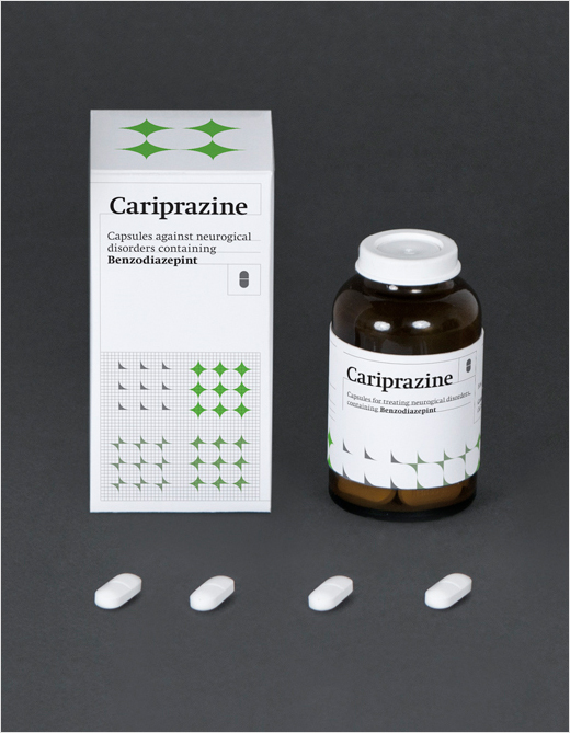
This medical-themed project was is in fact a college assignment, where Lili was tasked to come up with a branding and packaging proposal for a total of three different medications.
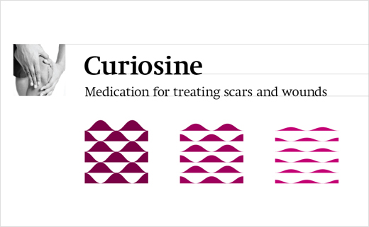
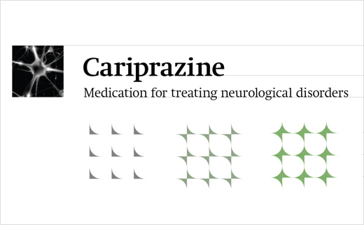
Lili’s objective was to keep the overall design clean and simple but at the same time interesting to the eye. “To characterise each drug, I decided to reflect on the process of healing, rather than showing the symptoms; so the attention gets directed away from the actual illness, and is instead placed on the positive healing effects and benefits of the product” explains Lili.
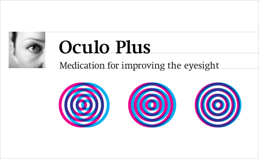
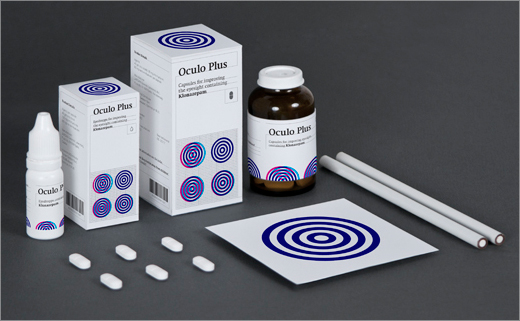
The use of visual indicators to convey what each individual medication is to be used challenges existing design convention. Aside from dosage instructions, typical prescription medication packaging carries little more than the product’s scientific or brand name, neither of which reveal anything about the medicine’s intended activity.
A patient taking medicine who cannot read—or at least experiences difficulty reading—could perhaps benefit from optical markers such as these devised by Lili, especially in cases where that patient, having been prescribed multiple medications, needs help differentiating between altering medicines.
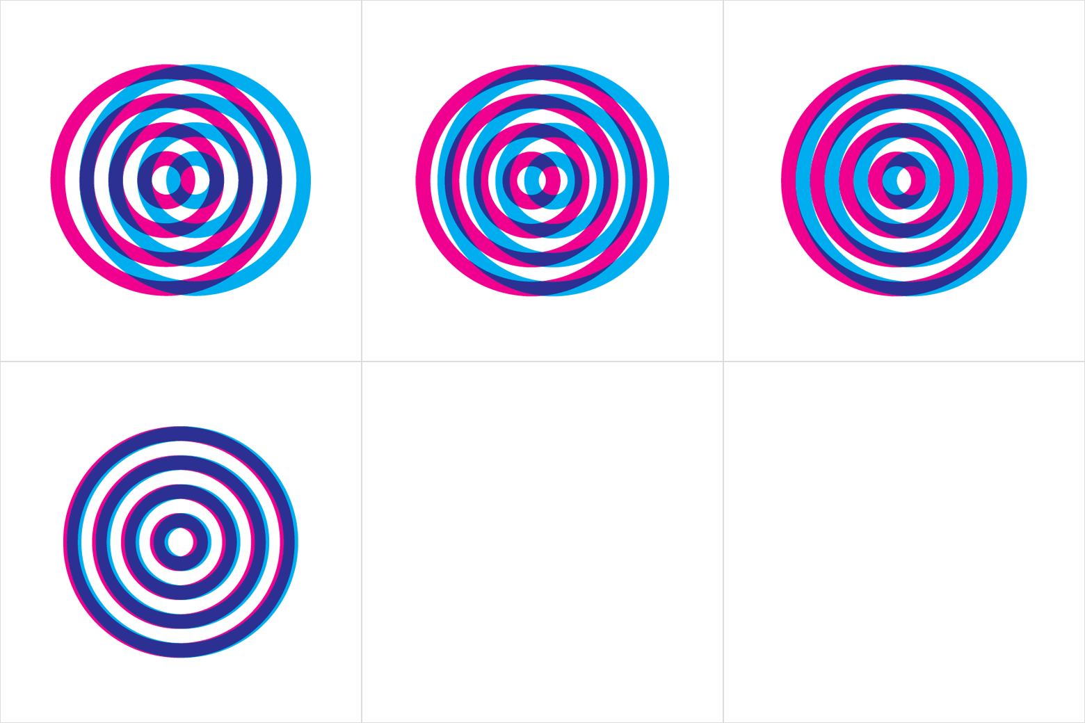
The futurist in Lili has also managed to conceive a series of animated graphical elements that may well be used on a packaging surface should such technology become readily available.


Lili Koves
www.behance.net/lili_koves


