Mayawell Soda Reveals New Logo and Packaging Design
Texas-based manufacturer of prebiotic soda, Mayawell, has this week revealed its brand new look.
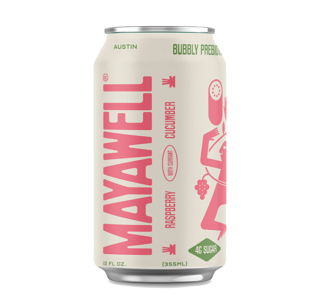
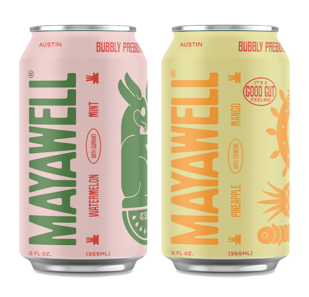
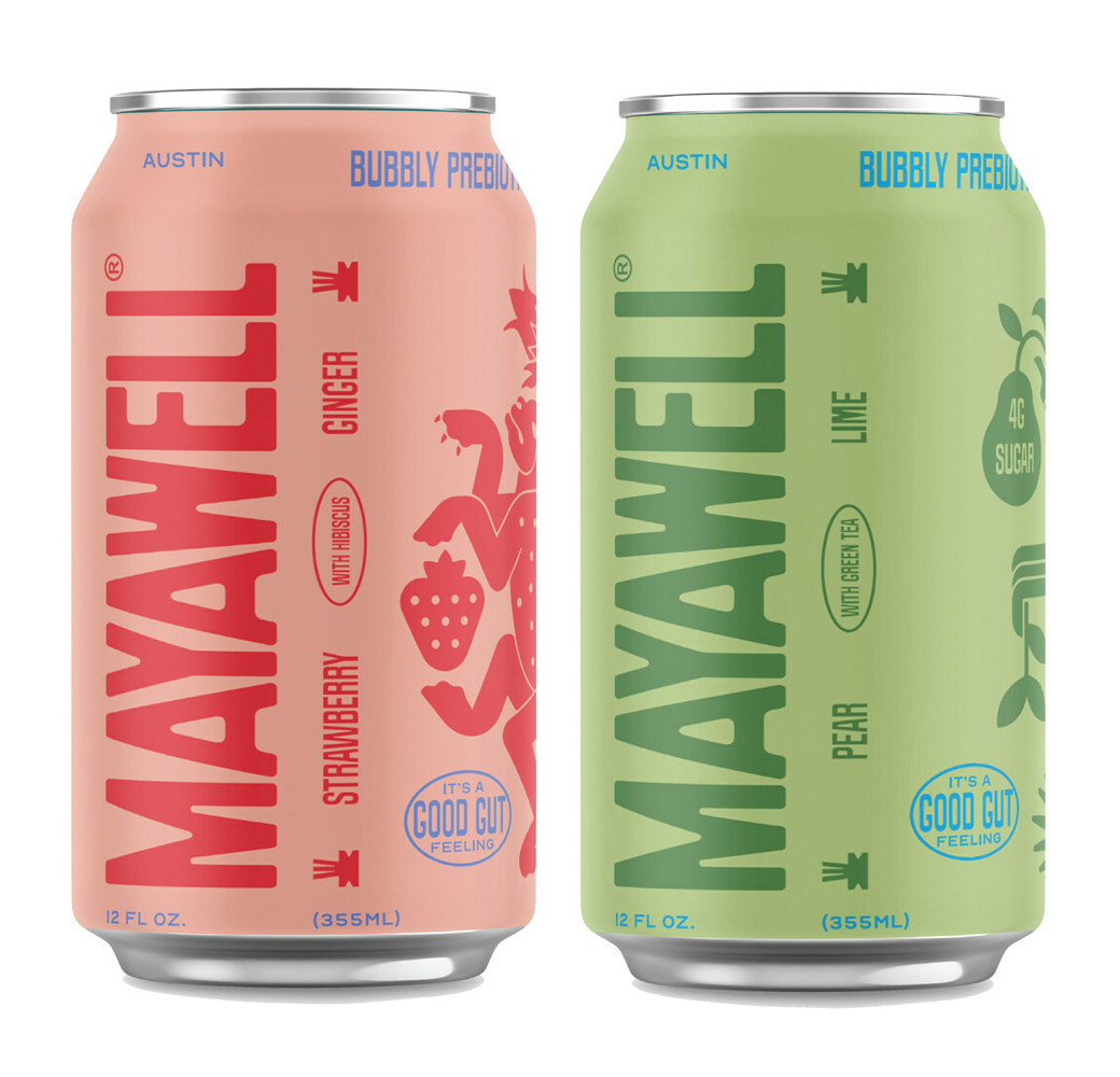
The refreshed design sees an overhaul of the company’s logo and packaging as well as digital footprint.
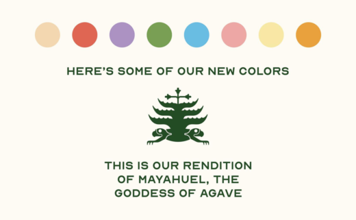
Created by Heavy, a design studio based out of Guadalajara, Mexico, the new identity incorporates Mayan and Aztec characters that are claimed to “reflect the rich history and mythology of indigenous cultures”.
For example, each flavour features a character inspired by Mayan and Aztec iconography, including The Quetzal, The Jaguar, The Hare, The Feathered Serpent, and The Drinker.
“By infusing its branding with these cultural references, Mayawell seeks to promote diversity and inclusivity in the wellness industry as the first Mexican prebiotic soda brand on the market,” says the Austin-headquartered firm.
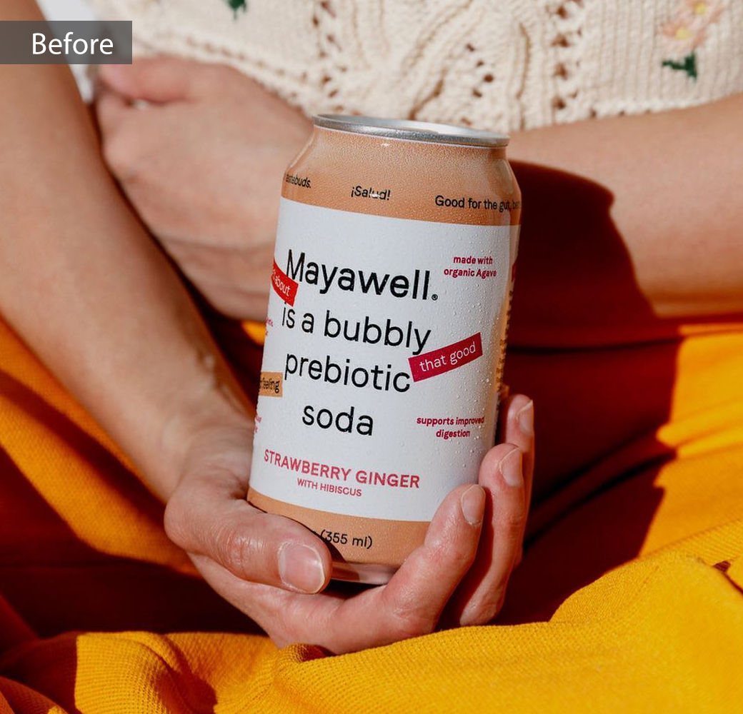
“Our previous cans introduced Mayawell as ‘a bubbly prebiotic soda’. However, with time, we discovered that while this is an accurate description of ‘what’ we are, it doesn’t necessarily depict ‘who’ we are,” further comments Oliver Shuttlesworth, co-founder of Mayawell.
With flavours like Strawberry Ginger, Pear Lime, and Watermelon Mint, the brand’s low glycemic sodas – which contain five grams of prebiotic fibre, under 40 calories, and just four grams of sugar per can – feature a proprietary organic agave prebiotic.
The company claims to be the first ever soft drinks manufacturer to use a sweetener that also functions as a prebiotic.
Source: Mayawell


