E-Commerce Marketing Platform Klaviyo Unveils New Logo Design
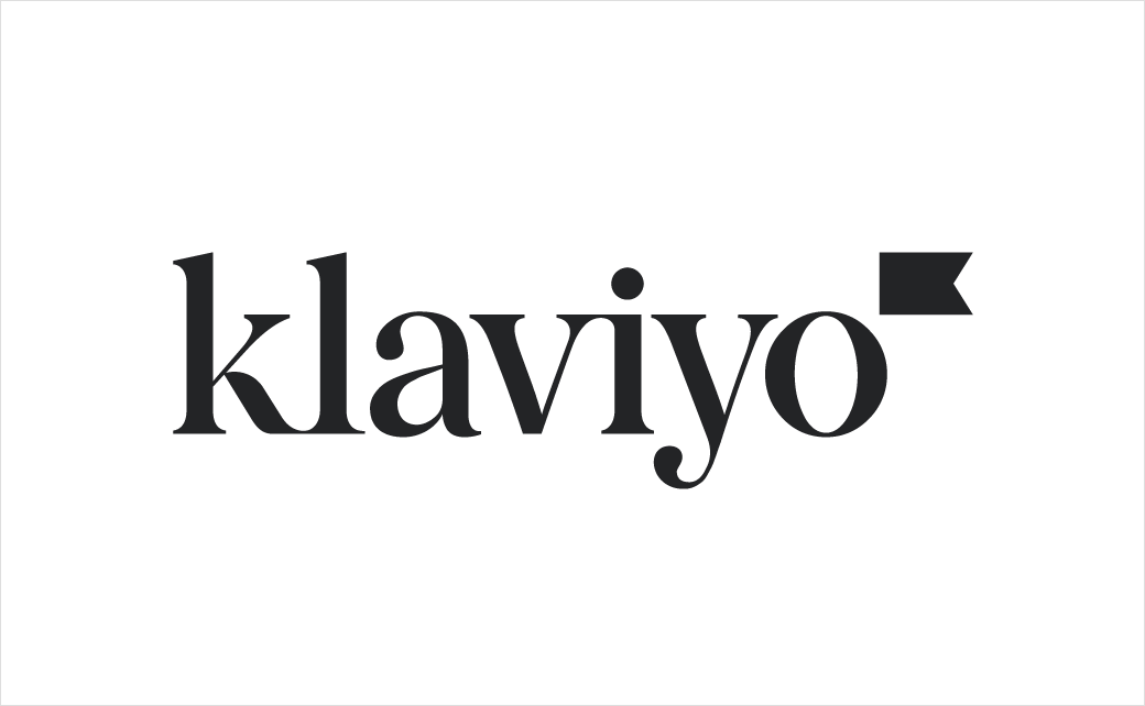
Email and SMS marketing automation platform, Klaviyo, has unveiled a new visual design that debuts a new logo, iconography, type, imagery, and colour palette.
The brand refresh reportedly comes on the back of accelerated growth for the Boston, Massachusetts-headquartered firm.
In 2021 alone, the company claims to have doubled its employee headcount while its software is said to have helped customers generate over $28B in revenue.
“Ownership is core to Klaviyo’s new brand identity. Klaviyo’s new mark is led by a flag, which seeks to represent a number of qualities and principles that matter to Klaviyo: data ownership, the communities Klaviyo helps its customers foster, the guidance the product gives, and success in speed. The colour palette is rooted in neutrals with pops of bright colour, and the imagery is warm and documentary-style, with a focus on the confidence and strength of Klaviyo’s customers,” says the company.
“Klaviyo’s always been focused on increasing ownership, and our new logo helps us signify that. Flags celebrate community and connection, they help guide and are instrumental in wayfinding, they’re symbols of speed and success,” further comments Andrew Bialecki, co-founder and CEO of Klaviyo. “Flags are the perfect symbol for Klaviyo – a company empowering and celebrating creators to own their data, to own their future, to see their purpose accelerated.”
“The business has grown immensely over the past few years, and we wanted our brand to match the maturity and evolution of the company,” adds John Goodwin, executive creative director of Klaviyo. “In a sea of tech sameness, our goal is to stand apart with a modern take on a classic, organic serif that is as relevant today as it will be 100 years from now. The flag on the logo mark acts as an exponent, showcasing how we help our customers grow exponentially.”

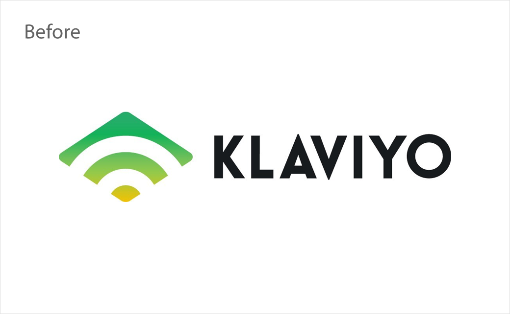
Source: Klaviyo


