Team Services Rebrands, Unveils New Logo Design
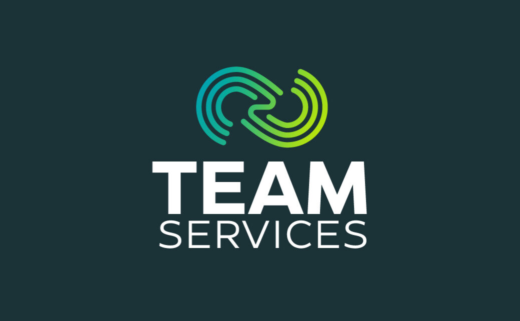
Team Services has unveiled a new logo design and website as part of a rebranding drive.
Founded in 2007, the American firm provides shore tankerman services to the inland marine transportation system along the Gulf Coast.
The new look is said to mark the first step in the company’s expansion plans, with the family-owned and operated business saying it expects to create 50-75 long-term new positions in the next three years for the transportation and logistics industries.
“Our company is looking to serve a larger audience than ever before,” explains owner and CFO, Brian Richard. “A rebrand was needed to keep the momentum going and let our clients know that Team Services plans to make an impact across the industries we serve.”
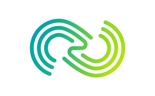
“The abstract infinity symbol in the new logo represents limitless possibilities and seamless unity brought to their operations and relationships. The brand’s overhaul symbolises its evolution, growth, and anticipation of the future,” adds a company spokesperson.
Accompanying the new logo is a revamped website, which is claimed to have a more user-friendly interface than before as well as an improved navigation system.
The redesigned site also gets new features such as an employee portal and educational opportunities within the organisation.
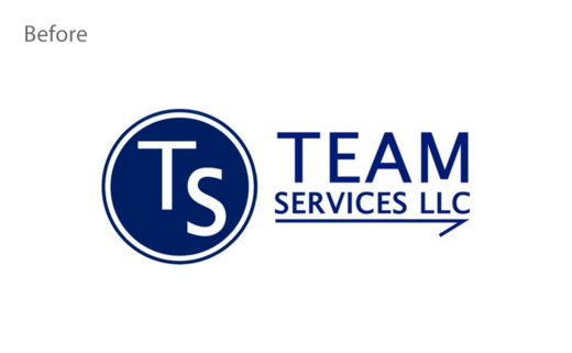
Source: Team Services


