Lux Tips: Designing a Logo So Dazzling People Will Wear It as Jewellery
Logo design matters for every business, but is arguably most important in the world of luxury branding. To get this right, it’s best to learn from established marques, so let’s look at some stunning examples of logos that people everywhere want to wear.
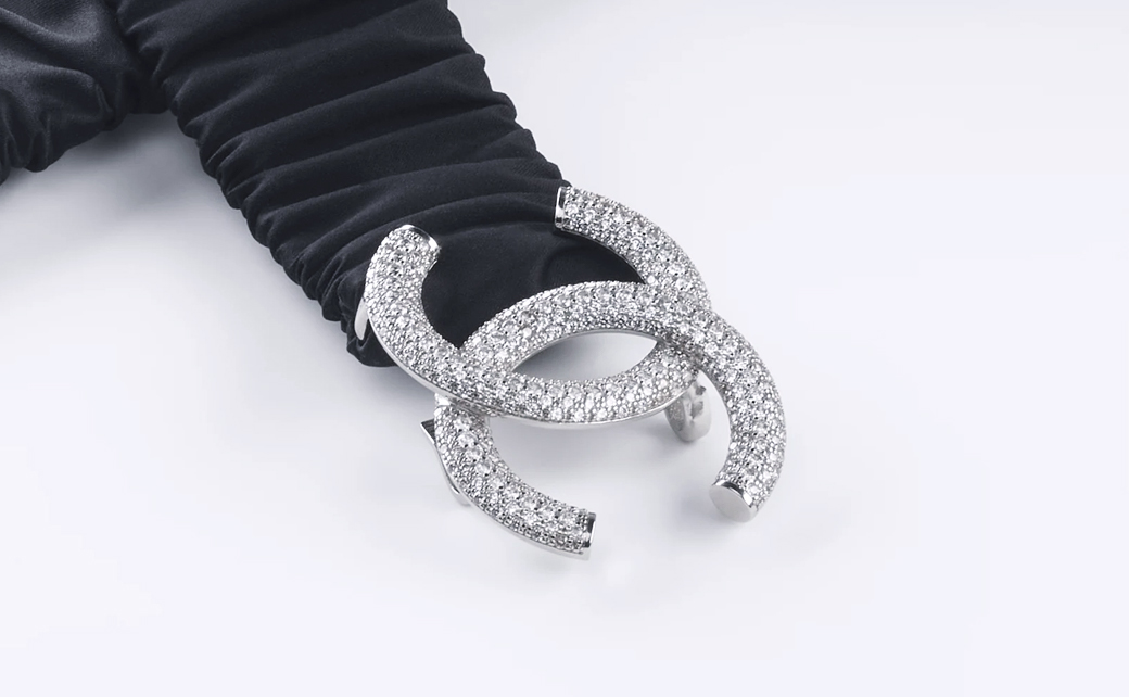
Beauty in Simplicity: The Elegance of Chanel’s Logo
Less is always more. When it comes to creating a luxurious logo, embrace the power of simplicity and clean lines.
That’s where it pays to take inspiration from Coco Chanel’s infamous double-C logo. Here are the reasons it’s so successful:
- This design is both effortlessly chic and immediately recognisable.
- Even without featuring the brand name, it embodies elegance with its simple yet bold intertwining Cs.
For your own designs:
- Eliminate unnecessary elements for an uncluttered look.
- Strive to keep your shapes simple and streamlined.
In short, a luxurious impression comes not from complexity but through sophistication in simplicity. This is embodied by Chanel’s iconic minimalistic emblem, and can inform your own design efforts.
Embracing Tradition: Gucci’s Double-G Emblem
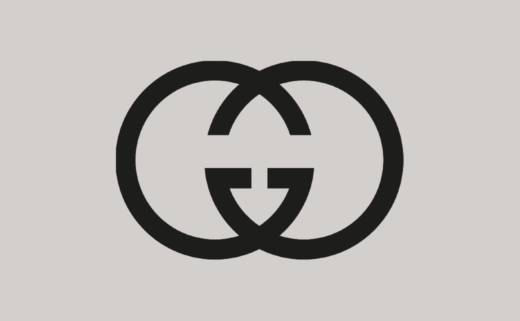
The beauty of a logo comes from it being both emblematic and timeless. An excellent example is Gucci’s double-G pattern. Here’s why it has endured over the past three decades:
- Its repeated “Gs” render the brand unmistakable without shouting its name.
- It thrives on tradition, not trends.
In shaping your own design:
- Incorporate authentic elements which carry meaning tied to your brand story.
- Avoid trendy visuals that may become obsolete over time.
Adopting some old-world charm like Gucci can create an enduring symbol with significant longevity. Since luxury brands are prized for their history just as much as their aesthetics, you can weave this principle into your logo for a truly ageless appeal.
Dimensions Matter: Capturing Compact Luxury with Hermes’ Carriage Icon
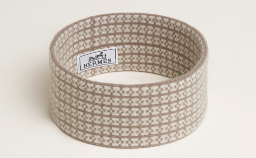
Making a logo visually commanding does not always equate to large-scale, in-your-face designs. The iconic luxury brand Hermès uses a powerful, yet compact emblem. Here’s what makes it special:
- Its horse and carriage design greatly portrays the brand’s heritage.
- Despite being small compared with the rest of the logo, it leaves a significant impact.
When designing yours:
- Think about how your imagery expresses your unique identity.
- Bear in mind where the logo might appear, and whether it will always feature the brand name, or just make use of visual signifiers.
There’s little question that the unfussy sophistication conveyed by Hermès’ silhouette-style carriage icon can teach us a lot. After all, true luxury isn’t always about grandeur, and sometimes it’s captured perfectly within the most modest dimensions. This is exemplified by a modern black diamond ring collection, which shows that style can say more with a whisper than a shout.
The Power of Colour Psychology: Tiffany & Co’s Impactful Blue Box Symbolism
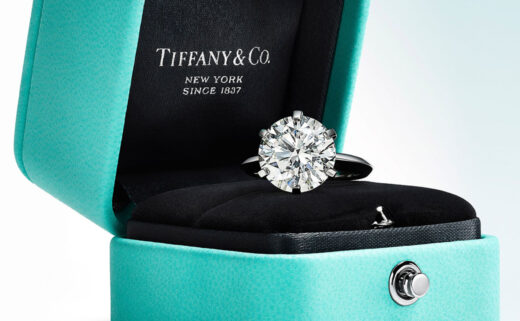
Recognising the strength that colour can bring to your logo design is crucial, alongside other critical concepts. A notable example lies in Tiffany & Co.’s captivating blue box. Here’s why it’s worth mentioning:
- Its distinctive ‘Tiffany blue’ conveys elegance and exclusivity.
- Having a precise trademarked Pantone shade, it achieves instant identification without even using words.
For your own creations:
- Reflect on the emotions you would like your brand to evoke, and choose colours accordingly.
- Keep it consistent for optimal recognition over time, which means using the colour in other places across your branding strategy as well, from social media to print ads and beyond.
Colour can set suggestive tones subconsciously which convey the quality and costliness of the brand in question. That’s precisely what makes Tiffany’s robin egg blue so cherished worldwide. Given this, enhancing your design with some strategic pops of powerful hues could be just the luxurious hint you’re after.
Wrapping Up
With these logo design tips in mind, you’re ready to start making your own. Once this process is underway, don’t be afraid to refine and revise your design based on third party feedback, as it needs to click with customers, not just satisfy the aspects we’ve mentioned here.


