Lufthansa Reveals New Logo and Branding
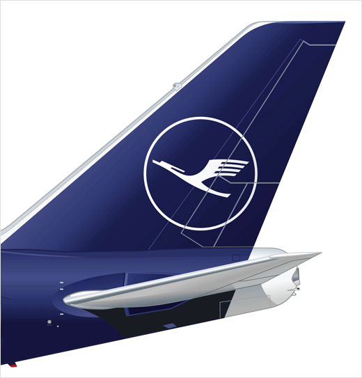
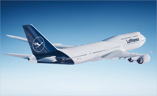
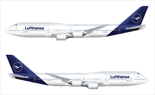
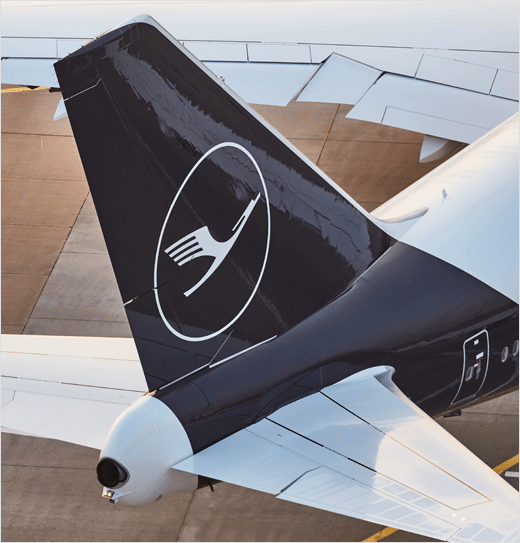
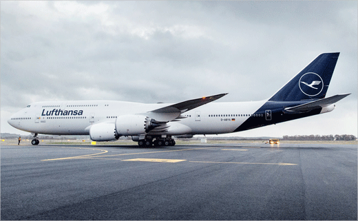
German airline Lufthansa has officially revealed its new brand design. The most visible change is the new aircraft livery.
In front of more than 3,000 guests in Frankfurt and Munich, the company officially presented a Boeing 747-8 and an Airbus A321 with the new design.
“Lufthansa has changed and is more modern and successful than ever. From now on, this will also be visible to the public through a new design,” said company boss, Carsten Spohr. “The crane has always been with us and clearly stands for the promising performance from Lufthansa. To this day, it still stands as a symbol of highest quality, excellent service, flying expertise, reliability, innovative spirit; and it stands for trust.”
Against the backdrop of digitisation and changing customer requirements, Lufthansa says it needed to modernise the aircraft appearance in order to remain up to date.
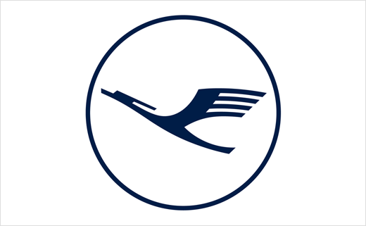
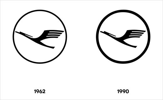
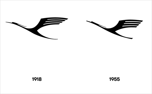
The bird symbol, drawn by hand exactly 100 years ago by graphic artist Otto Firle, remains the airline’s primary symbol. However, every detail of the design is said to have been reworked. Changes include a thinner ring, which the designers claim makes the crane look more “elegant by bringing it into the foreground and granting it more space”.
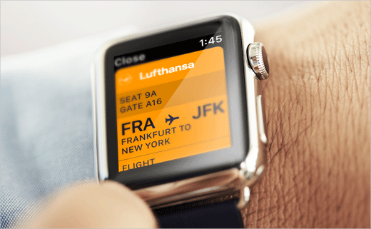
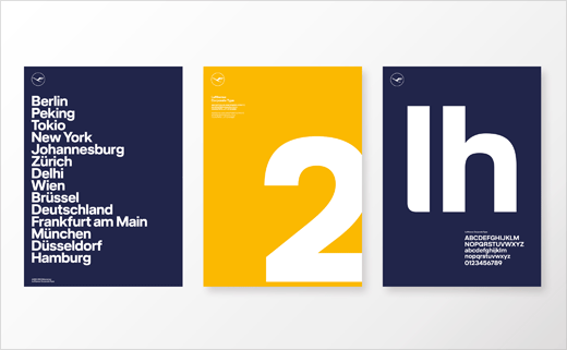
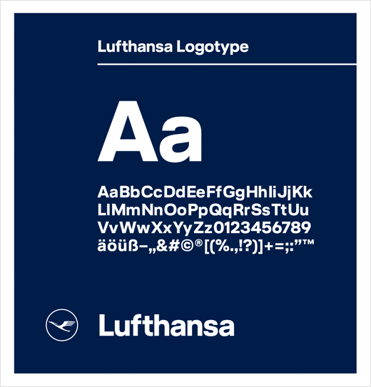
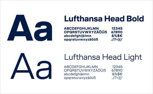
The revised logo is further accompanied by an all-new font system that has been developed in conjunction with Berlin-headquartered type foundry, HvD Fonts.
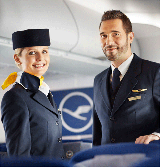
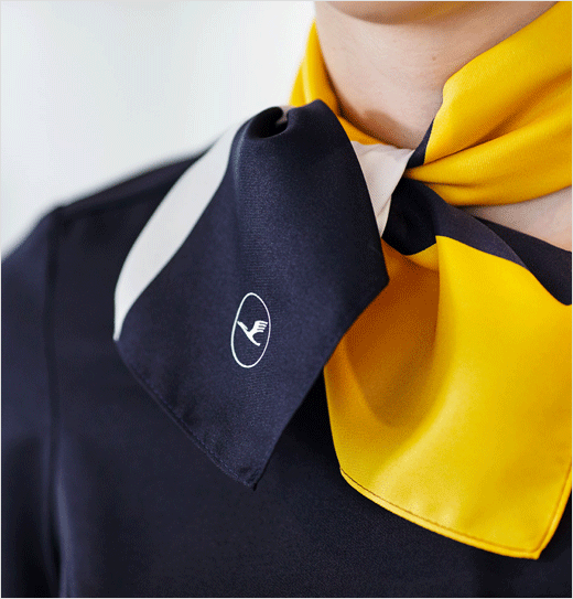
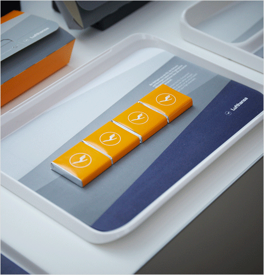
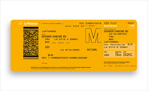
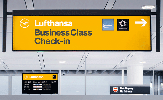
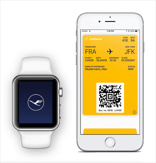
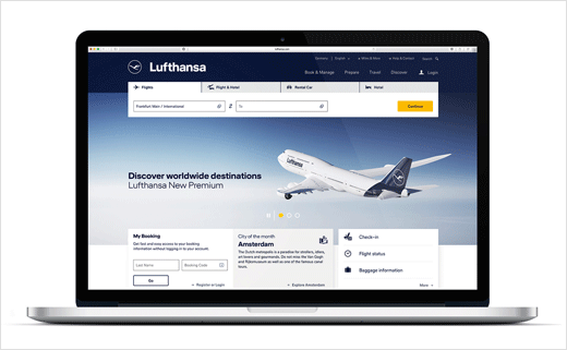
In terms of colour, Lufthansa’s familiar blue-yellow combination has been retained – but the use of the primary colours have been redefined, with the blue now serving as the leading brand colour. Specially developed for Lufthansa, it is somewhat darker than before – “it stands for reliability, clarity and value,” says Lufthansa.
Yellow from now on will feature as a secondary colour, especially on accessories found inside the company’s aeroplanes such as tableware, amenity kits, blankets and pillowcases. Lufthansa claims around 160 million items will be exchanged over the next two years.
Source: Lufthansa


