loyalkaspar Redesigns Promax Brand for the Future
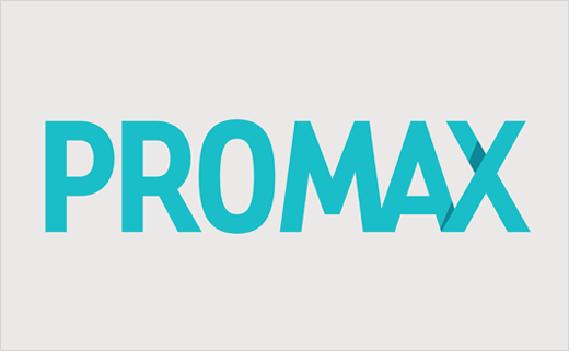
Global entertainment marketing association Promax has revealed a new logo and identity created by branding agency, loyalkaspar.
Headquartered in Los Angeles, Promax was founded in 1956 as a non-profit association for promotion and marketing professionals working in broadcast media. At present, it claims to be the largest such association in the world.
With the rebrand, loyalkaspar says its job was to create “a fresh visual identity and a user-friendly superstructure that would promote clarity, community and inclusivity”.
“Our goal was to create a new brand that conveys a certain sense of authority while remaining approachable – one that reflects the supportive, playful community that Promax represents,” comments Beat Baudenbacher, principle and chief creative officer at loyalkaspar.
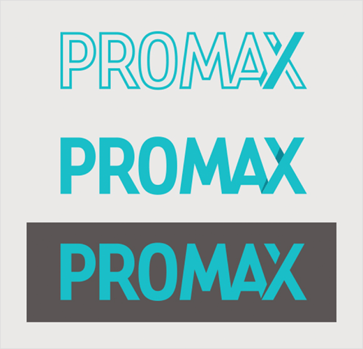
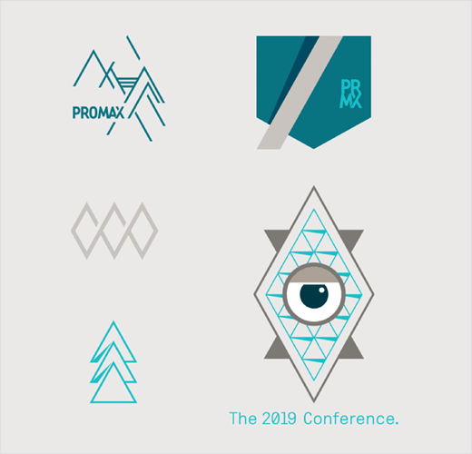
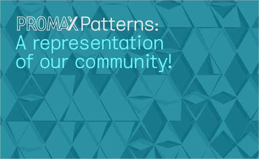
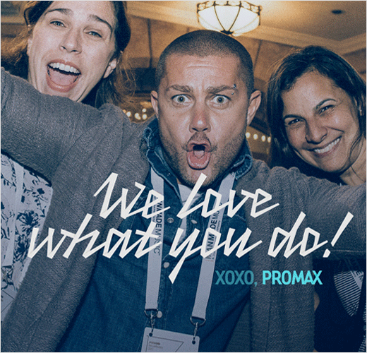
The refreshed identity encompasses a new logotype; a custom typeface; a range of patterns with a blue colour scheme; and a campaign line “to highlight the human element of Promax.”
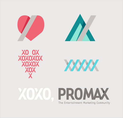
With specific reference to the logo, Baudenbacher says he honed in on the fact that the first three letters of Promax contain curves, while the last three contain straight lines and angles.
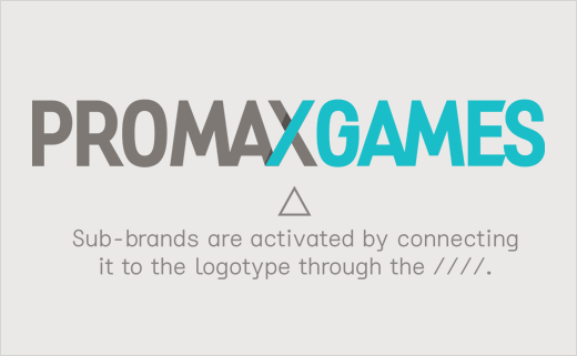
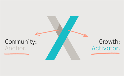
That led to the idea of combining the ‘A’ and the ‘X’ which developed into an entire brand architecture where the forward slash of the ‘X’ becomes “a functional activator, visually connecting Promax to its sub-brands”.
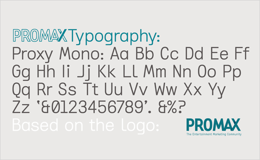
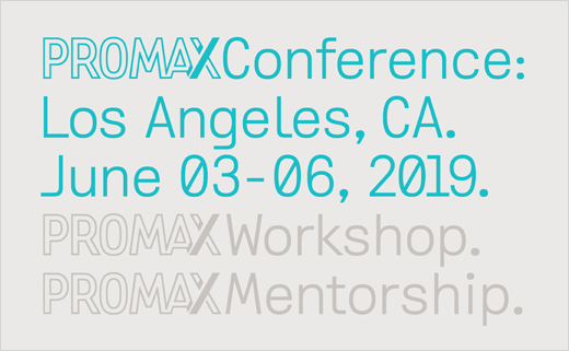
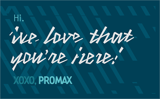
The logo is then contrasted with a “less serious” looking typeface, which has been designed in-house by the agency.
“Proxy Mono is based on the geometry of the Promax logo, so there’s a visual connection, despite the purposeful contrast. It feels a little tech-y, a little vintage and a little not-trying-too-hard,” explain the designers.
loyalkaspar
www.loyalkaspar.com


