Lotus Reveals New Logo and Wordmark
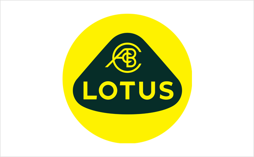
British sports car brand Lotus has this past week revealed a new corporate identity, complete with a refreshed logo.
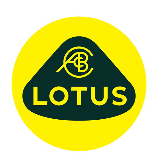
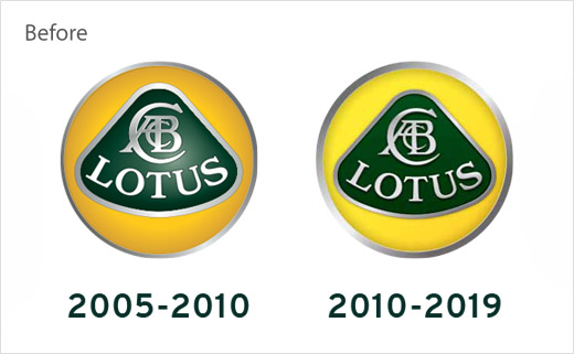
Specific design changes to the latter include a revised roundel as well as an all-new typeface for the wordmark.
“We’ve looked back at the original Lotus roundel and thought about Colin Chapman’s philosophy – to simplify and add lightness. We’ve applied that to create a new roundel, taking the weight out of the lettering and adapting the spacing. We’ve also straightened the word ‘Lotus’ so it’s consistent with the Lotus wordmark,” explains the company’s marketing boss, Simon Clare.
With Chinese car manufacturing giant Geely acquiring a 51 per cent share in Lotus back in 2017, which included an investment of over £1.5 billion, the 71-year old brand is currently in the process of a major global transformation.
Last month it unveiled an all-electric hypercar, the Evija, which is designed, engineered and produced at the company’s headquarters in Hethel, Norfolk.
Source: Lotus


