Logo Revealed for New Oklahoma City Convention Center
The logo design for the new $288 million Oklahoma City Convention Center has officially been revealed.
Described as “colourful and energetic”, the logo uses shades of red, orange, blue, green and yellow in a design that is claimed to evoke the building’s architecture.
“The different colours fold together like origami, refolding itself to suit the needs of our community as it continues to grow,” explains Sonni Adams, creative director for Freestyle Creative, which designed the new brand. “I love watching this city evolve and grow, and I’m beyond honoured that my team had the opportunity to be a part of this”.
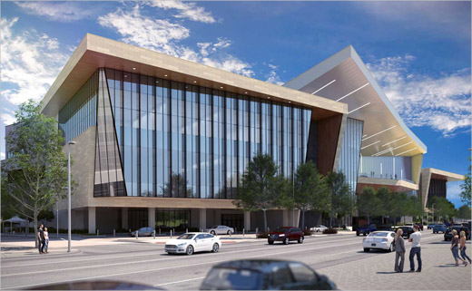
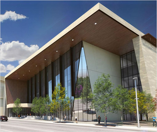
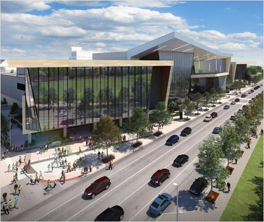
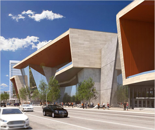
Renderings of the new convention centre show it featuring an angular façade with towering glass walls, as part of an overall design scheme that reportedly takes visual cues from the city’s “sky, landscape and architectural character”.
Set to open in mid-2020, it will be located on the south end of Oklahoma City’s downtown district, replacing an existing centre in the process.
When completed, the new building will encompass a 200,000-square-foot exhibit hall as well as a 30,000-square-foot ballroom.
Source: Oklahoma City Convention Center


